2025 was all about staying local, small commissions and self-initiated projects. I often had long turnover times and could work at projects at a comfortable pace.
The changing landscape of communication arts, becoming more and more swept over by (ugly) A.I. creations, feels really unsettling and discouraging right now. One thing giving me hope is that I have an unwavering belief in myself and in my identity as an artist. Of course, it helps when other people see that, too.
So for those who continued to believe in me, thank you.
HIGHS
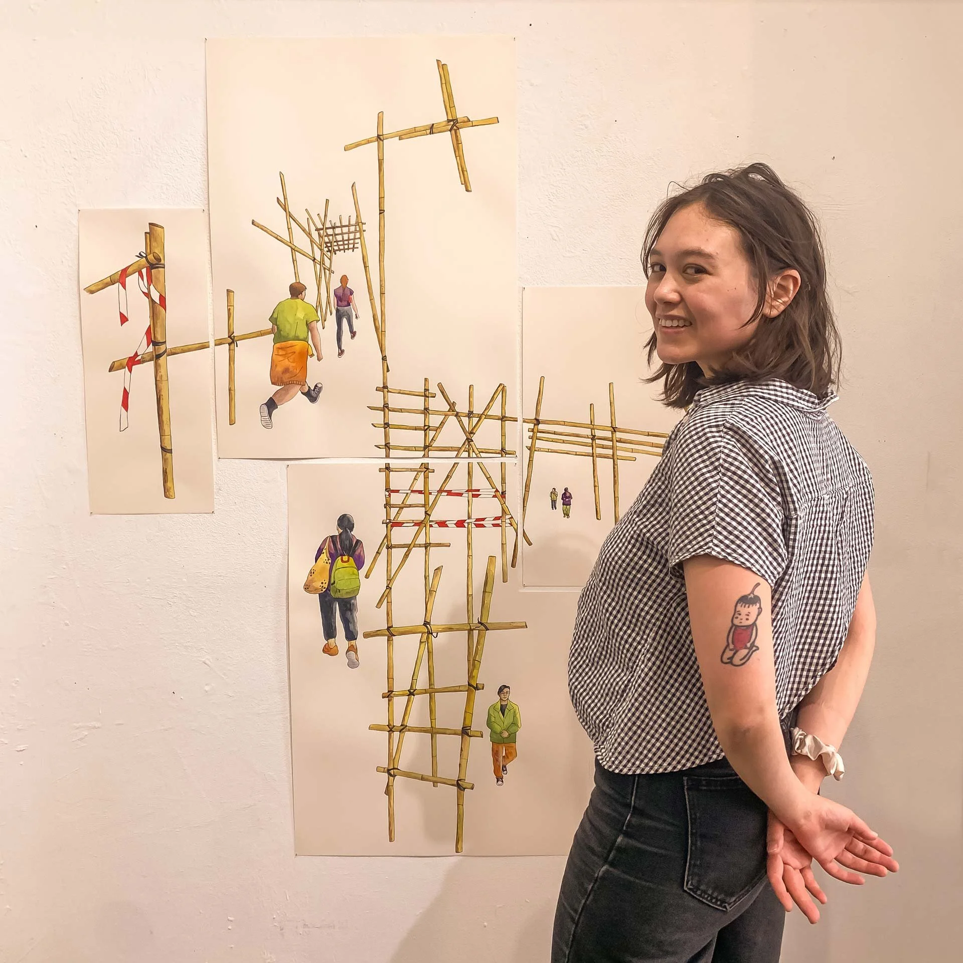
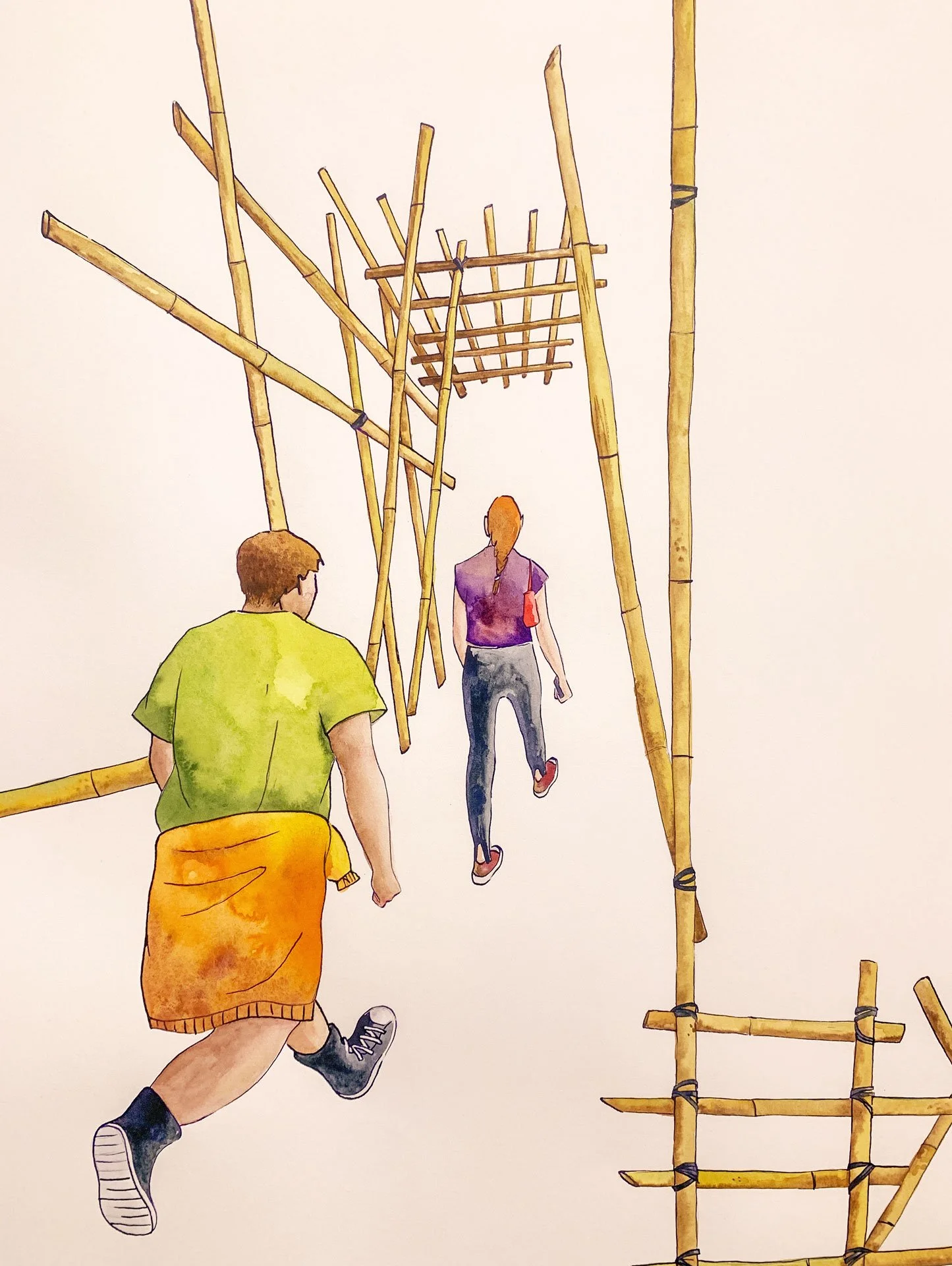
Bamboo Scaffolding

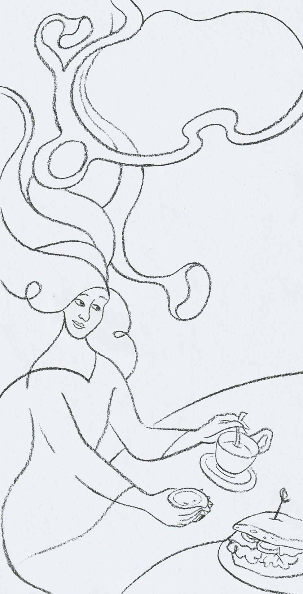
“Bamboo Dreams”, watercolour, acrylic ink, colour pencil on paper. 2025.
In May I joined my art collective, PULPXIX, for a group exhibition called “Out of Scale”. I made a collaged water colour piece all about bamboo scaffolding, as at the time, there were plans for bamboo scaffolding to be phased out in Hong Kong.
I challenged myself in terms of scale, editing, and presentation. You can read about the process here.
Of course, at the time I could not have known about the tragic Tai Po fire that would happen later in November, and the debates that followed. I’m not sure about the future of bamboo scaffolding, but to me, they will always be a cultural icon, and a reliable resource that had been used for many centuries.
If you are feeling charitable and able, here’s a list of ways you can support the survivors of the fire.
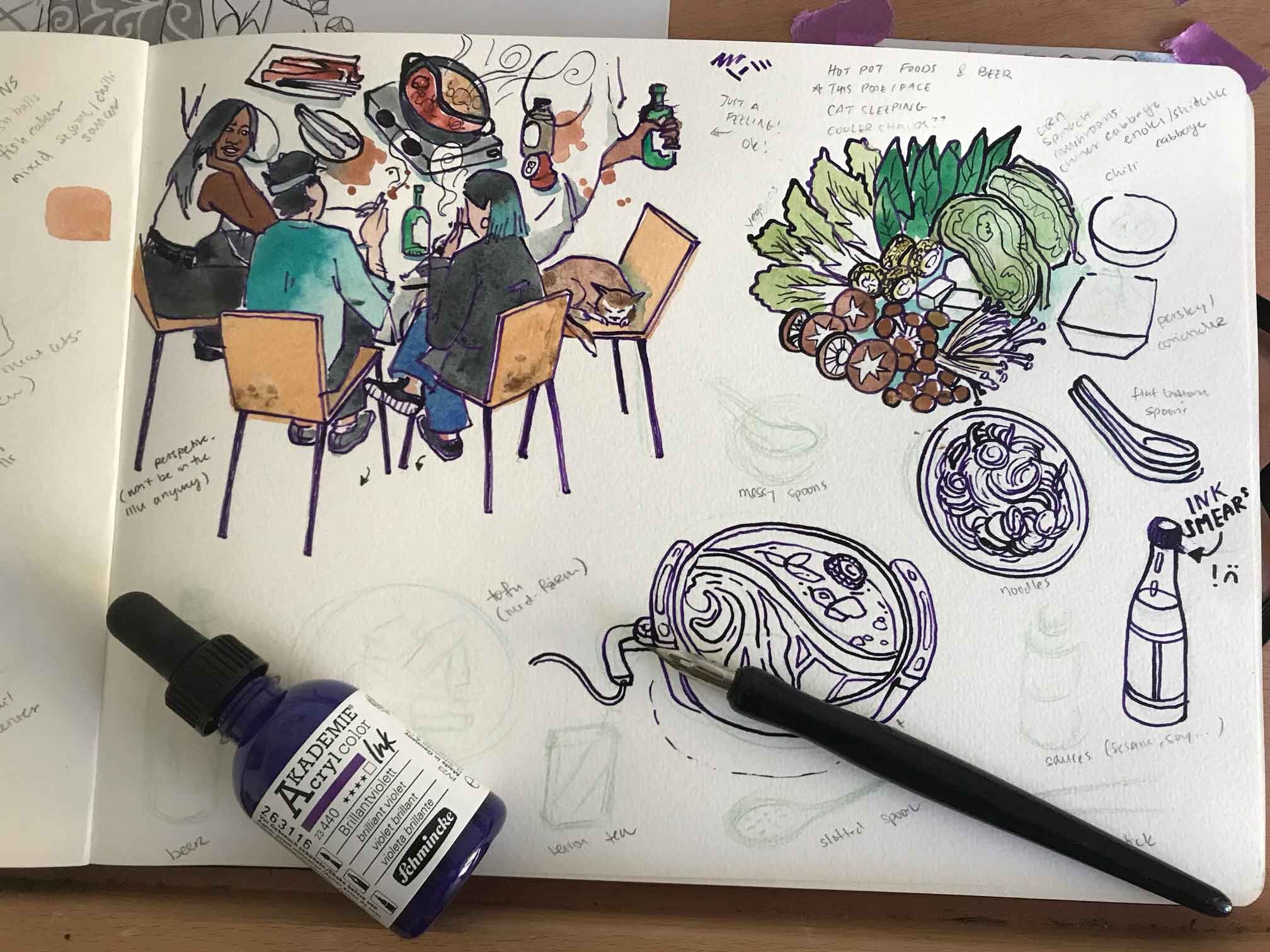
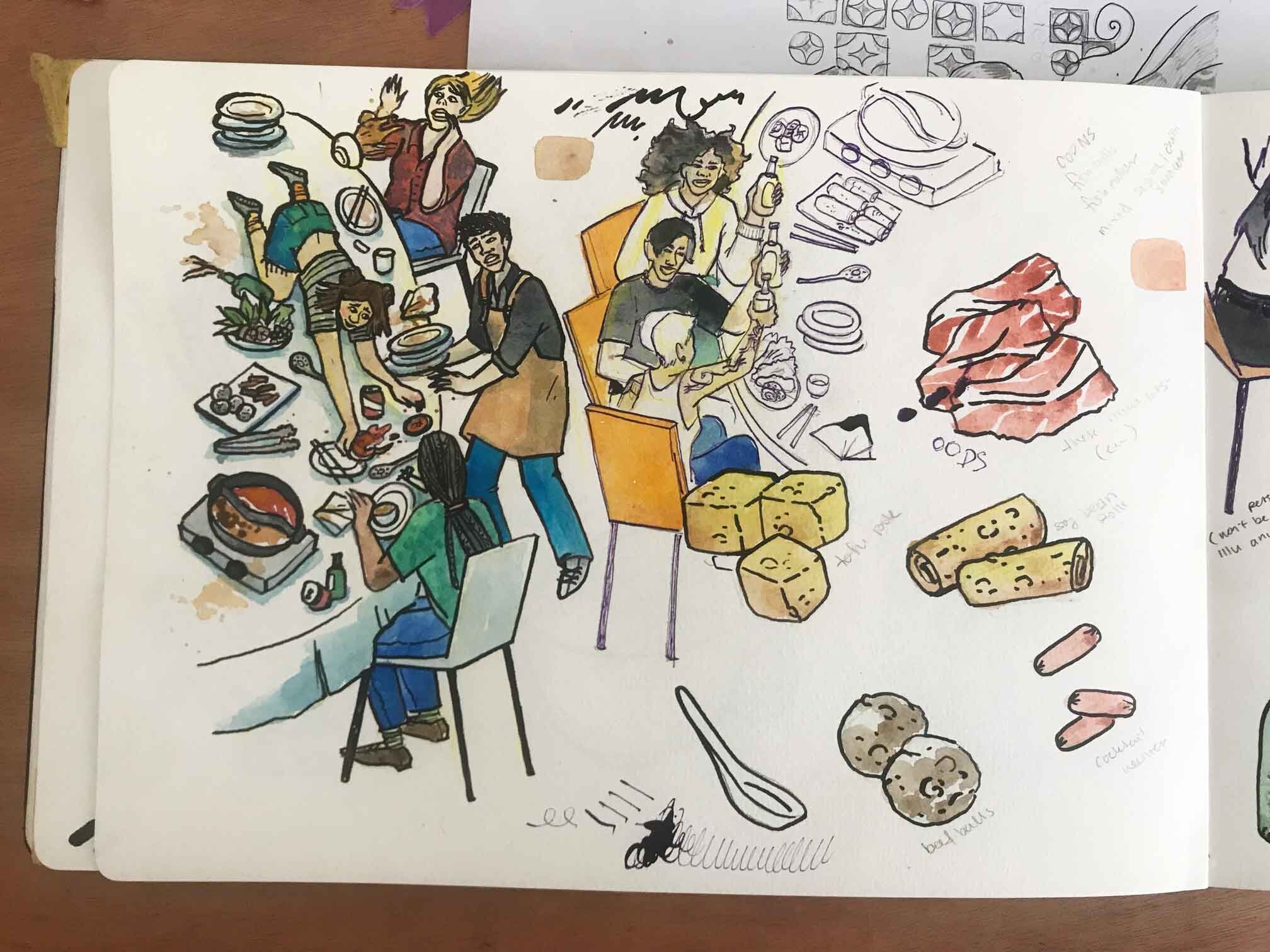
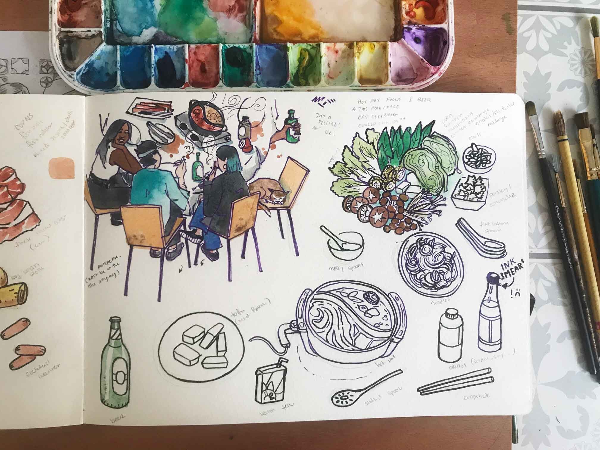
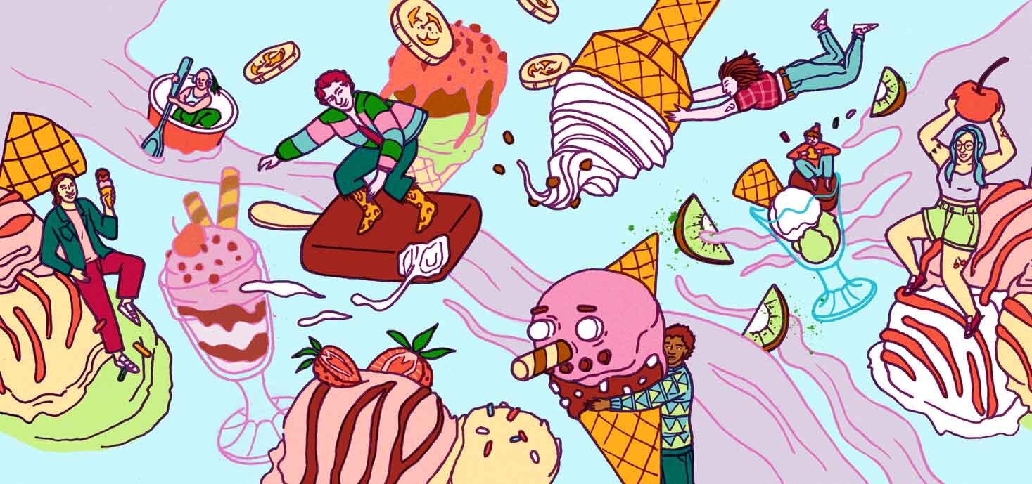
Risograph inspired food illustrations
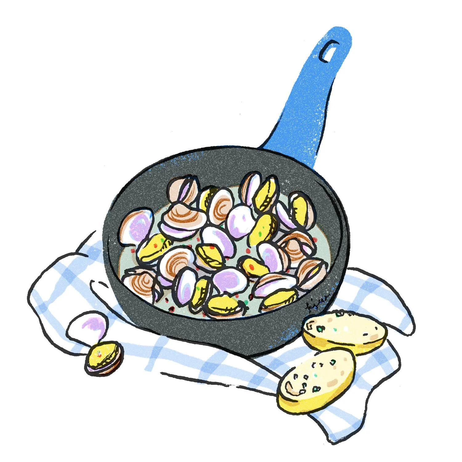
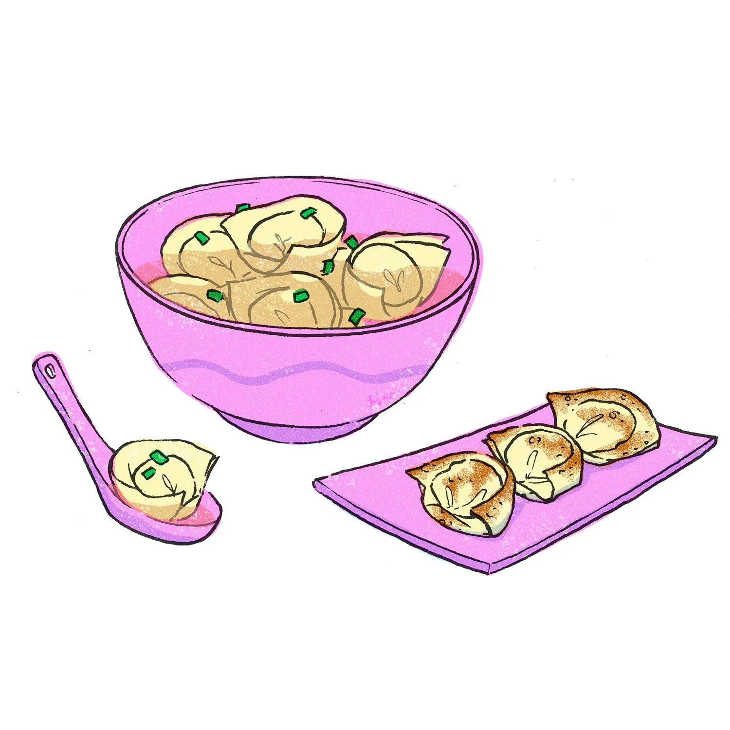
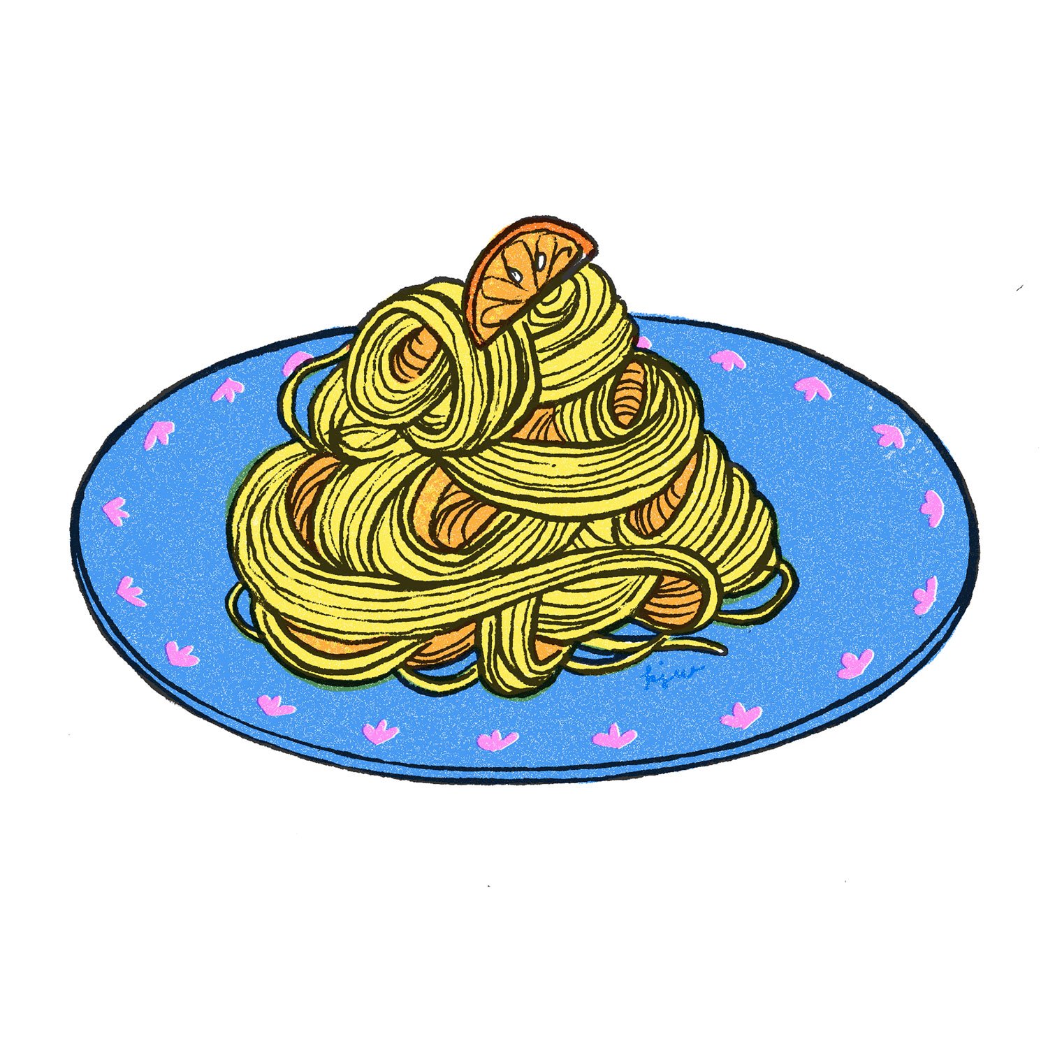
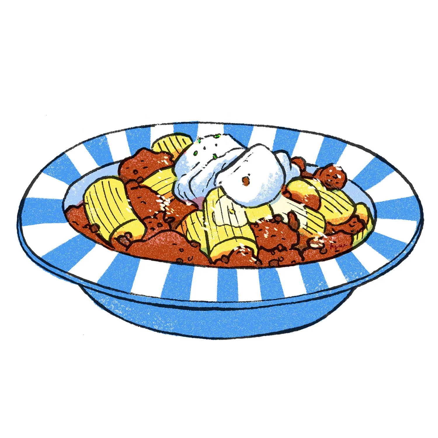
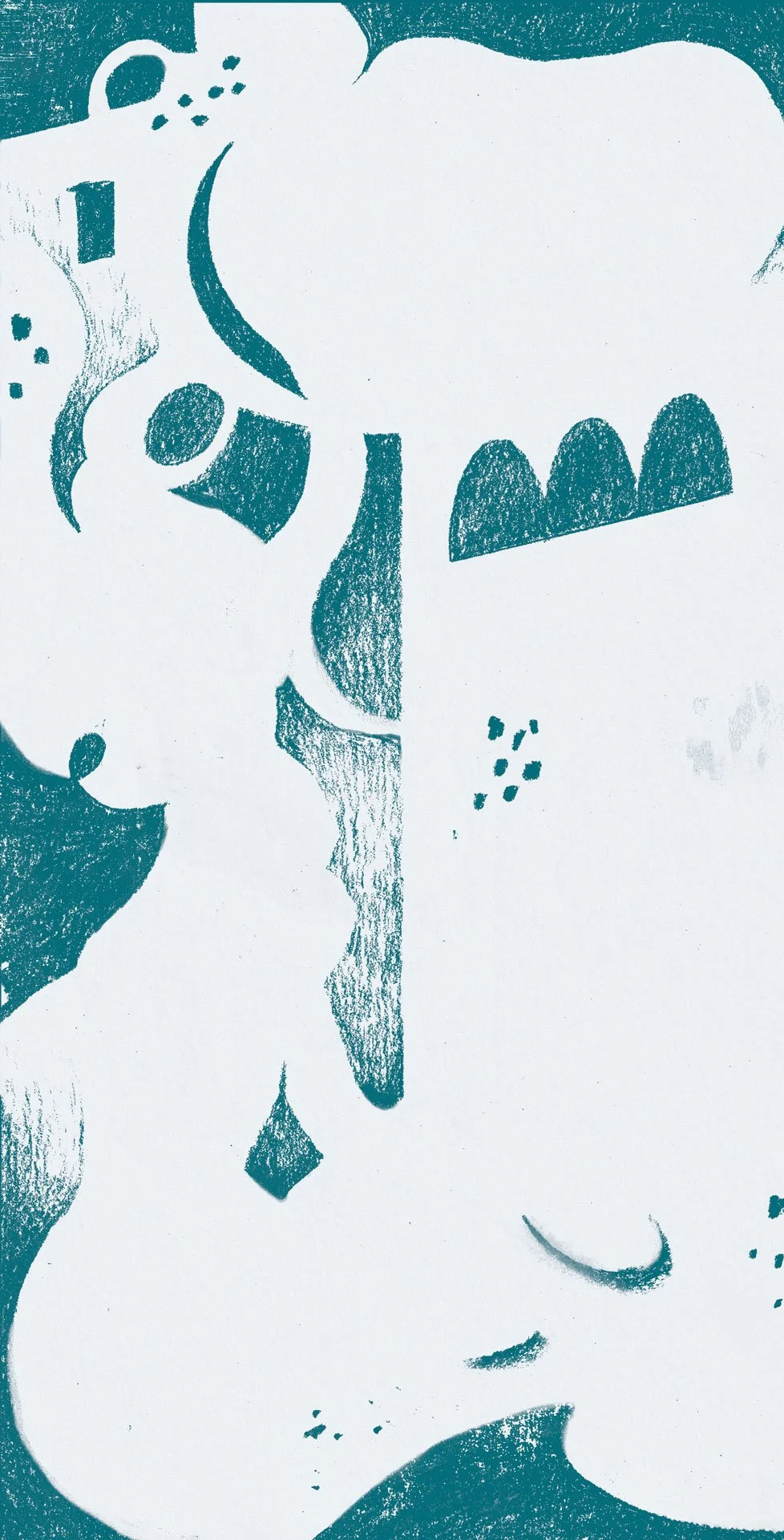
Selected risograph-style food illustrations. 2025 © Kat J. Weiss
Back in April my friend Jen commissioned me to illustrate 25 recipe cards for a wedding gift. I followed this tutorial by Tom Froese to recreate the effect in Adobe Photoshop.
For those not in the know: Risograph printing is like screen printing, but using a machine that looks like an office printer. Colours used in this technique are often bright and fluorescent for reasons I cannot explain, but this is what “Riso” has essentially become known for. Often used in small to mid-size institutions like clubs, churches and schools, before being phased out by modern photocopiers. Inside the printer, a stencil is wrapped around an ink drum, which is then printed onto paper — each colour is printed separately, the paper reinserted into the printer. This leads to interesting textures and misalignments, which artists really like. (Source: me and the internet)
Mentoring at Art Workshops for Kids
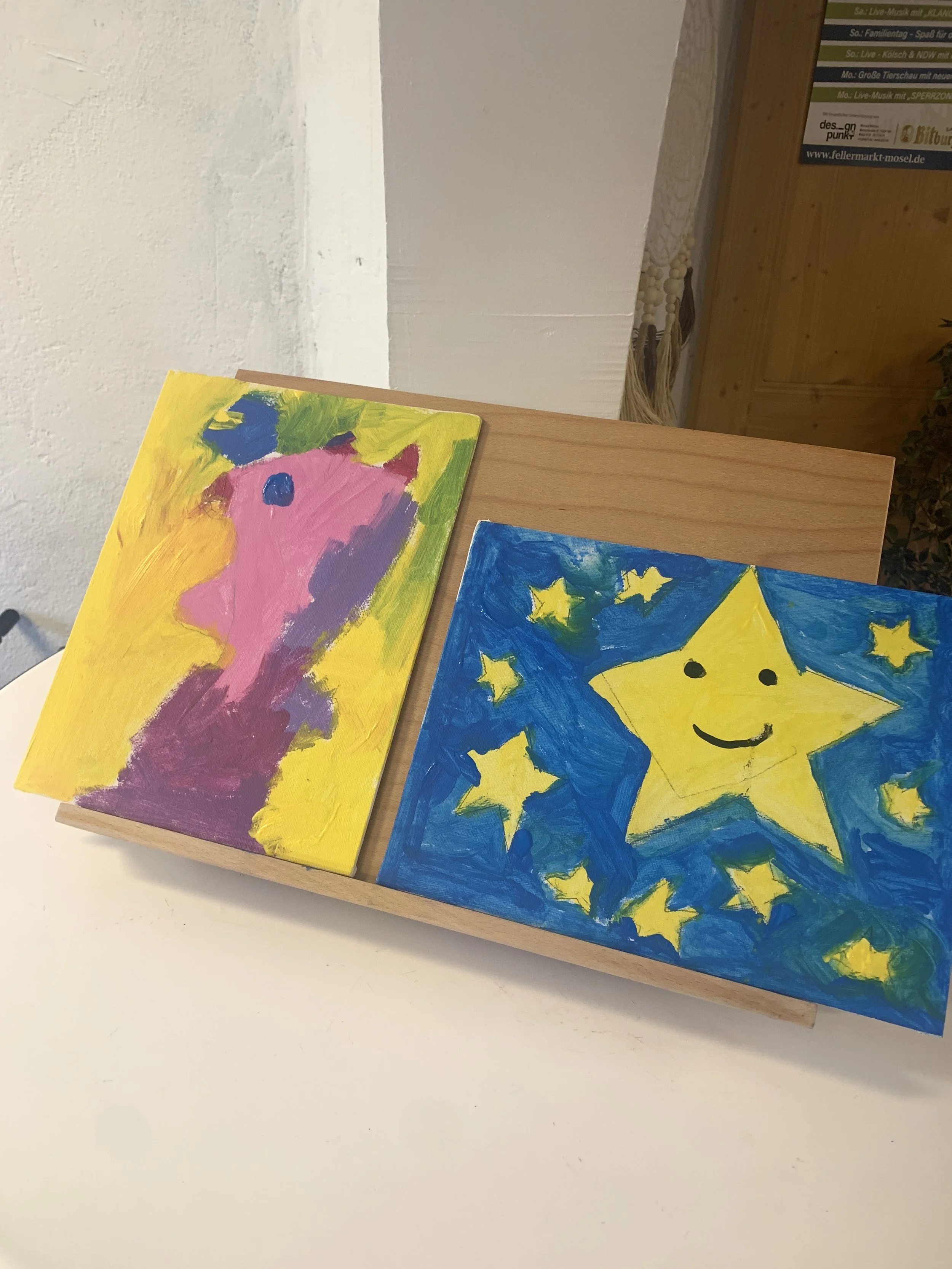
Also in May, a friend of mine asked me to jump aboard a project for IB Trier, an organisation for youth, social and educational work. Rollendes Kunstatelier, or “Rolling Art Studio”, is a mobile art workshop for children up to 18 years of age.
Every month, the “Art Studio” visits different areas in the region, especially small towns, and invites participants to express themselves and experiment with different media, completely free of charge.
My role is as a mentor, not a workshop instructor per se; the idea is that the children can play around and do as they please, and my task is to show them how the materials work, and to give them some prompts. I’ve never liked telling people exactly what to do, preferring to lead by example, so I think this suited me well.
I feel immensely grateful to be part of this project, not only because I am paid a fair wage, but because I believe strongly in what they offer: accessible art to anyone.
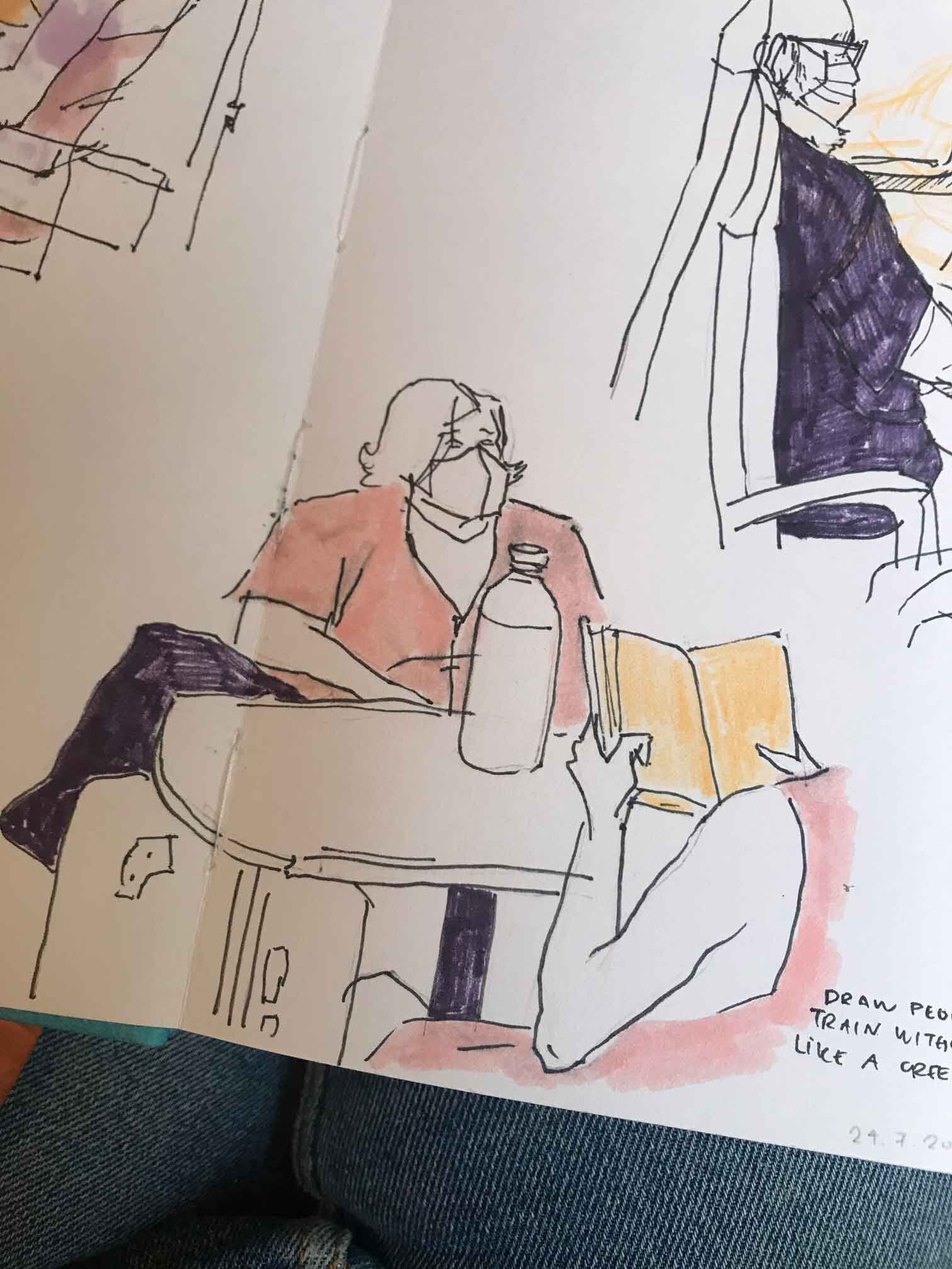
Doing Inktober on my own terms
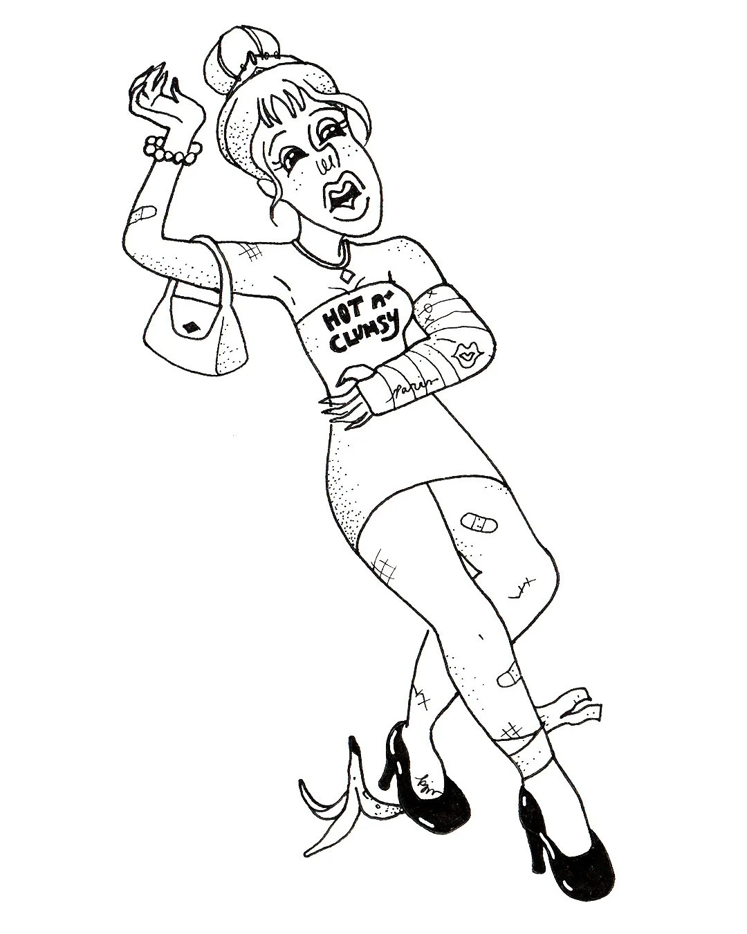
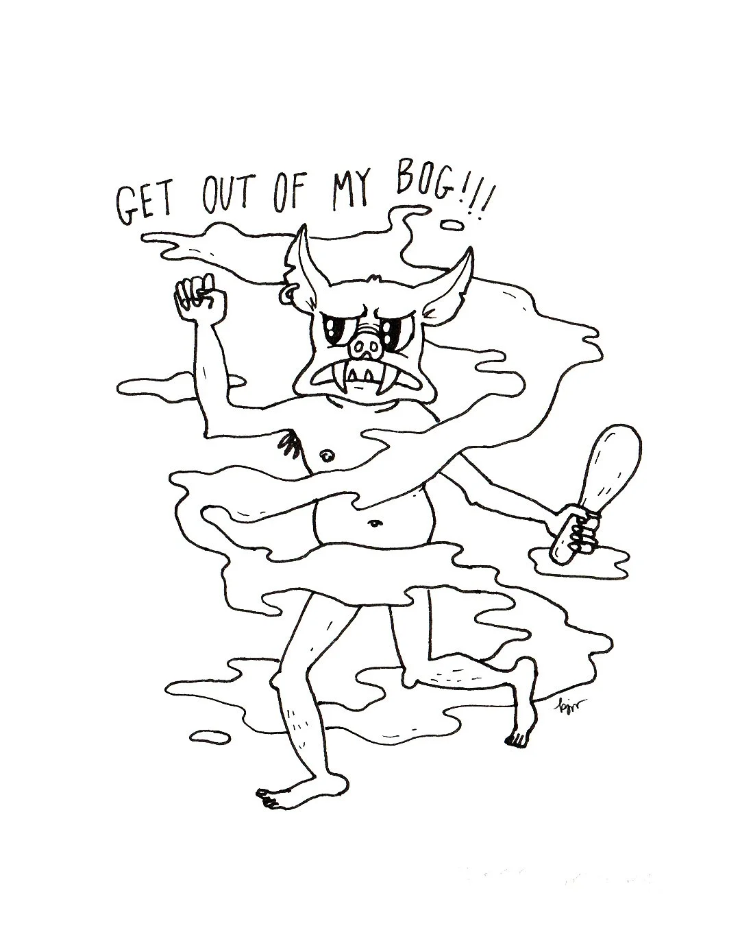
Selected drawings from Inktober 2025 © Kat J. Weiss
October: I finished the Inktober prompt list of 2025, turning it into an honest daily drawing practice for myself. I shared most of the drawings in my biog and on Instagram, but never pressured myself to present anything publicly. That helped a lot to keep the process low-key and low-stakes. Read about the experience here.
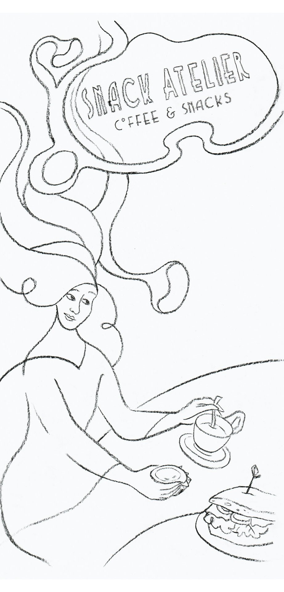
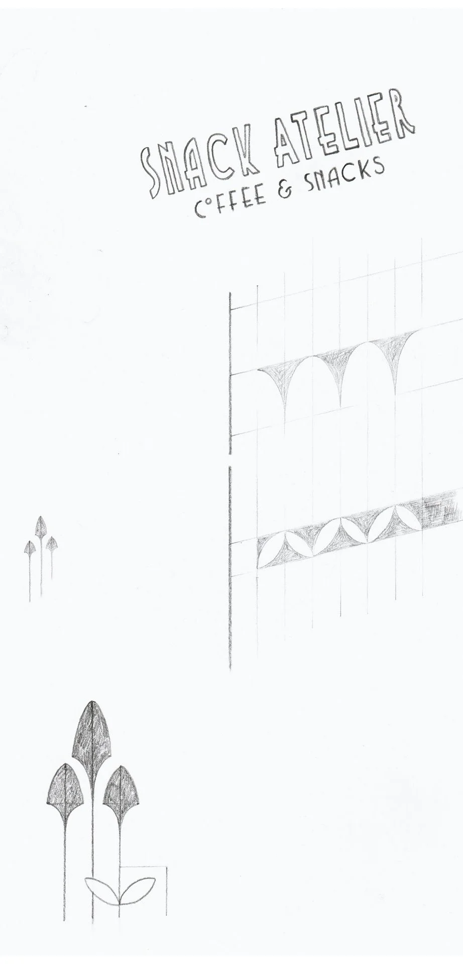
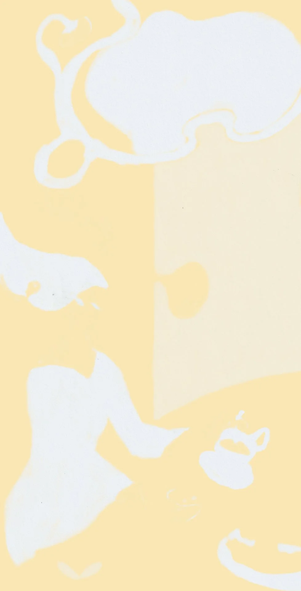
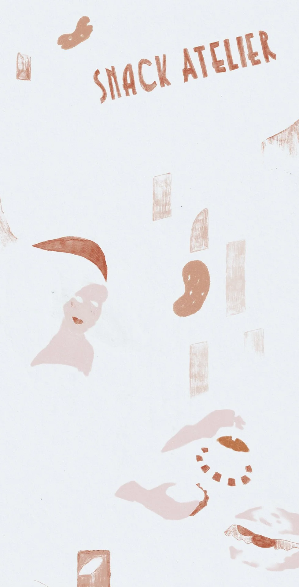
Lithograph-Inspired Illustration for a local café
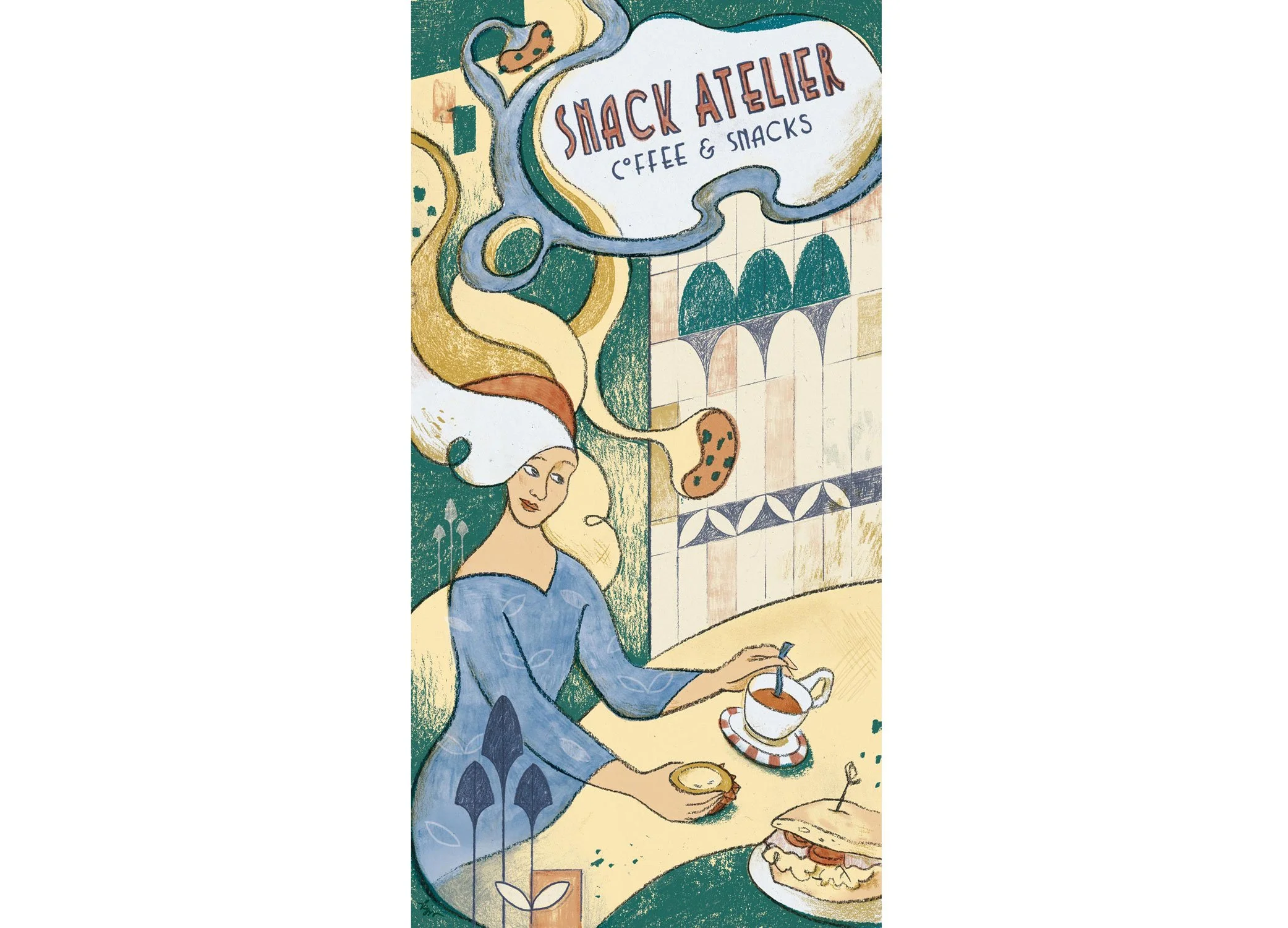
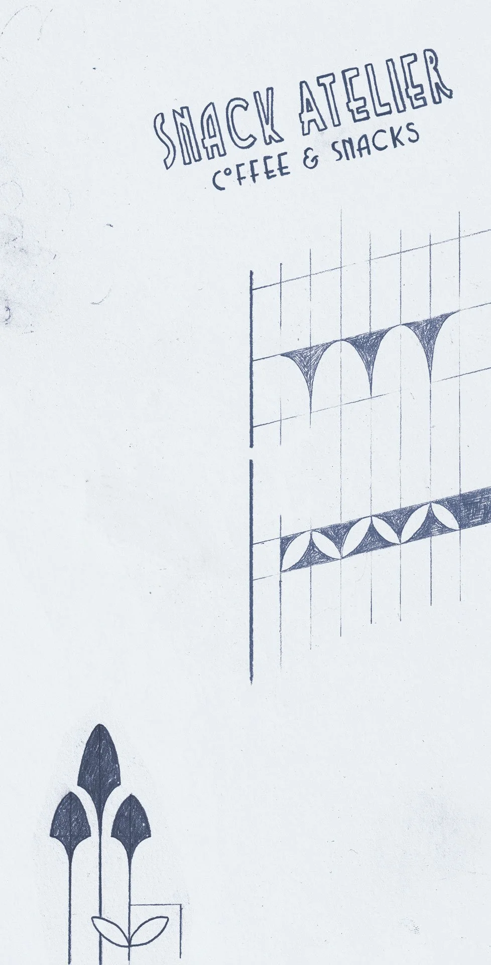
Snack Atelier flyer illustration. 2025 © Kat J. Weiss
September to recently: a local café in my neighbourhood asked me to illustrate the front of a flyer for them. Their little café is very pretty, with Art Deco and Jugendstil elements. I immediately thought of Tolouse-Lautrec’s advertising posters and wanted to recreate the look.
Tolouse-Lautrec worked with lithography, a “printmaking process in which a design is drawn [with an oil-based crayon] onto a flat stone”.
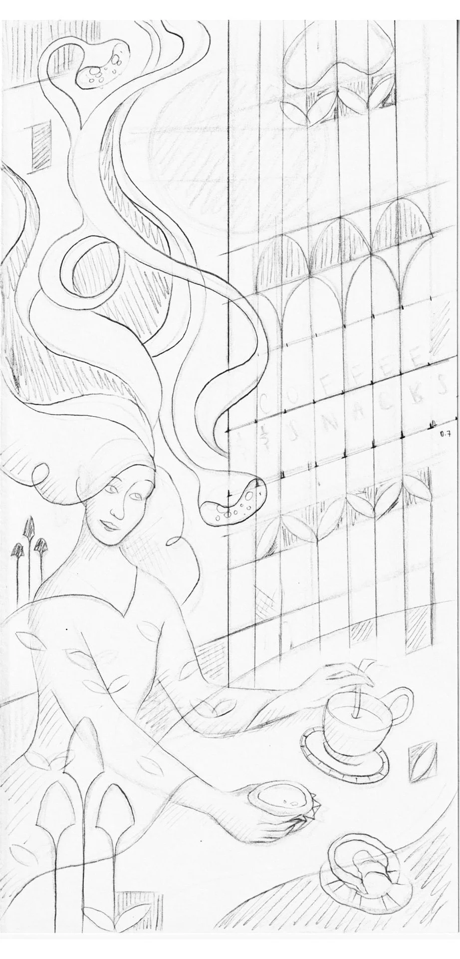
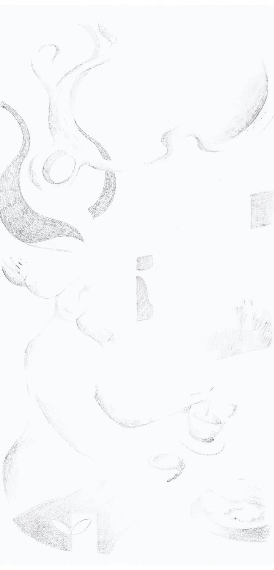
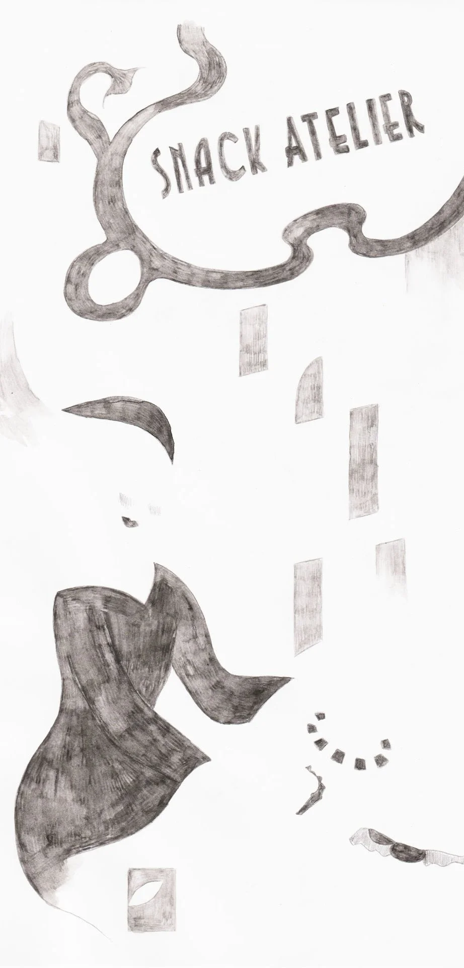
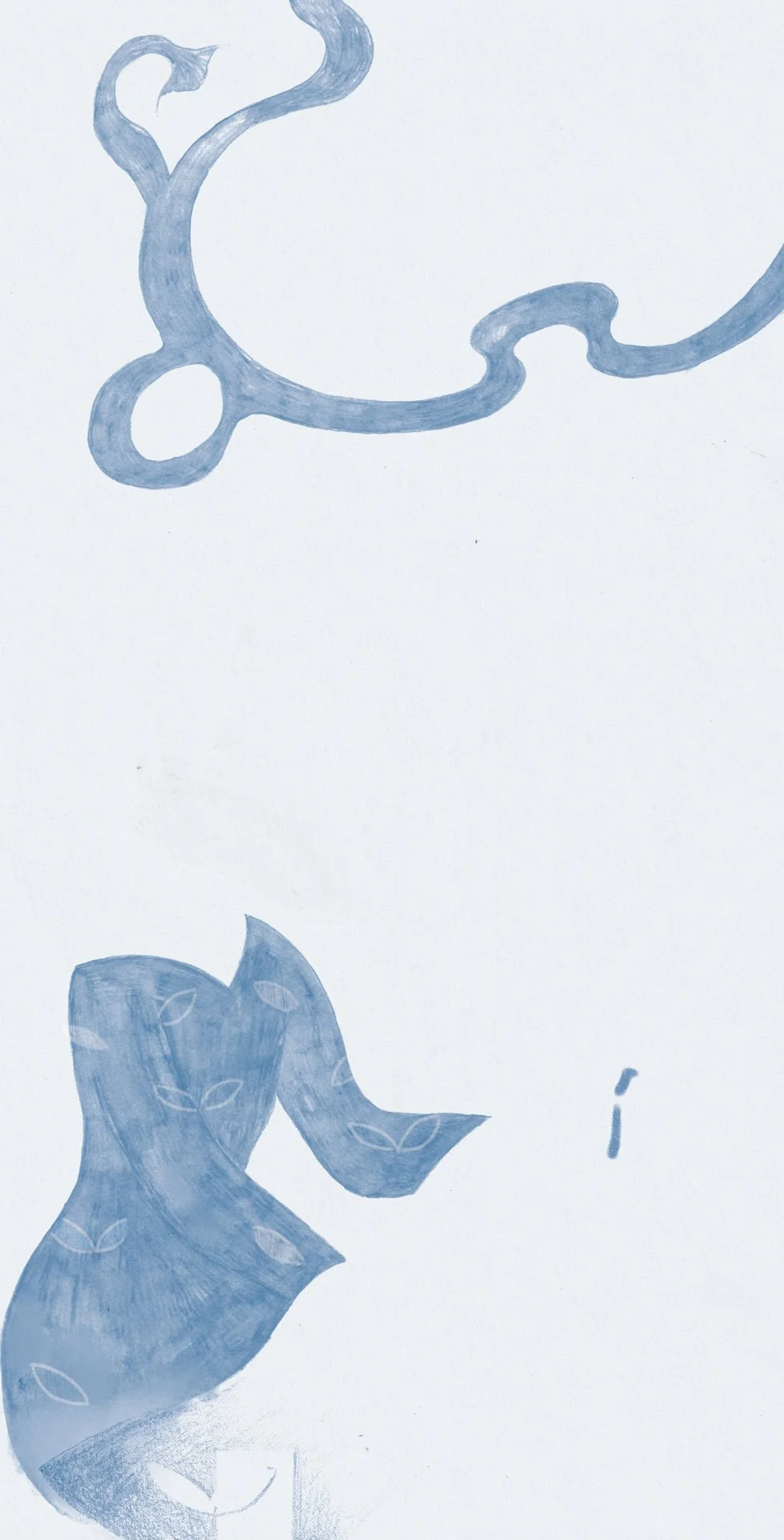
Left to right: original sketch, then layers 1, 2, 3, 4, & 5
I recreated the look using charcoal, graphite, and in one case, water-soluble graphite. I created each matrice (or layer of colour) on a separate sheet of paper, tracing over the original drawing with a light table. I then scanned each of the matrices and superimposed them in Adobe Photoshop.
I played with the translucence of each layer using different Blend Modes: Multiply, Screen or Linear Burn.
My original colour blocking was not super precise. Usually, printmakers have to map out exactly which colour is assigned to which matrice/layer of colour, but in my case, working digitally gave me the flexibility of moving elements around
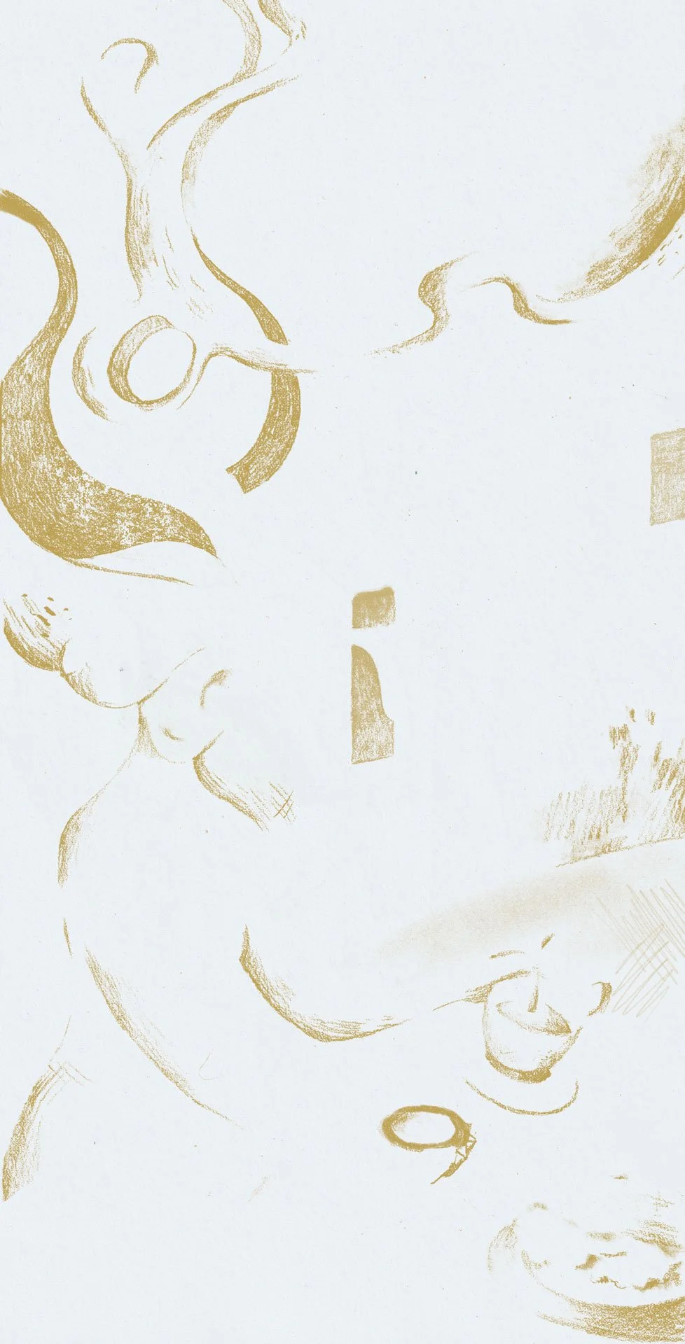
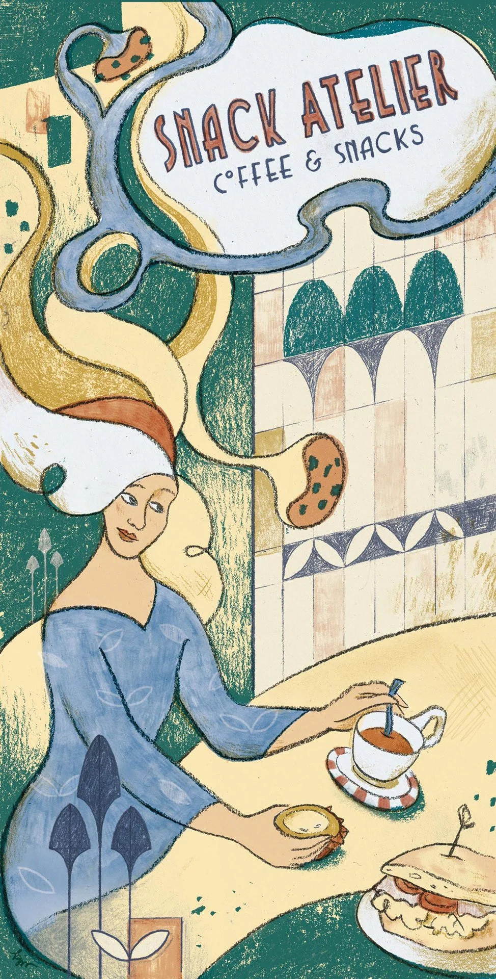
Left to right: new layers 1, 2, 3, 4, 5, 6 & 7, then final illustration
Christmas Card Illustration
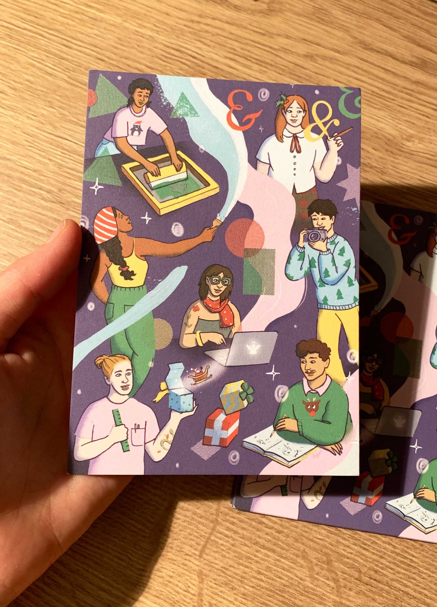
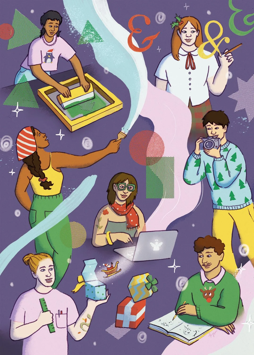
Christmas card illustration for Designforum RLP. 2025 © Kat J. Weiss.
December: My last commission of the year came from Design Forum Rheinland-Pfalz, a organisation acting as an intermediary between designers, companies and politicians. I created a Christmas greeting card depicting artists and designers engaged in the joyful act of creation. I think this was a wonderful way to wrap up the year!
LOWS
Almost no progress on T-shirts

I’ve been talking for ages about rebooting my t-shirt printing gig, and though I made a bit of progress this year (making screens, dyeing and screen printing t-shirts), I did not get to an actual launch. Hoping for more progress this year…
Didn’t realise a dream project of mine
I’ve always wanted to create a watercolour-based, Seek-And-Find Calendar inspired by the Moselle region in Germany, where I live. I haven’t found the time yet, due — and thanks — to all the other projects I got to work on!
HONOROABLE MENTIONS
Stickers
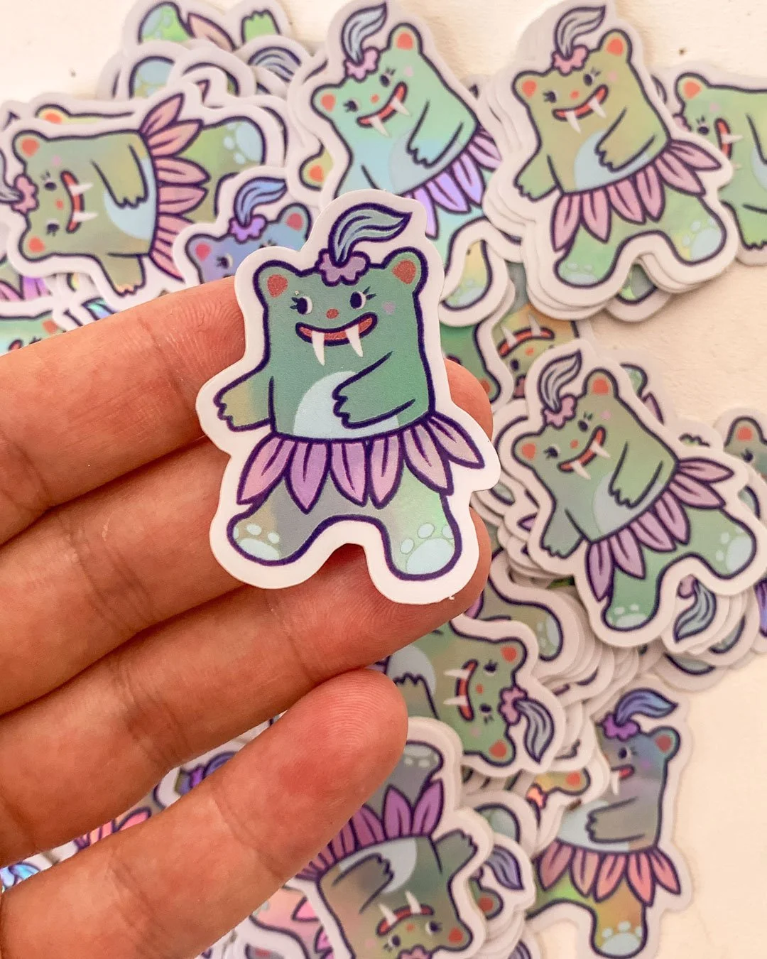
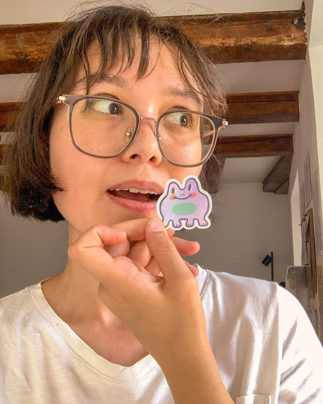
Beginning of summer: I made some fun little stickers.
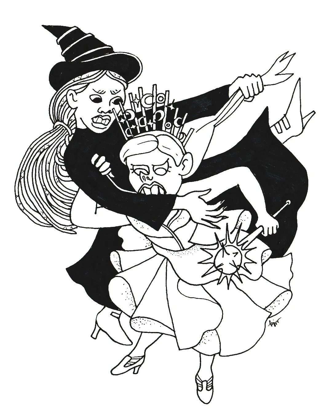
Illustrating Superstitions from around the World
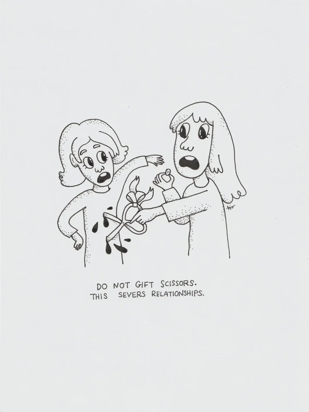
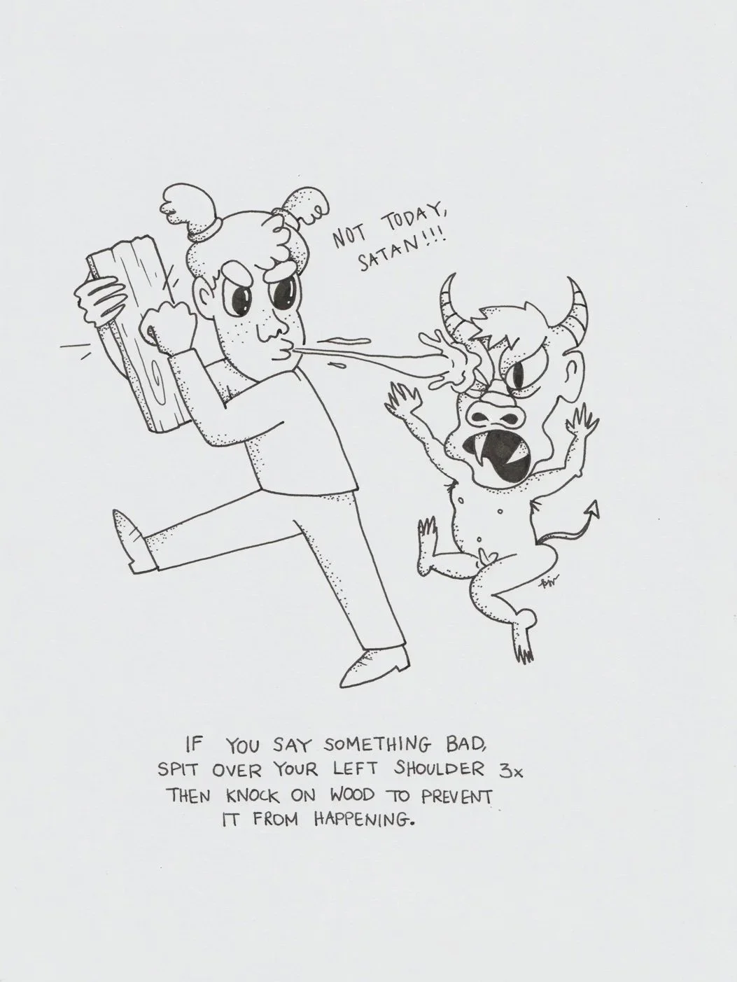
Superstitions. 2025 © Kat J. Weiss.
At the beginning of December, I once again joined my art collective PULPXIX for another group exhibition, titled “Useful Things”. After a phone call with my mother, I was inspired to illustrate the many ominous, often humorous superstitions that exist around the world. For example, how in Chinese culture it’s considered bad luck to gift scissors or clocks.
Christmas Gift: Couple’s portrait
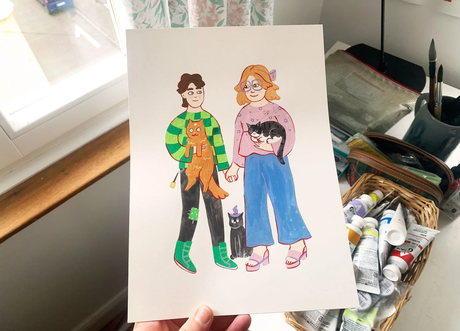
For Christmas: I created this cute gouache portrait for my friend and her girlfriend <3