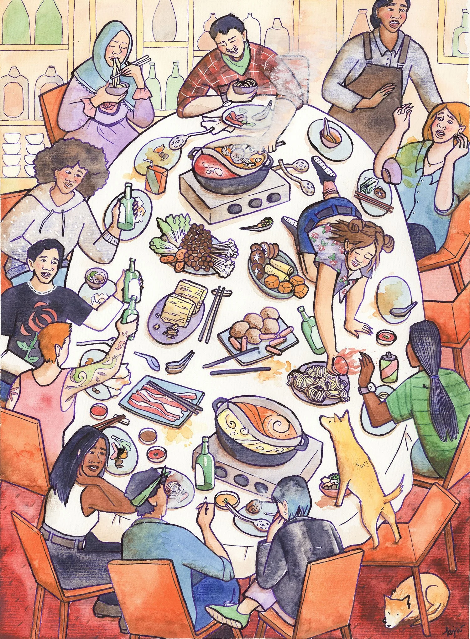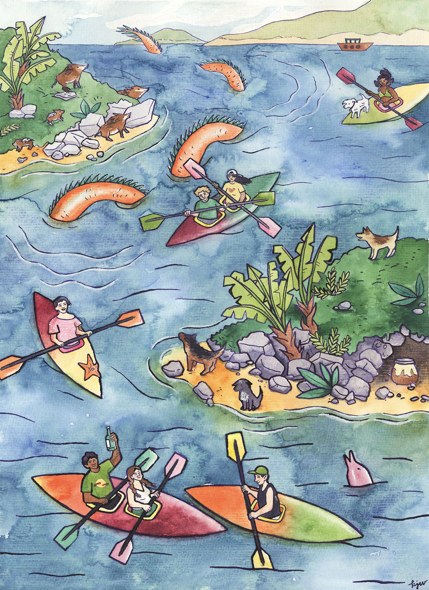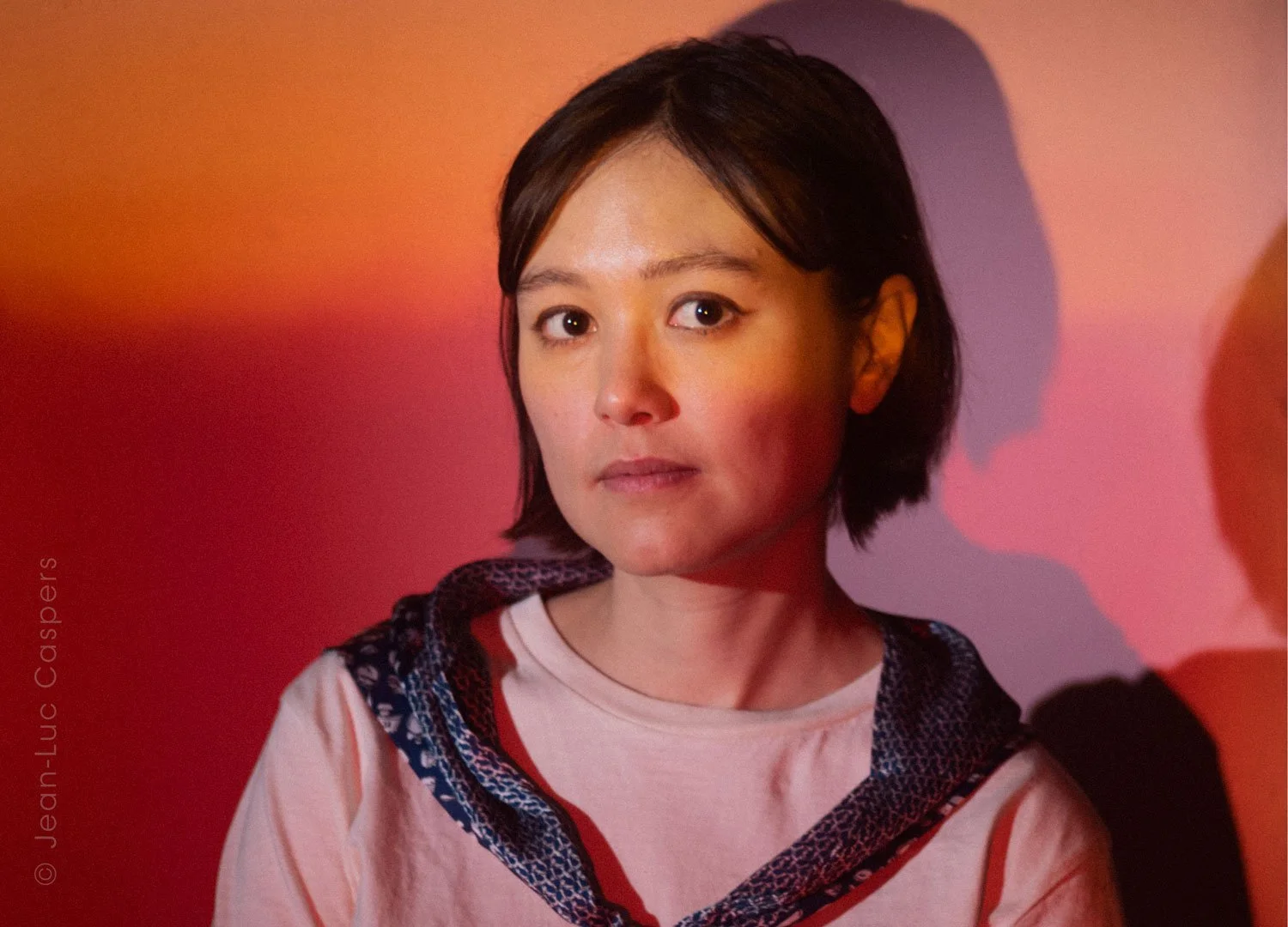
My art was on TV! 👀 And I have many, many feelings about this...

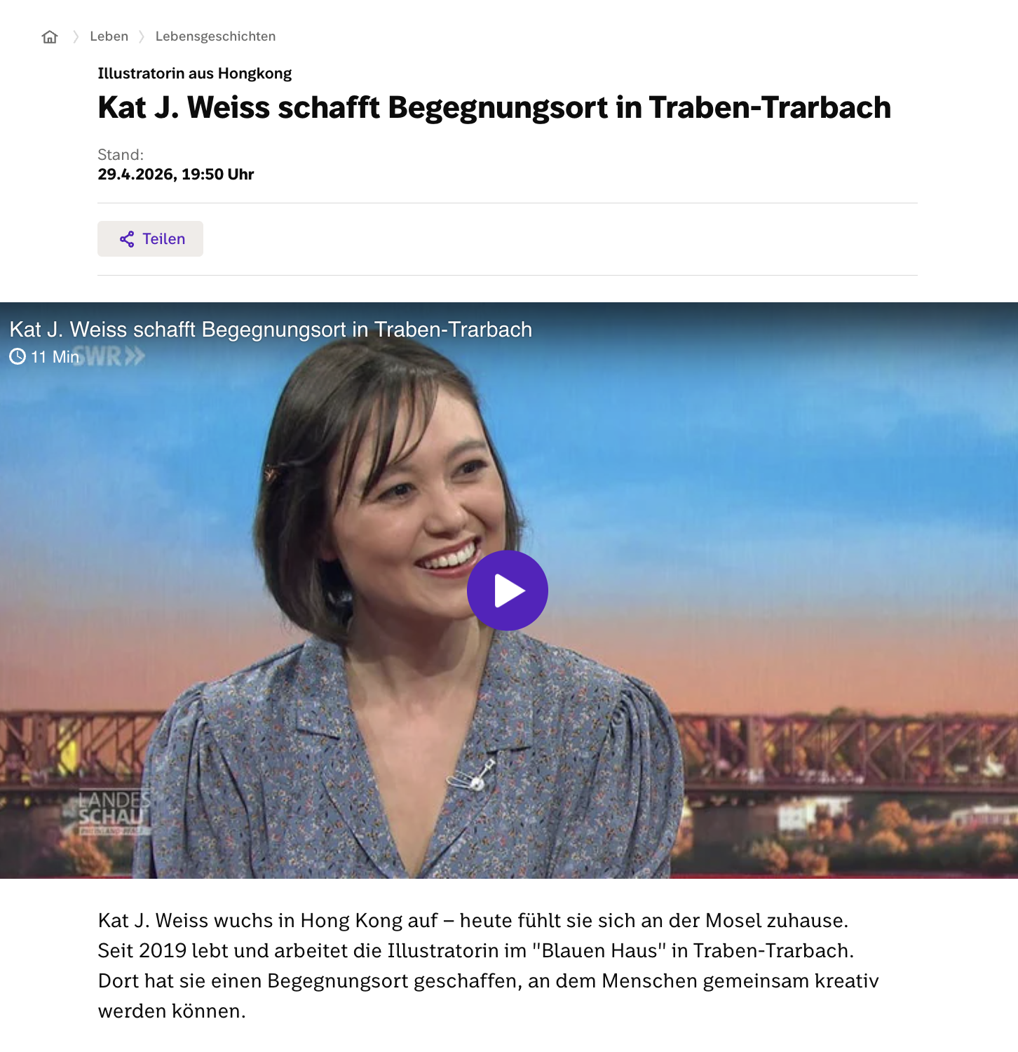
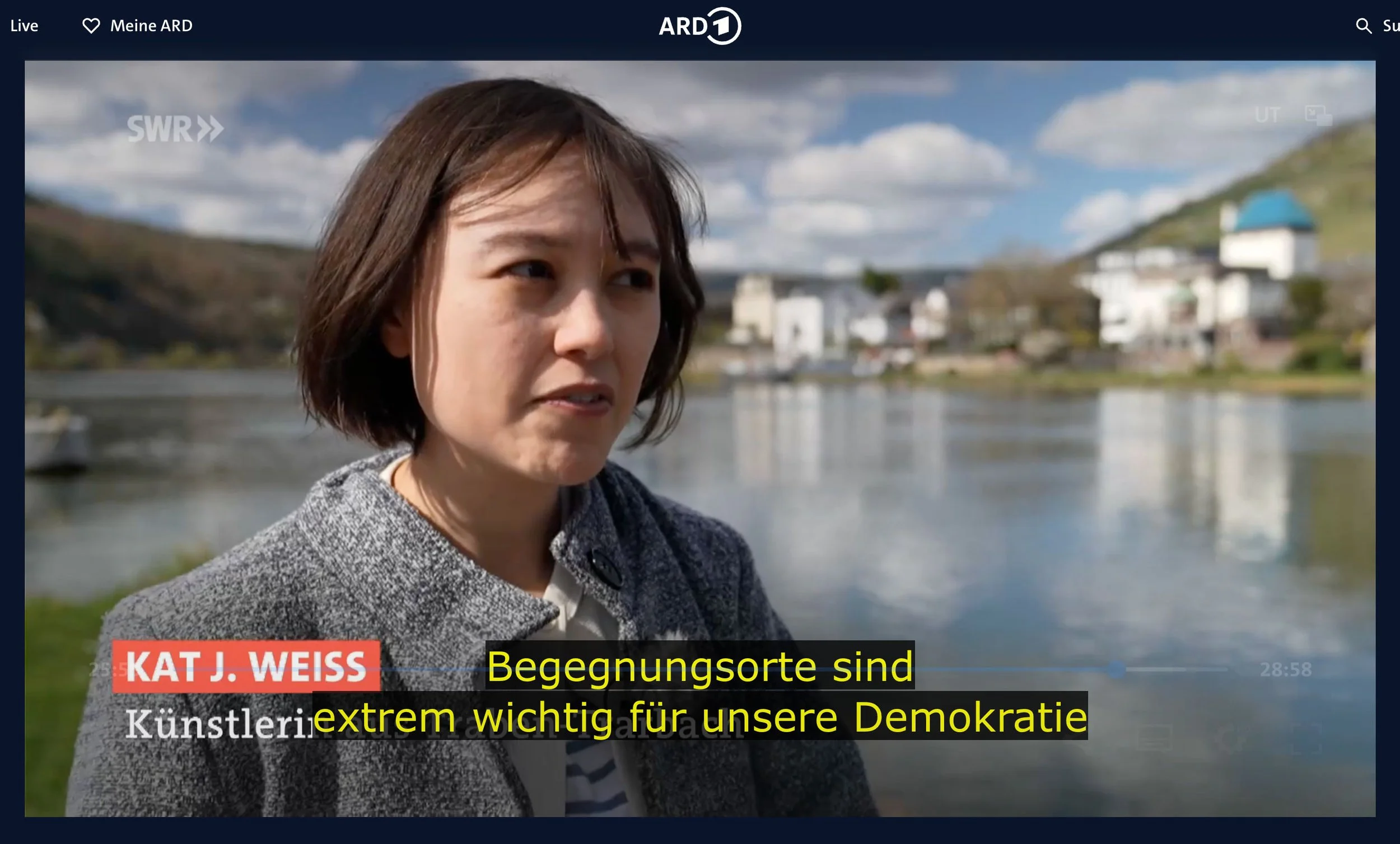
Last month, I was interviewed about my art, my work as an illustrator, my life as well as my community project, “Das Blaue Haus” (“The Blue House”). The interview appeared on SWR Aktuell Rheinland-Pfalz, a regional news broadcasting channel in Germany.

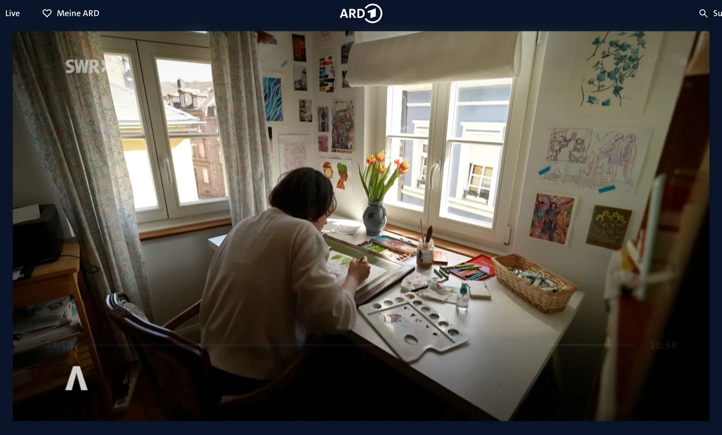
Filming took place in my home studio.

This may be coming out of left field for some of you, so to give some quick context: I started Das Blaue Haus last year in January as a response to increased loneliness and polarisation in our society, as well as vacancy in our inner city in Traben-Trarbach (the place where I currently live).

Das Blaue Haus is essentially an extended living room of sorts, intended as a “third space”, a term coined by American sociologist Ray Oldenburg which refers to a social setting outside of family and work life. I have organised a couple of meet-ups and events here, including creative/crafting “co-working” sessions, board game afternoons/nights, and more recently: karaoke!

Never could I have ever imagined that the enthusiasm for my project would build up so quickly! One thing led to another, and I was first interviewed for a radio broadcast last year in December. At this point in time, the focus was purely on Das Blaue Haus.

Then in March this year, I was interviewed by a newspaper in Trier. This is where the focus started to shift a little bit, still reporting on the community project, but with significant focus on my illustration, and in particular, my biography. I really, really did not see that one coming!

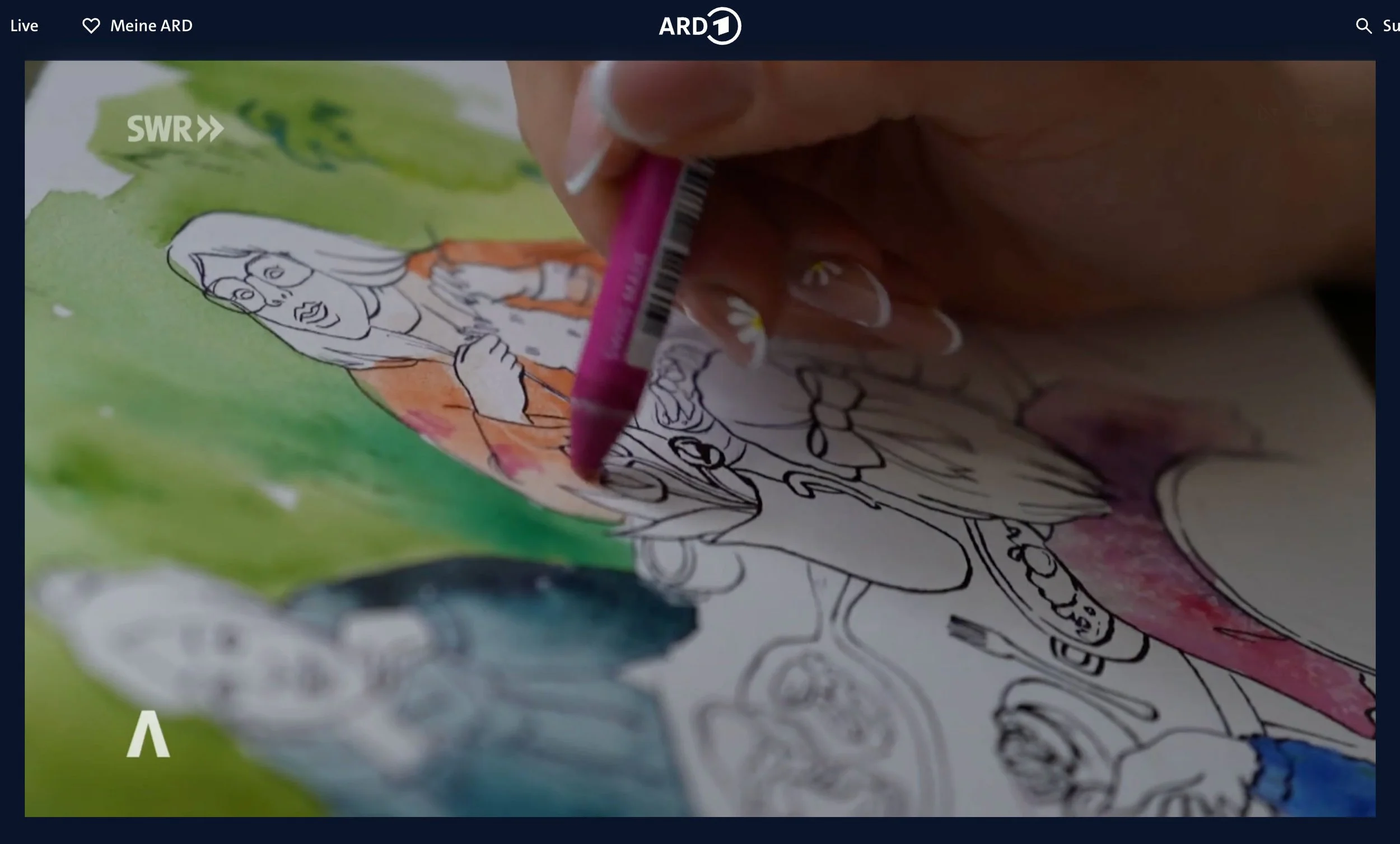
Then, seeming to build up on all of this, it all came to the TV interview, with my abbreviated life story and art taking centre stage. Das Blaue Haus is still mentioned, but it is a shorter part of the interview. You can watch the segment here, in German only, at minute 23:20:

If you’re on Instagram, you can watch a little snippet of this interview with English subs here.

Needless to say, I feel incredibly overwhelmed AND OVERCOME WITH GRATITUDE BY all of this.

My immediate instinct is to not take credit for any of this. Because: you know me! But seriously, none of this could have happened without a significant amount of luck and privilege. I try to have consideration for that, while not letting it discredit my ideas completely.

“Meeting places are extremely important for our democracy“

I feel so fortunate to be part of such a supportive and enthusiastic community, always there to lend a helping hand and spread the word. The people around me remind me that it’s ok to ask for help, and that it’s mostly much better to organise as a group. This is what community is all about!

I also feel… vindicated. And like the universe plays really weird tricks on you sometimes.

Because literally a week before I was asked to be on TV, I had a portfolio review where I was essentially told that my messaging wasn’t clear, that I seem “all over the place”.

And this, really, is what I have been told my entire illustration career. Strong sense of style, but “too free” and “not marketable enough”.

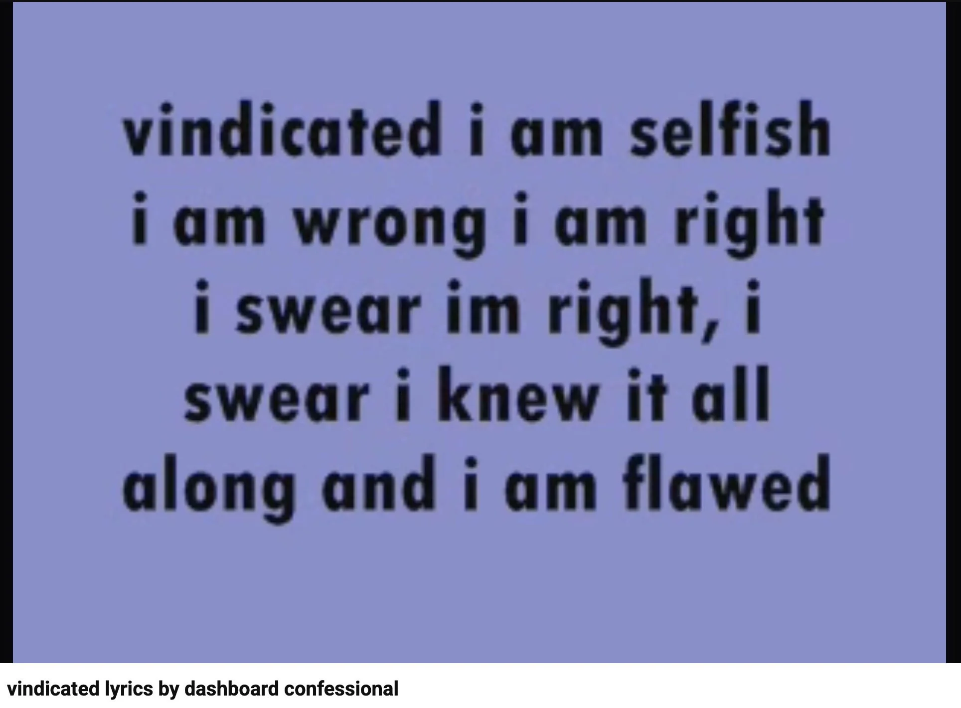
This song lol!! Is literally me! Emo pop punk kids of the early 00s rejoice 🤘🏼

The reviewers and experts I have consulted with have had the best intentions. Just doing their job, sharing what they know. And definitely, there is always room to improve!

But perhaps I have taken these words of advice too unsalted thus far. Maybe I CAN trust my point of view and direction a little more. Even if my path as an illustrator looks a little different than those of others.

Serendipity smacking me on the head.

I never planned for my art to merge so blatantly with social advocacy in real life. Sure, I always made it a point to stand for diversity and equality in my art work, but me doing voluntary work was just me doing voluntary work. A separate thing. One thing was not meant as a platform for the other, and vice versa.

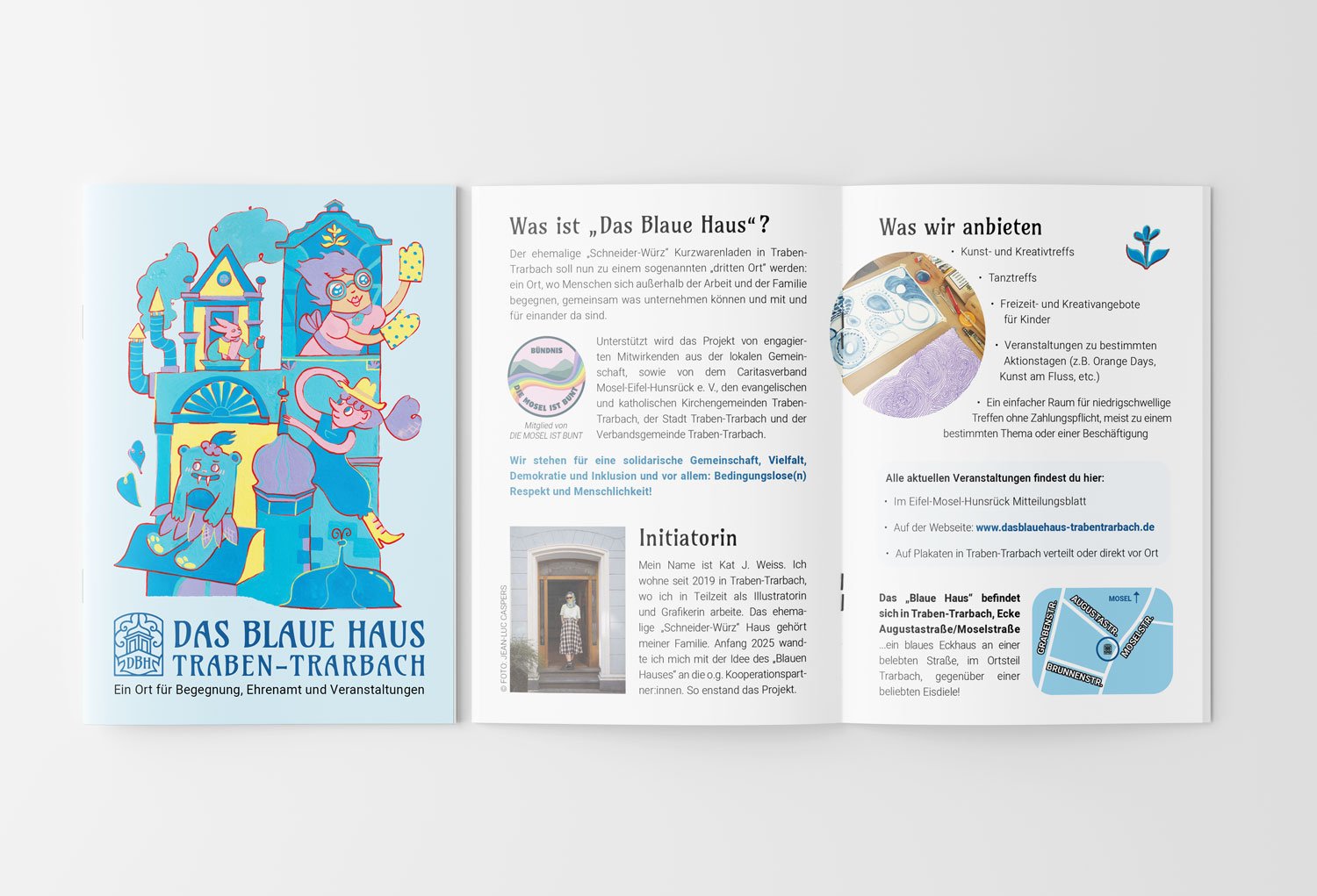
Illustration and brochure Design for Das Blaue Haus © Kat J. Weiss 2026

Perhaps it was inevitable. I used my know-how as a designer and illustrator to create brochures and posters for my project. I centred events around creativity. I yearned for community in my pictures, and then started truly living in them.

Perhaps it was all meant to flow into each other eventually, an artistic purpose meeting a life goal.

Nostalgia sneaking up on my heart.

My upbringing and education is somewhat more eclectic than what most people (without migrant backgrounds) experience here in Germany. Third-culture kid stuff. It has been a big focus in these media pieces. What was growing up in Hong Kong like, studying in America, and then moving to a small town in Germany? Culture shock?

I cannot underscore enough how immensely fortunate I have been to be given and afforded such a colourful life. It seems weird to admit but I was embarrassed by it for a long time. I did not feel that I deserved it, and I did not want people thinking I wasn’t checking myself. I tried very much to focus on the present, and who I could become. As a result, I forgot about the many magical moments in my past: finding your “gang” during the first years of university, toughing through all-nighters together, moving abroad to another campus, finding your gang again.

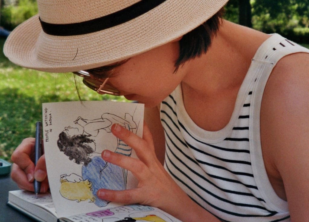
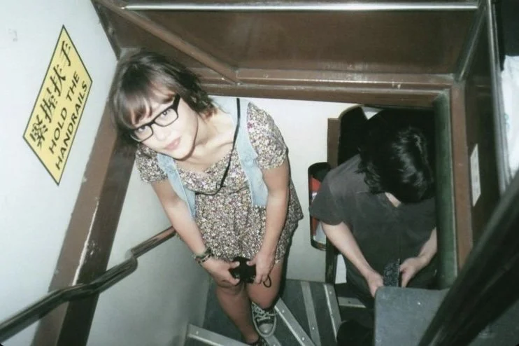
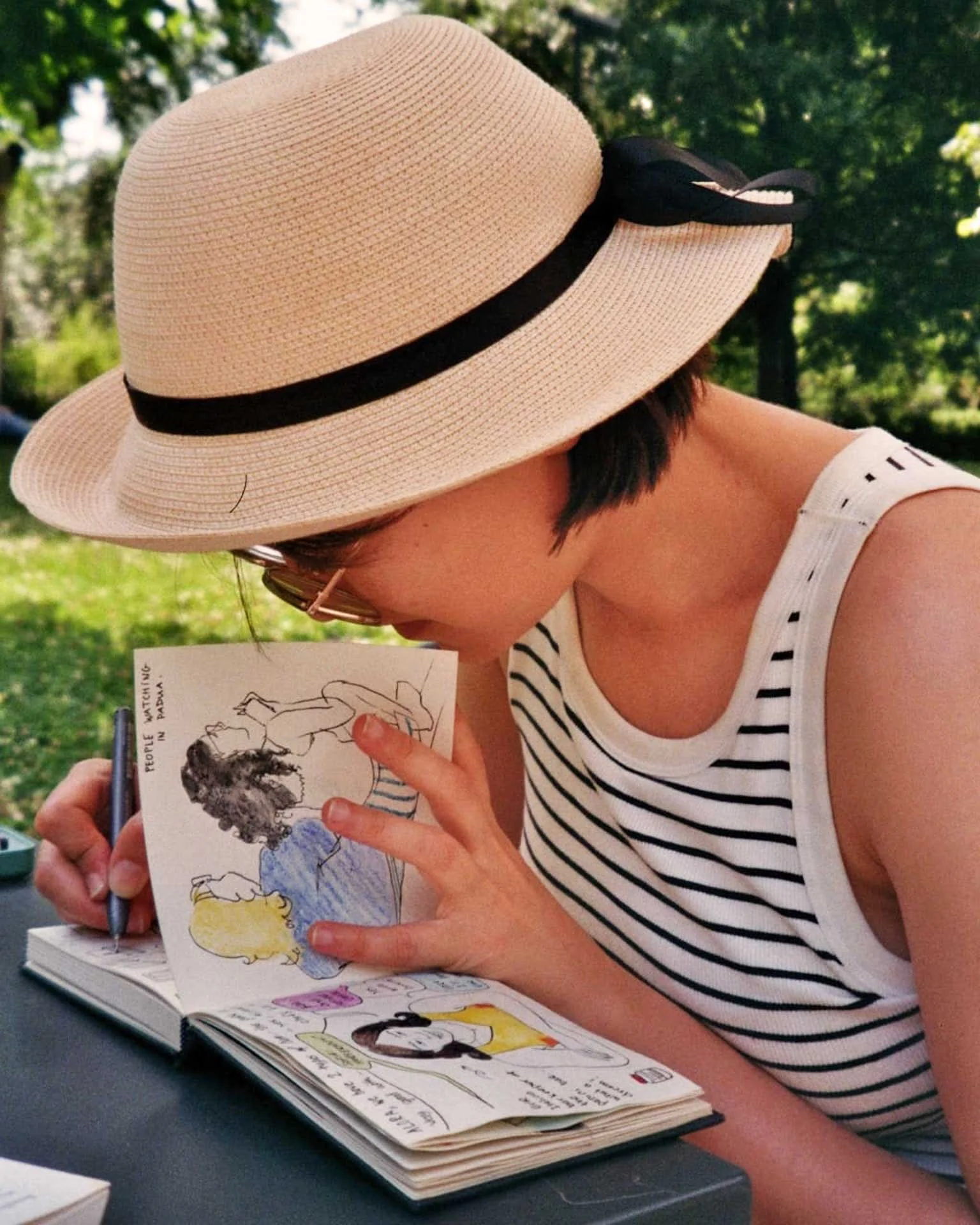
An photo of me in a Hong Kong tram by one of my oldest friends, Marisa. We did a bunch of “artsy” film photo tours like this, pre-university days!

Attending a Bob-Ross-Paint-Along birthday party (where someone ends up scrawling “THERE IS NO GOD” over their landscape), going to many, many DIY, ramshackle thrown-together house gigs, listening to your friend sing the most beautiful song in a dark kitchen corner and it somehow filling up the entire room and touching you for life.

I could go on forever. The point is, being asked all these questions about my past has brought all of these memories back, memories I tried to tuck away but really should put up on an altar for all they have made me.

A side note on style, inspiration, and the nuance of identity

In the interview, there is a snippet of me describing my illustration style: that it has East Asian aspects to it, in it’s flatness, verticality, and crowded sceneries — compare with Thai mural paintings or Japanese woodblock printing for instance.

The reality is much more nuanced than that, but I don’t fault anyone for “misrepresenting” me, after all, it was merely a 2,5 minute long segment!

The entirety of what I “actually” said is as follows: that I see myself as an artist combining both East and West, which is how most of my upbringing was. I am very much inspired by detail-obsessed Art Nouveau/Jugendstil/Vienna Secession artists, who looked to Japanese woodblock printing for inspiration.

So in a way you could say I am closing the loop?

My watercolour paintings… East Asian inspired? Maybe.
© Kat J. Weiss 2026


To add to that, I spent many happy childhood afternoons drawing big crowded pictures at my friends’ house. We would draw funny characters, make jokes about our characters, sing songs about our characters. I feel so appreciative of how we were encouraged to live and collaborate creatively, from early on. I have no doubt that my tendency to draw crowded sceneries probably stems in part from those experiences.

What I’m trying to say is that influence and inspiration are complicated, and you can never just point to a single origin, even if in me you may see an “mixed-Asian” person and automatically think “Asian-influenced”.

Reality is much more complex than that! And I refuse to be put into one box.

I’m grateful for this moment of attention. I’ll ride this wave while I still can.

Who knows how long this will last? Or when DUN DUN DUN my big downfall will come? Look at me catastrophising already. I’m trying my best to stay humble, but can’t I just exist in this excitement for a bit?!

For what it’s worth, perhaps this will give me a moment to look back on, something to hold on to on a rainy day, for that bit of confidence and courage to continue making my art. When I need it.

My Illustration Highs and Lows of 2025!

2025 was all about staying local, small commissions and self-initiated projects. I often had long turnover times and could work at projects at a comfortable pace.

The changing landscape of communication arts, becoming more and more swept over by (ugly) A.I. creations, feels really unsettling and discouraging right now. One thing giving me hope is that I have an unwavering belief in myself and in my identity as an artist. Of course, it helps when other people see that, too. 

So for those who continued to believe in me, thank you. 


HIGHS

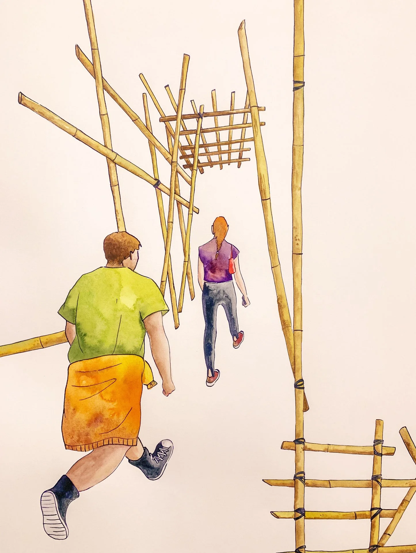
Bamboo Scaffolding

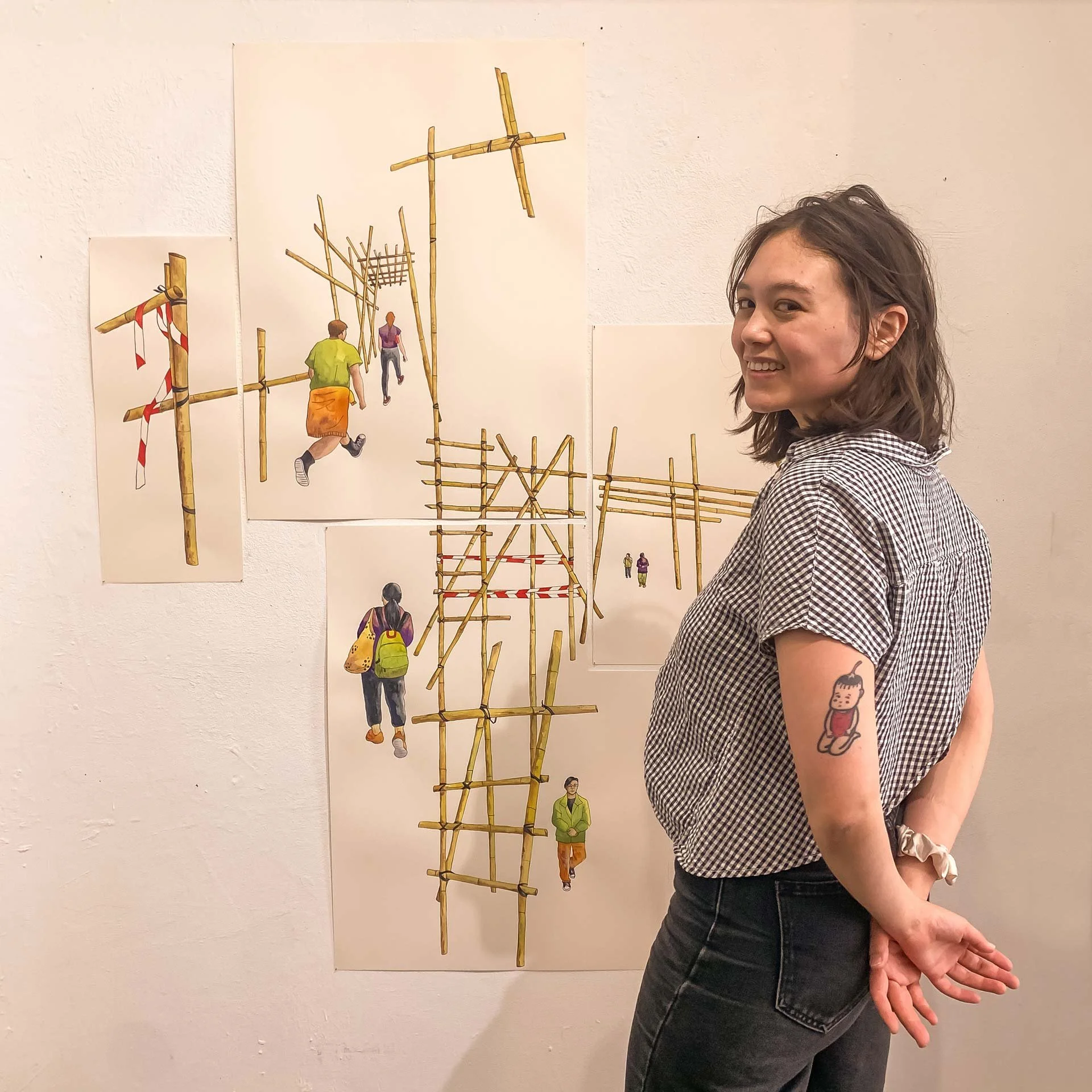
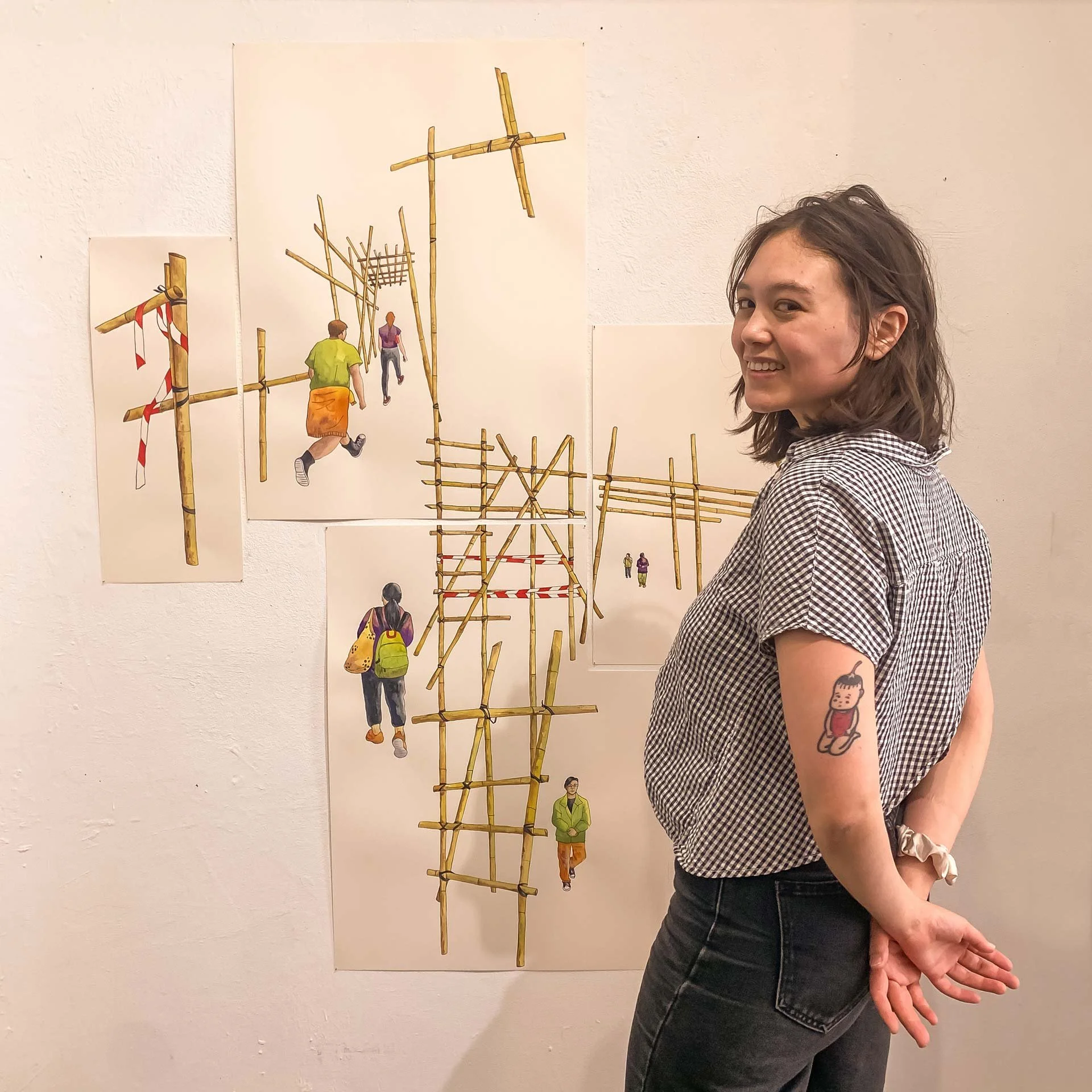
“Bamboo Dreams”, watercolour, acrylic ink, colour pencil on paper. 2025.


In May I joined my art collective, PULPXIX, for a group exhibition called “Out of Scale”. I made a collaged water colour piece all about bamboo scaffolding, as at the time, there were plans for bamboo scaffolding to be phased out in Hong Kong. 

I challenged myself in terms of scale, editing, and presentation. You can read about the process here. 

Of course, at the time I could not have known about the tragic Tai Po fire that would happen later in November, and the debates that followed. I’m not sure about the future of bamboo scaffolding, but to me, they will always be a cultural icon, and a reliable resource that had been used for many centuries. 

If you are feeling charitable and able, here’s a list of ways you can support the survivors of the fire. 

Risograph inspired food illustrations

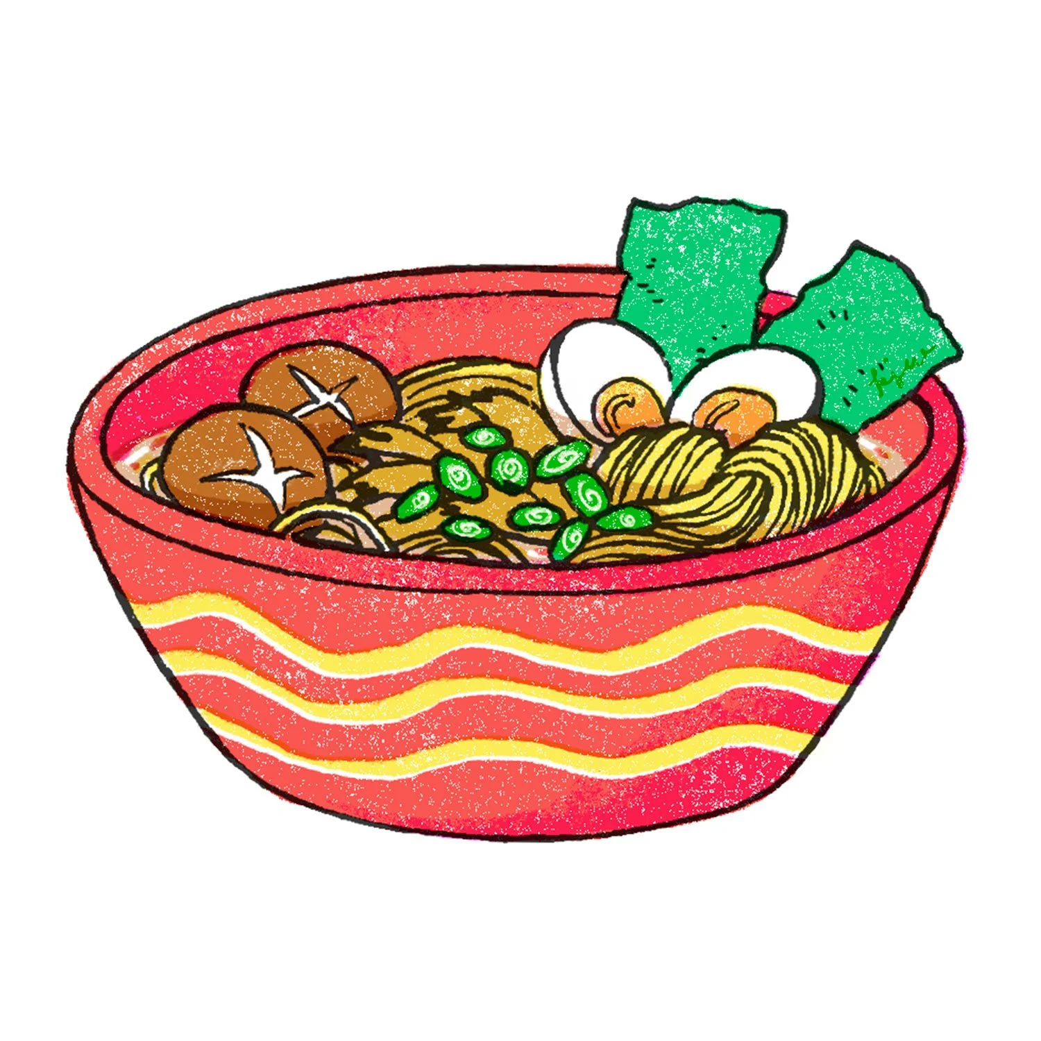
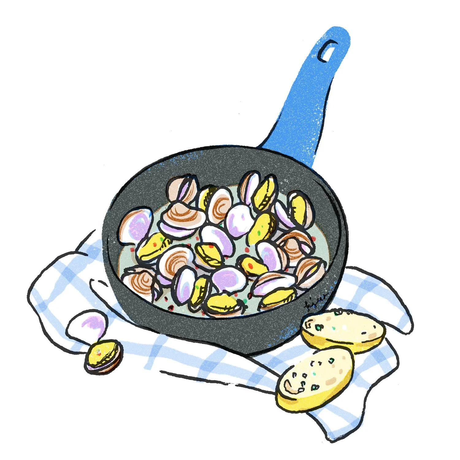
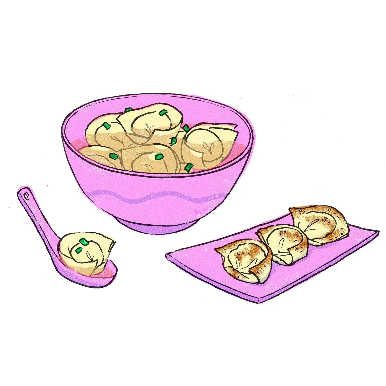
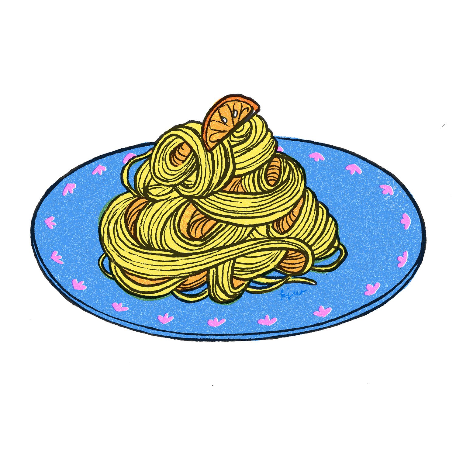
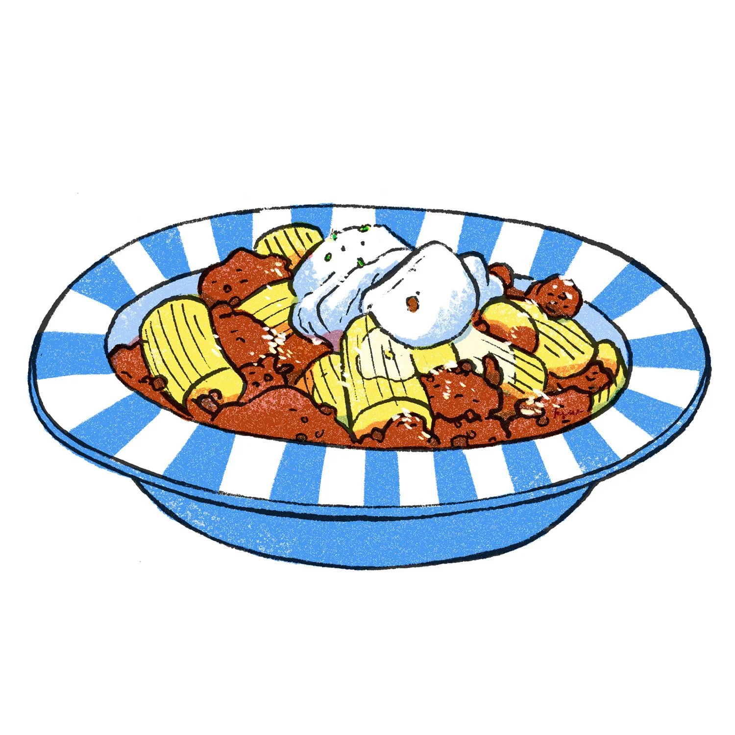
Selected risograph-style food illustrations. 2025 © Kat J. Weiss


Back in April my friend Jen commissioned me to illustrate 25 recipe cards for a wedding gift. I followed this tutorial by Tom Froese to recreate the effect in Adobe Photoshop.

For those not in the know: Risograph printing is like screen printing, but using a machine that looks like an office printer. Colours used in this technique are often bright and fluorescent for reasons I cannot explain, but this is what “Riso” has essentially become known for. Often used in small to mid-size institutions like clubs, churches and schools, before being phased out by modern photocopiers. Inside the printer, a stencil is wrapped around an ink drum, which is then printed onto paper — each colour is printed separately, the paper reinserted into the printer. This leads to interesting textures and misalignments, which artists really like. (Source: me and the internet)

Mentoring at Art Workshops for Kids

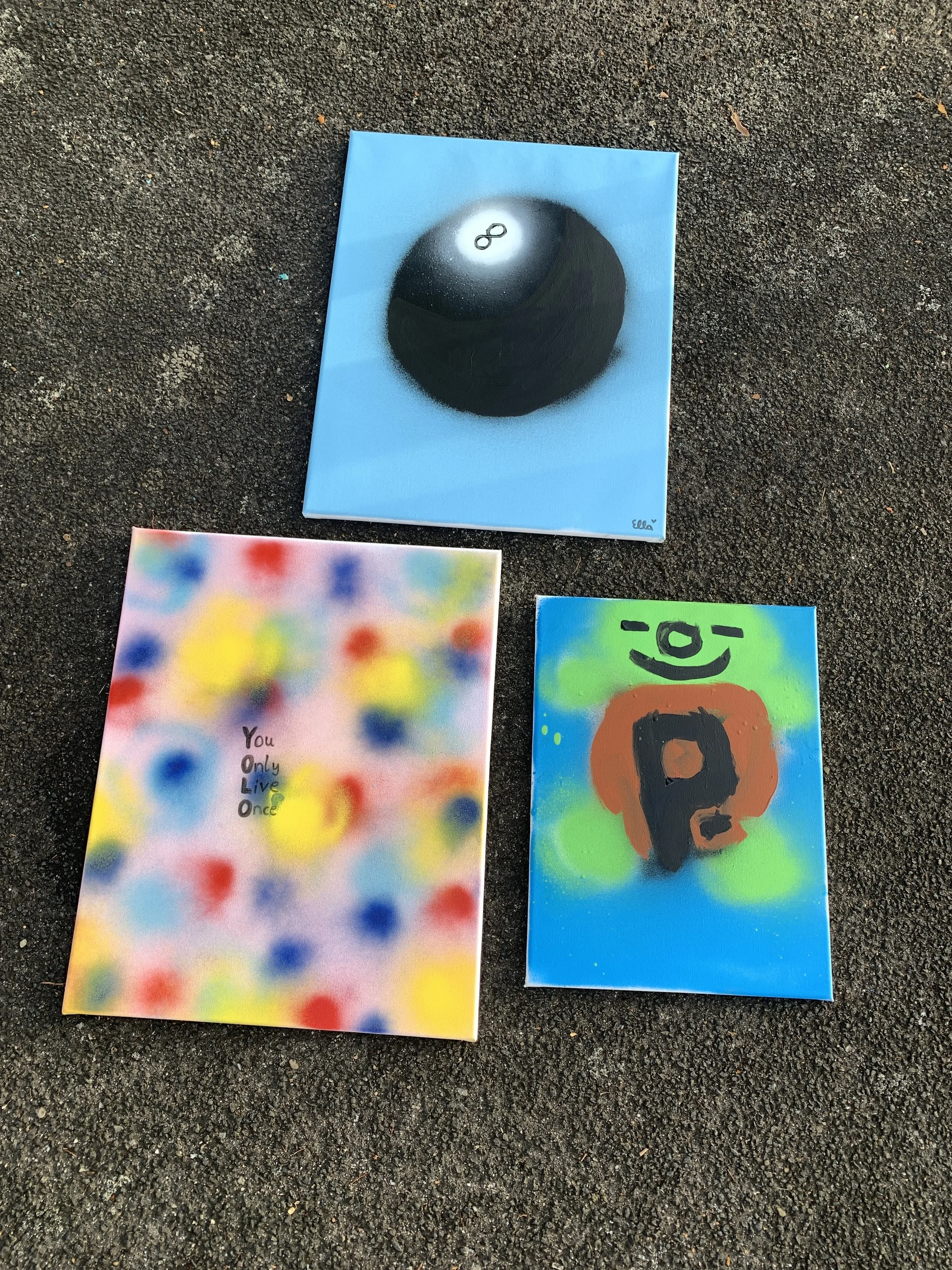
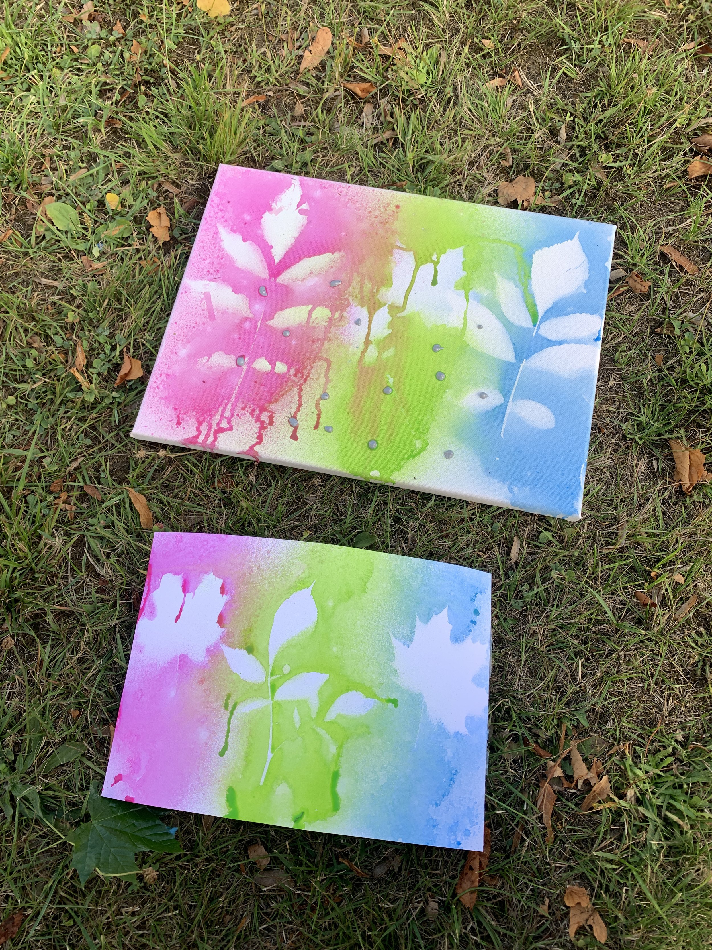
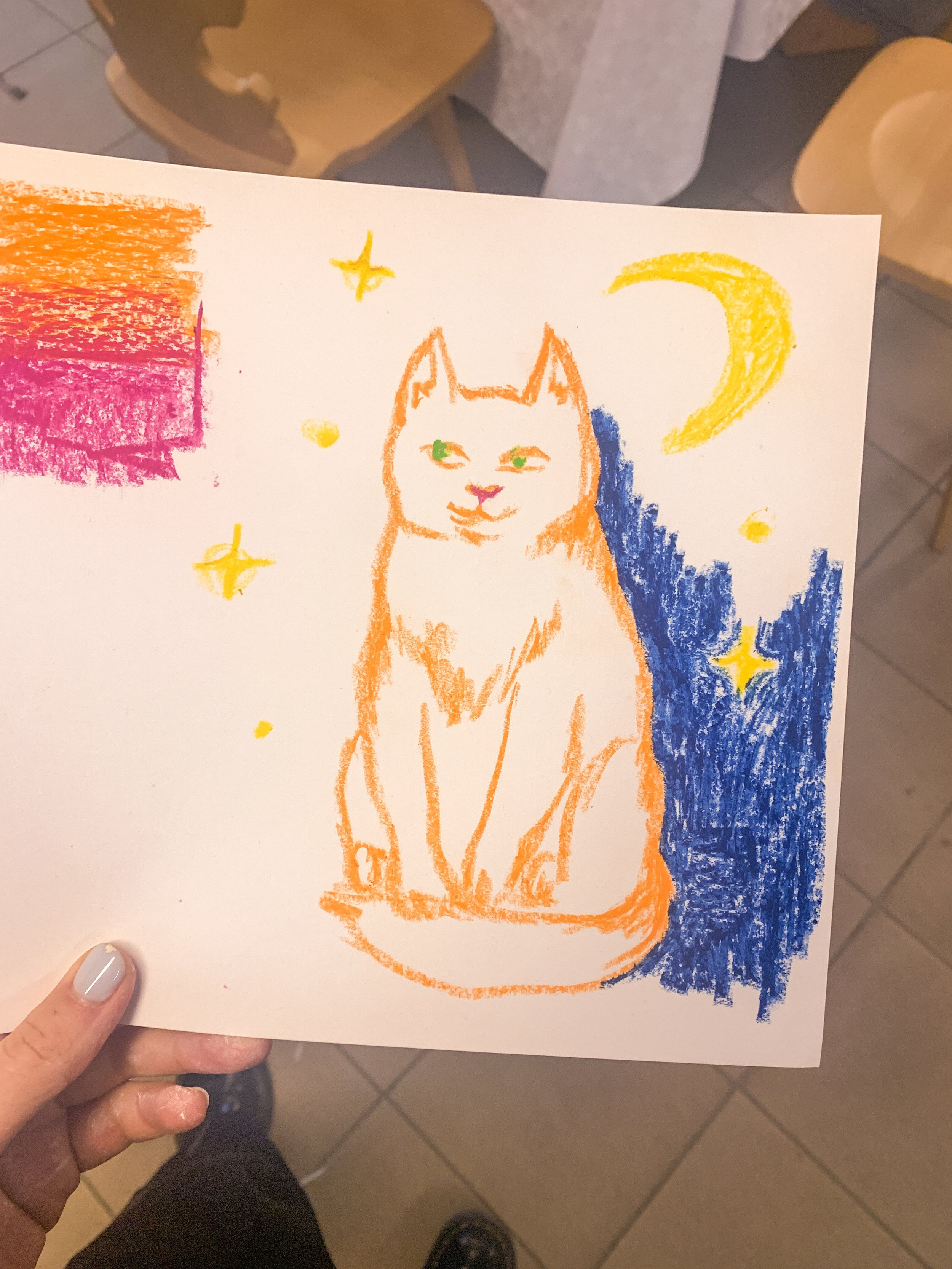
Also in May, a friend of mine asked me to jump aboard a project for IB Trier, an organisation for youth, social and educational work. Rollendes Kunstatelier, or “Rolling Art Studio”, is a mobile art workshop for children up to 18 years of age.

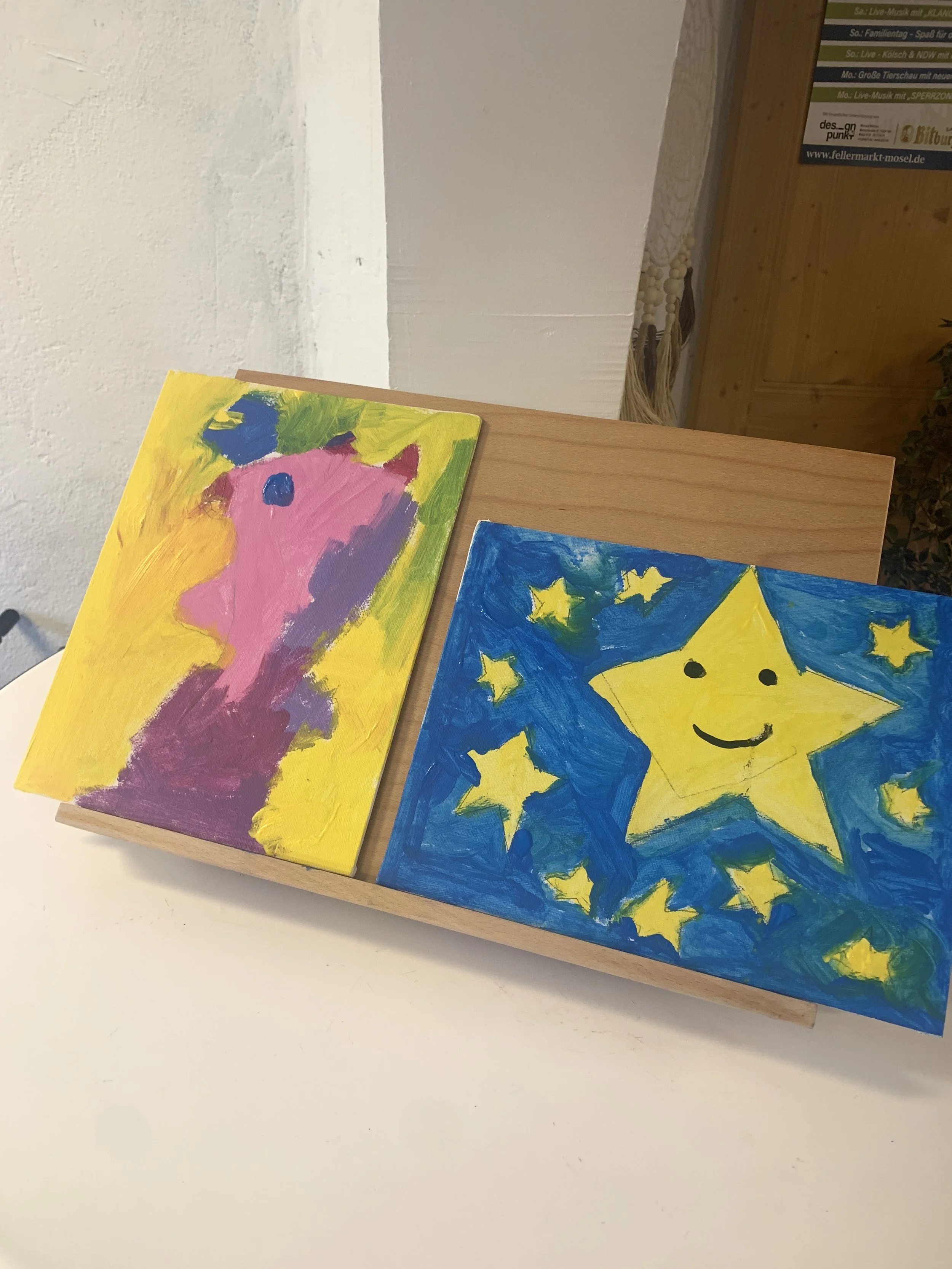
Every month, the “Art Studio” visits different areas in the region, especially small towns, and invites participants to express themselves and experiment with different media, completely free of charge.

My role is as a mentor, not a workshop instructor per se; the idea is that the children can play around and do as they please, and my task is to show them how the materials work, and to give them some prompts. I’ve never liked telling people exactly what to do, preferring to lead by example, so I think this suited me well. 

I feel immensely grateful to be part of this project, not only because I am paid a fair wage, but because I believe strongly in what they offer: accessible art to anyone.


Doing Inktober on my own terms

Selected drawings from Inktober 2025 © Kat J. Weiss


October: I finished the Inktober prompt list of 2025, turning it into an honest daily drawing practice for myself. I shared most of the drawings in my biog and on Instagram, but never pressured myself to present anything publicly. That helped a lot to keep the process low-key and low-stakes. Read about the experience here.

Lithograph-Inspired Illustration for a local café

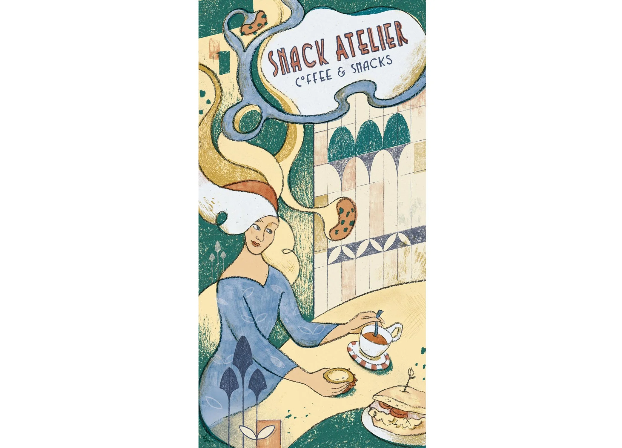
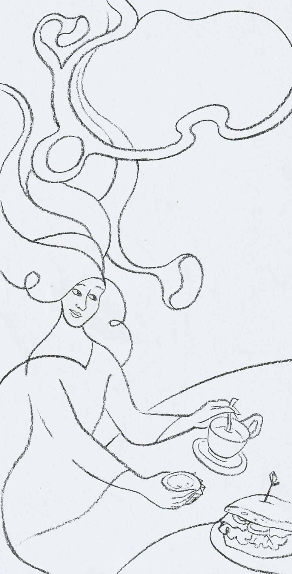
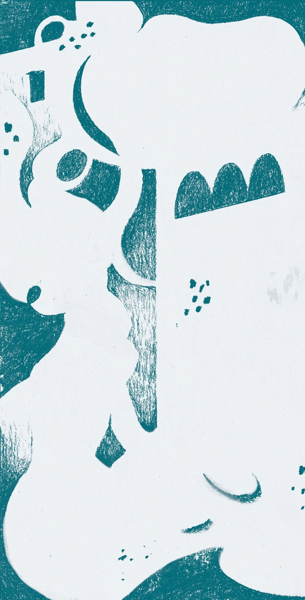
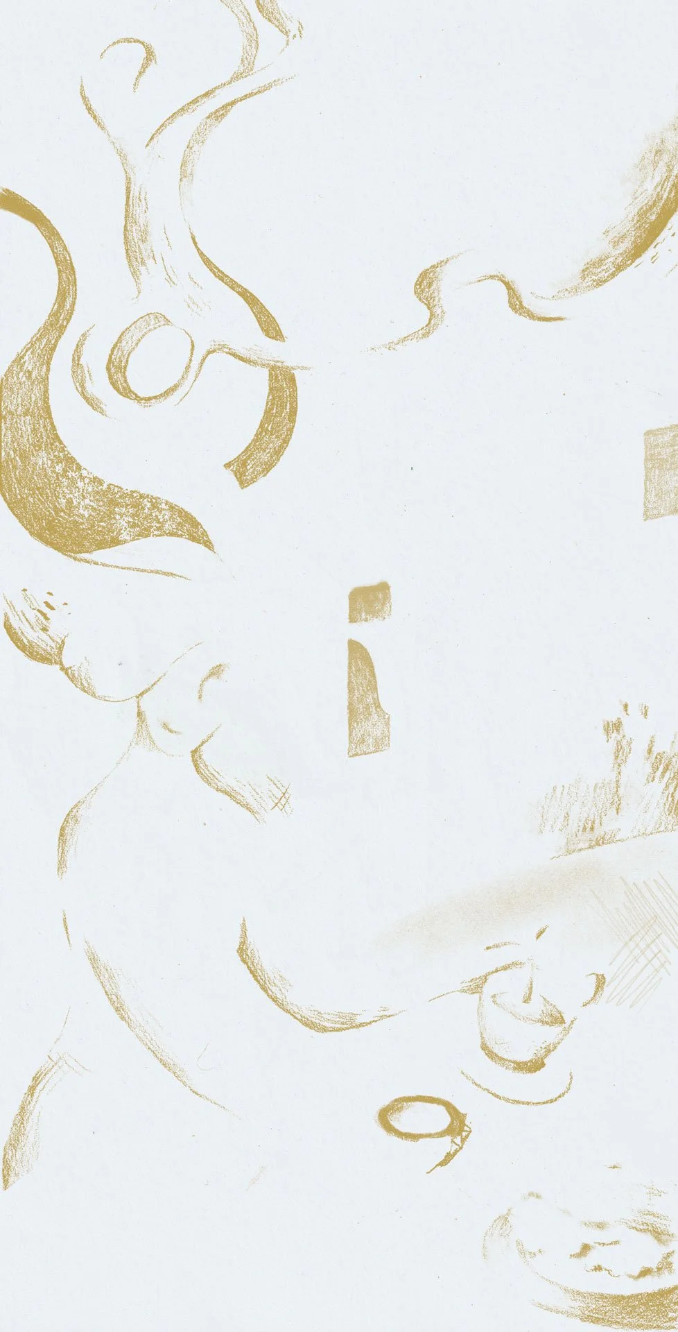
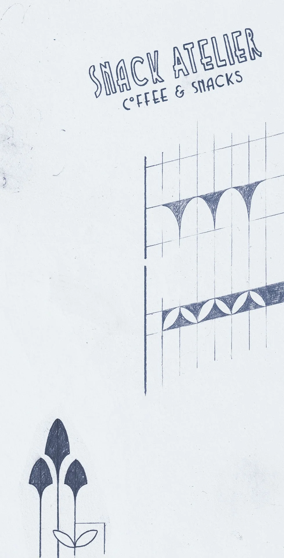
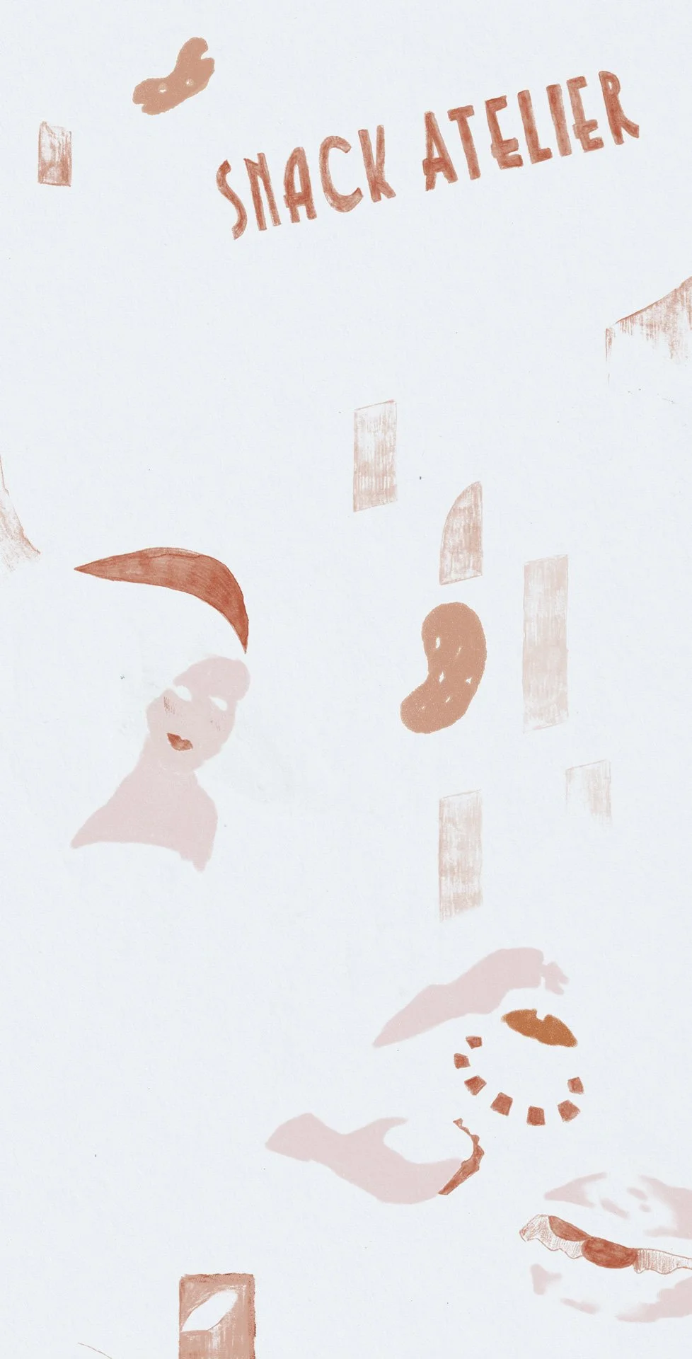
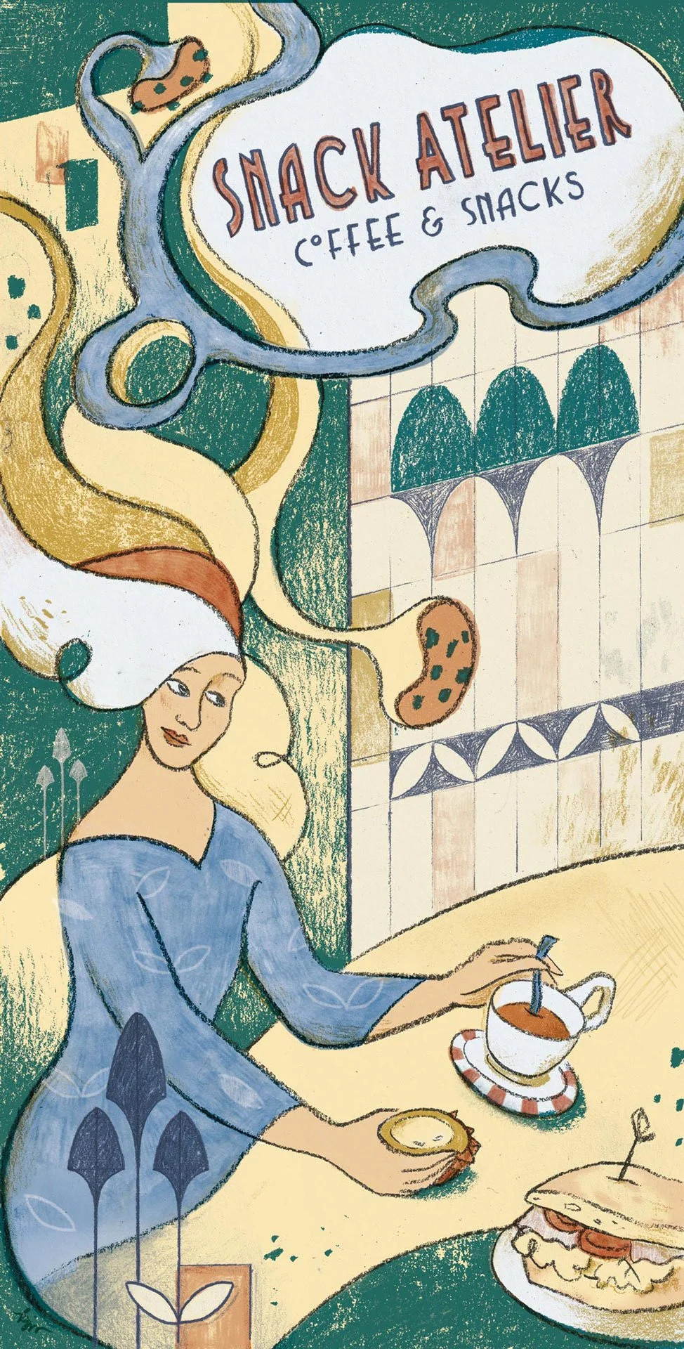
Snack Atelier flyer illustration. 2025 © Kat J. Weiss


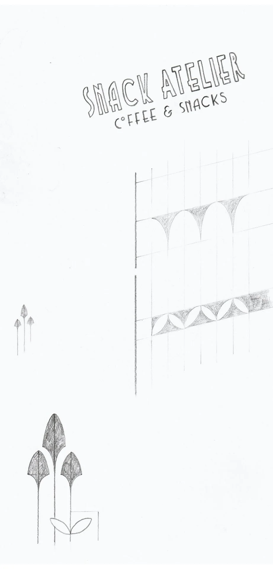
September to recently: a local café in my neighbourhood asked me to illustrate the front of a flyer for them. Their little café is very pretty, with Art Deco and Jugendstil elements. I immediately thought of Tolouse-Lautrec’s advertising posters and wanted to recreate the look. 

Tolouse-Lautrec worked with lithography, a “printmaking process in which a design is drawn [with an oil-based crayon] onto a flat stone”.

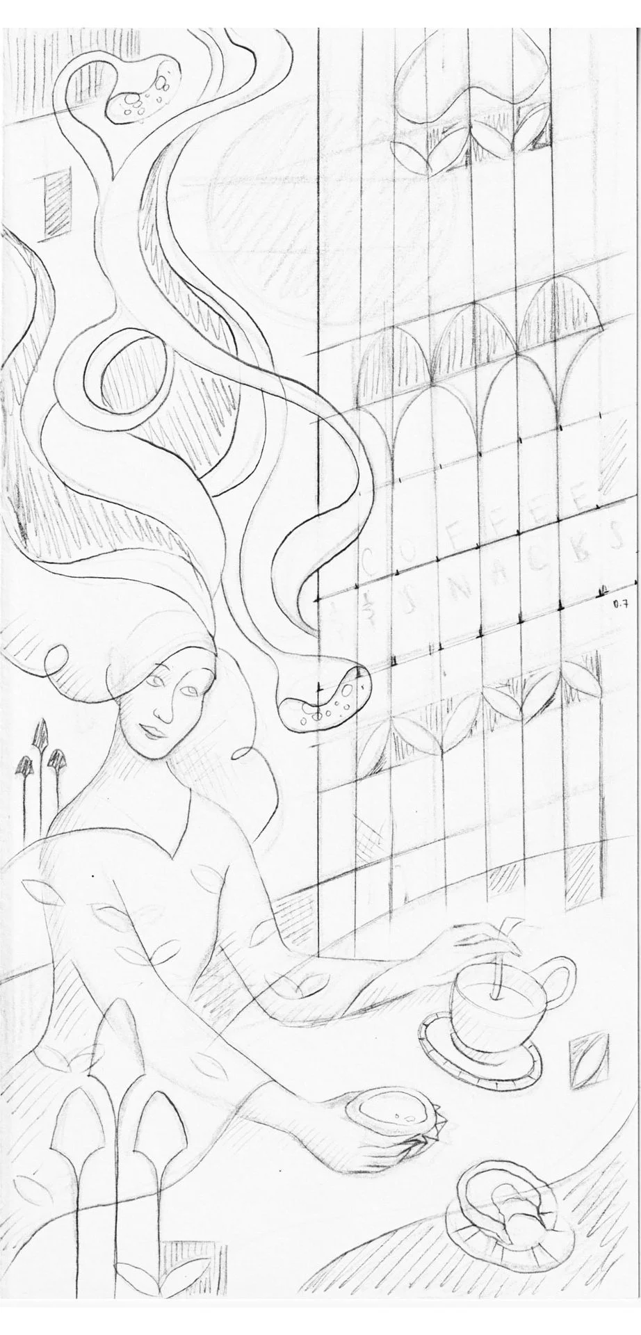
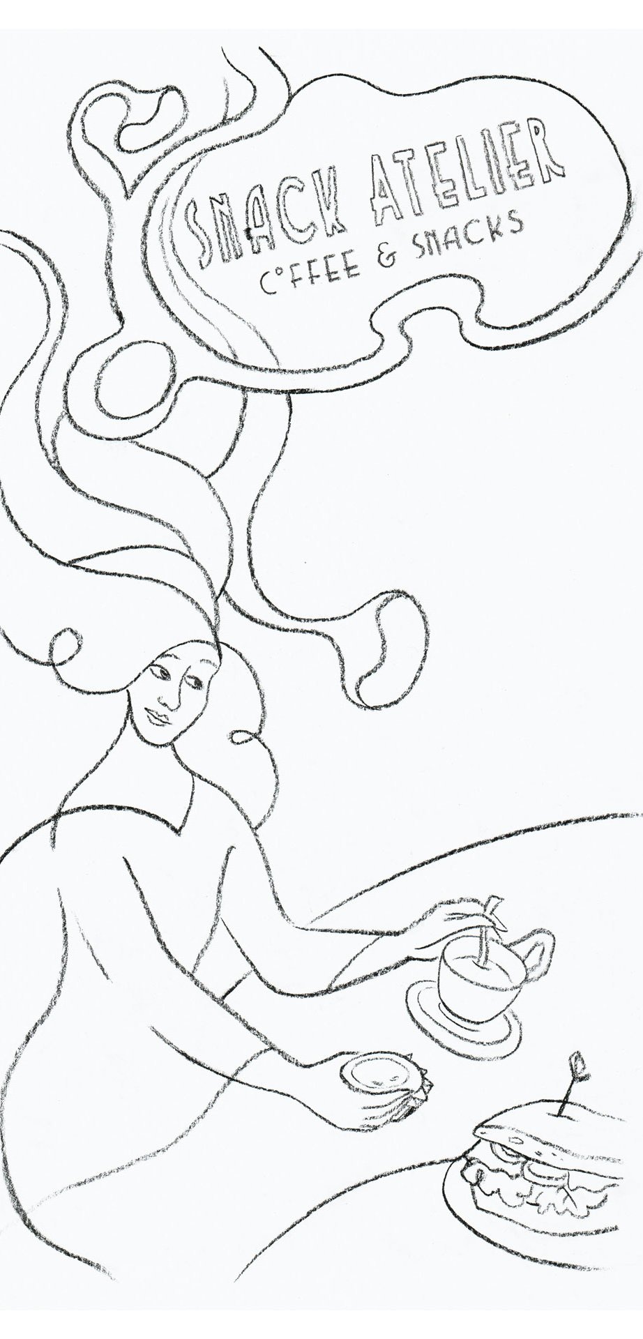
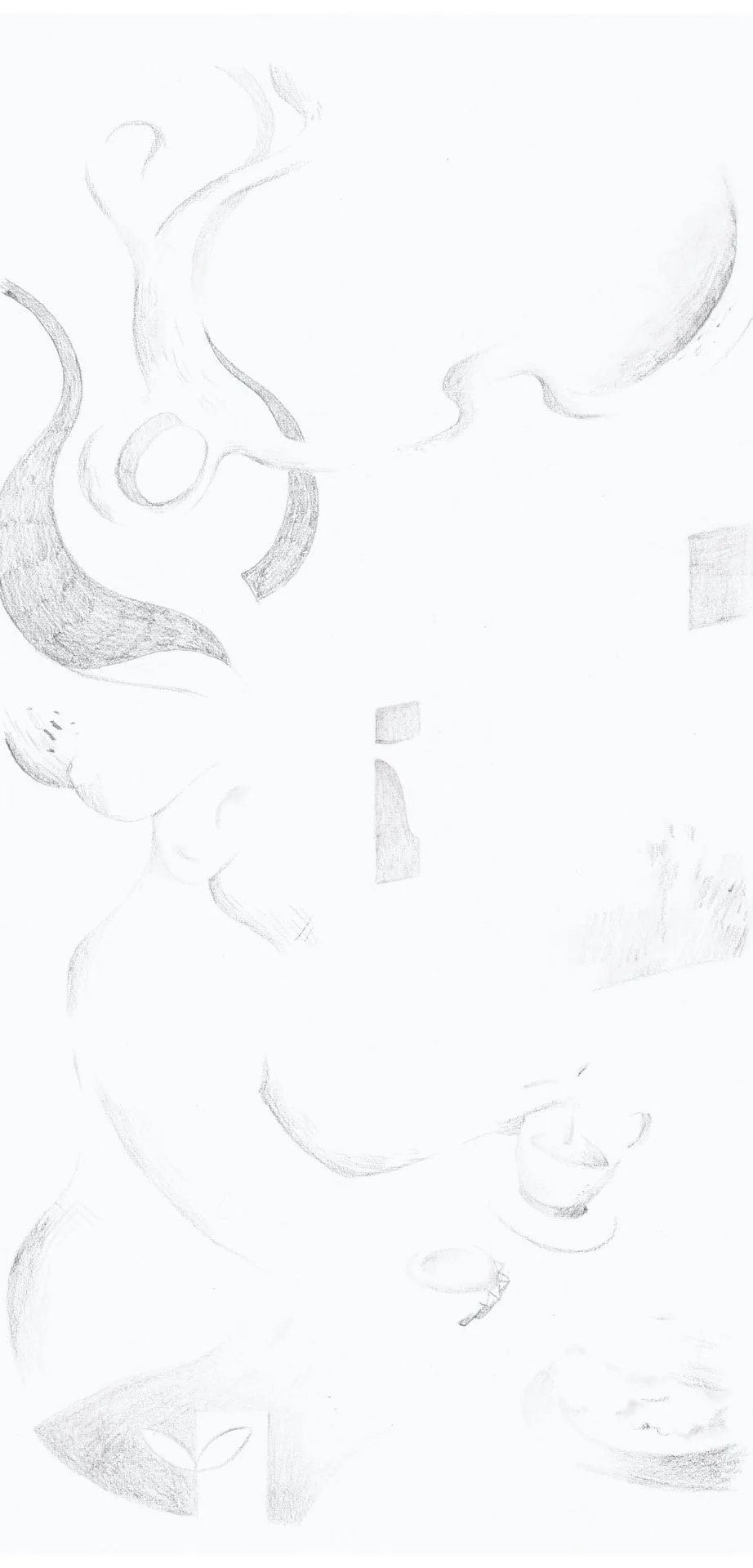
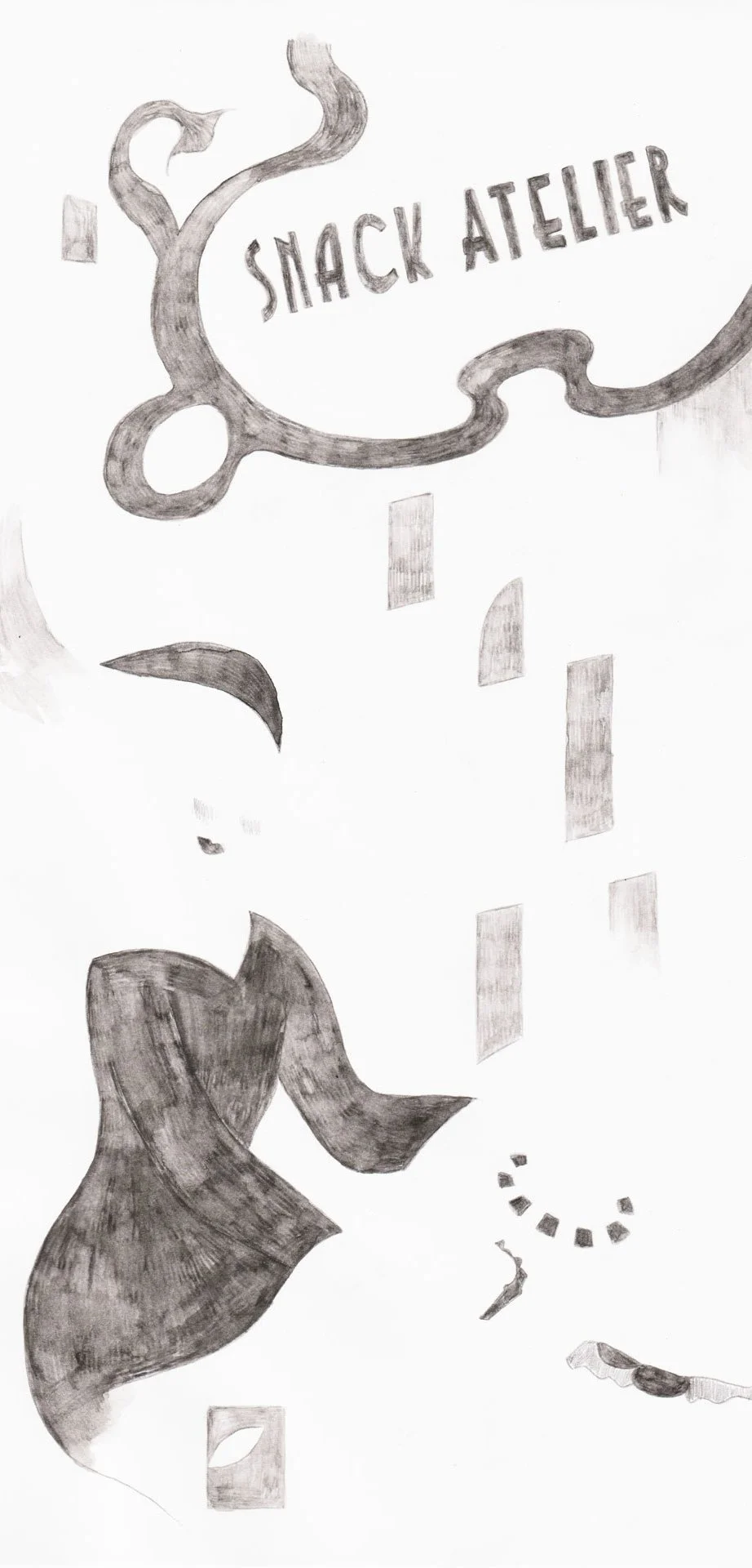
Left to right: original sketch, then layers 1, 2, 3, 4, & 5


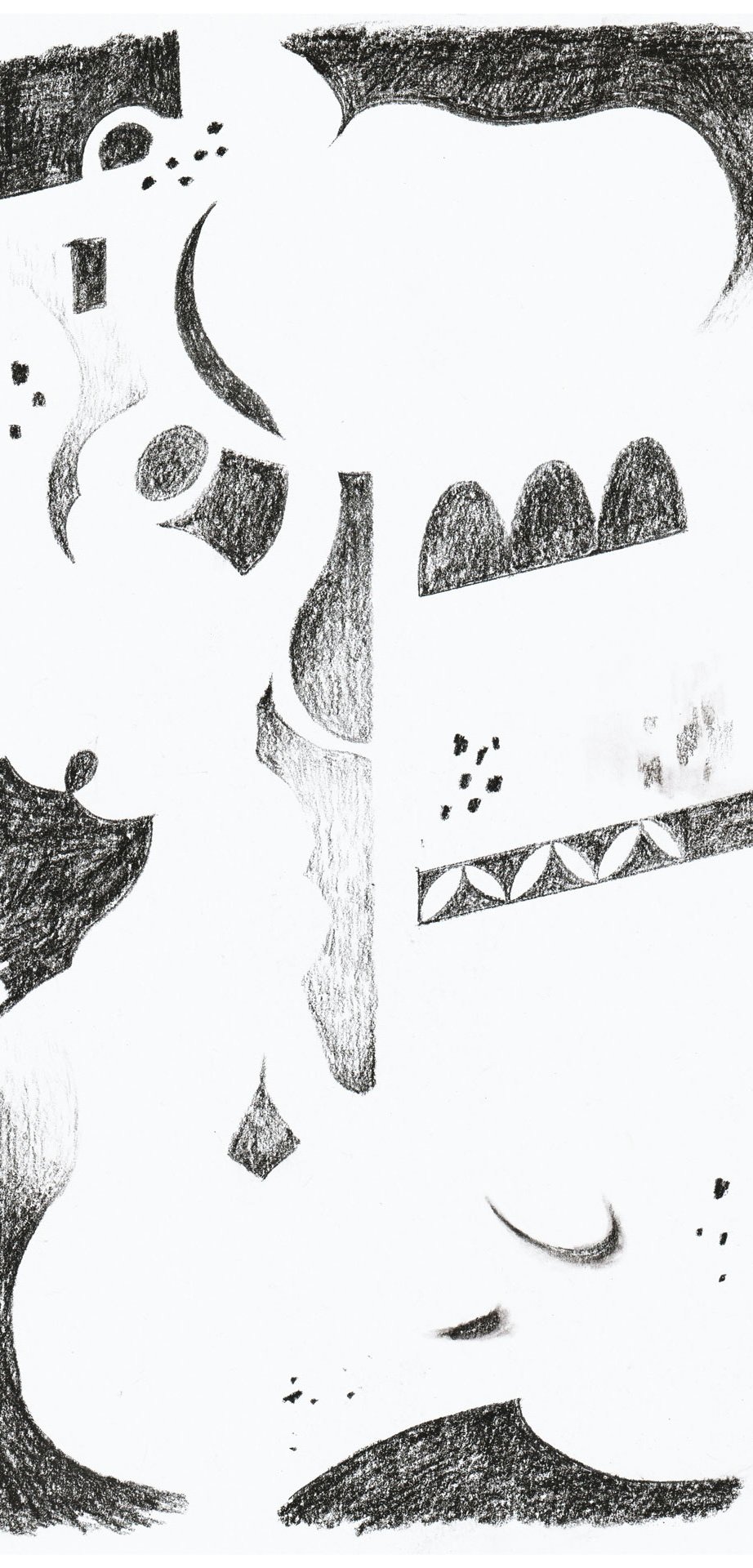
I recreated the look using charcoal, graphite, and in one case, water-soluble graphite. I created each matrice (or layer of colour) on a separate sheet of paper, tracing over the original drawing with a light table. I then scanned each of the matrices and superimposed them in Adobe Photoshop. 

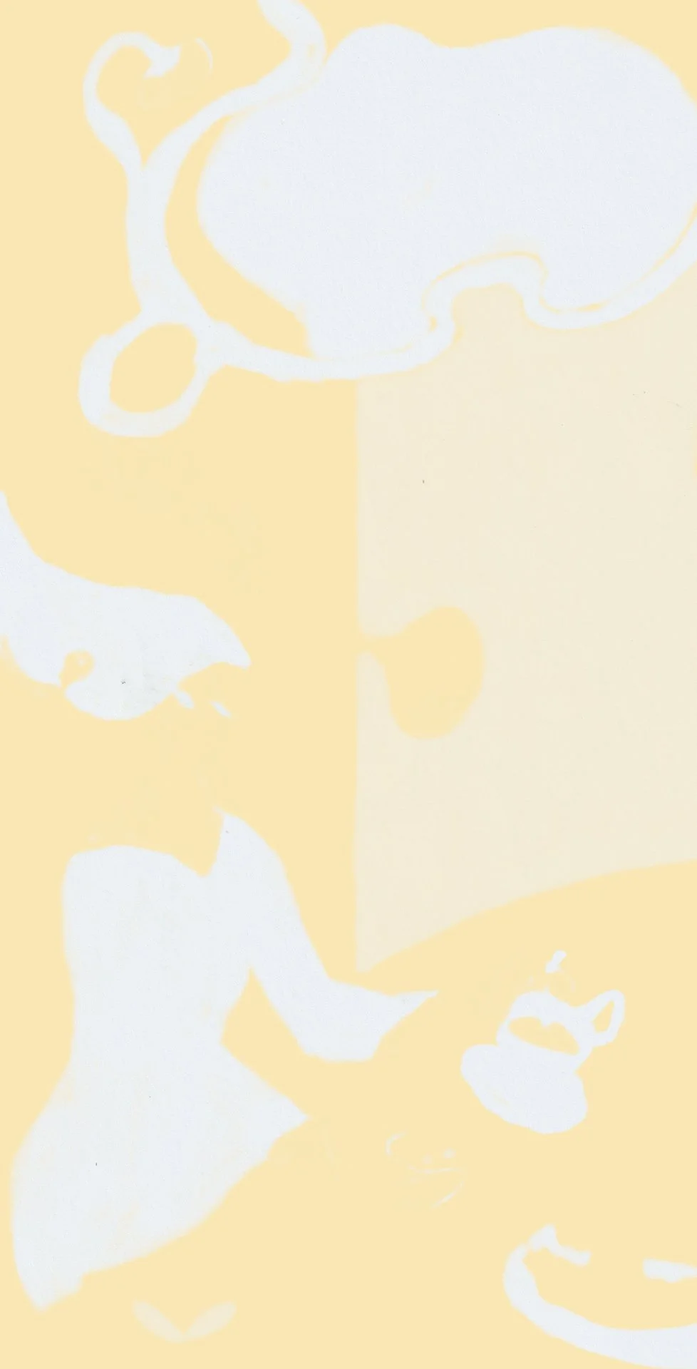
I played with the translucence of each layer using different Blend Modes: Multiply, Screen or Linear Burn.

My original colour blocking was not super precise. Usually, printmakers have to map out exactly which colour is assigned to which matrice/layer of colour, but in my case, working digitally gave me the flexibility of moving elements around

Left to right: new layers 1, 2, 3, 4, 5, 6 & 7, then final illustration


Christmas Card Illustration

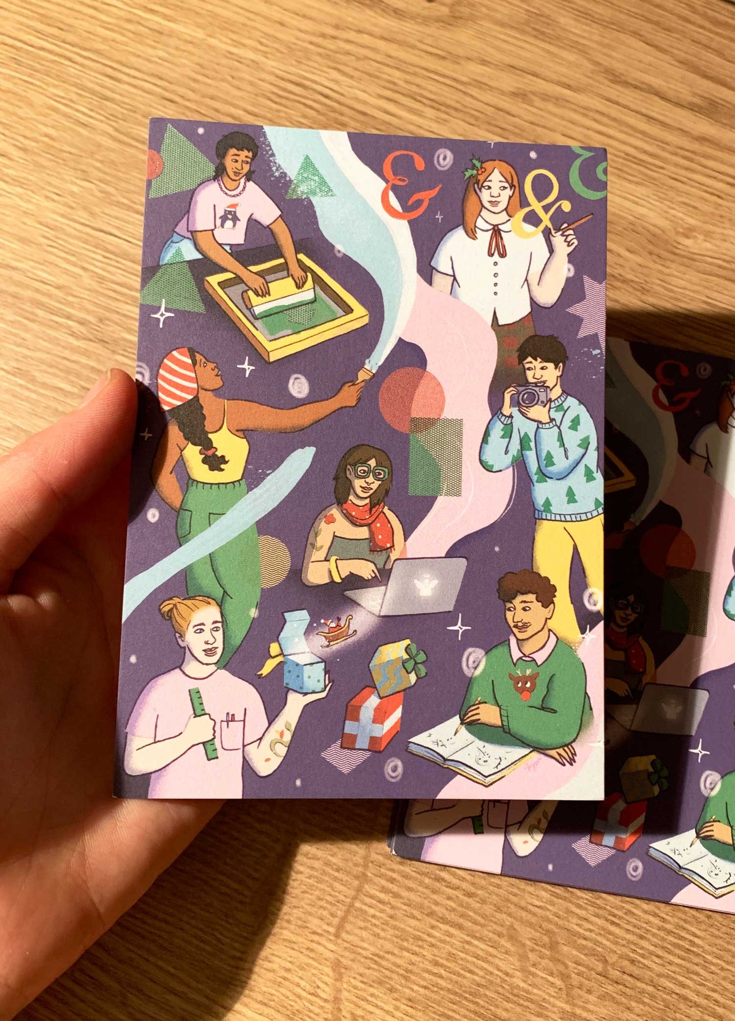
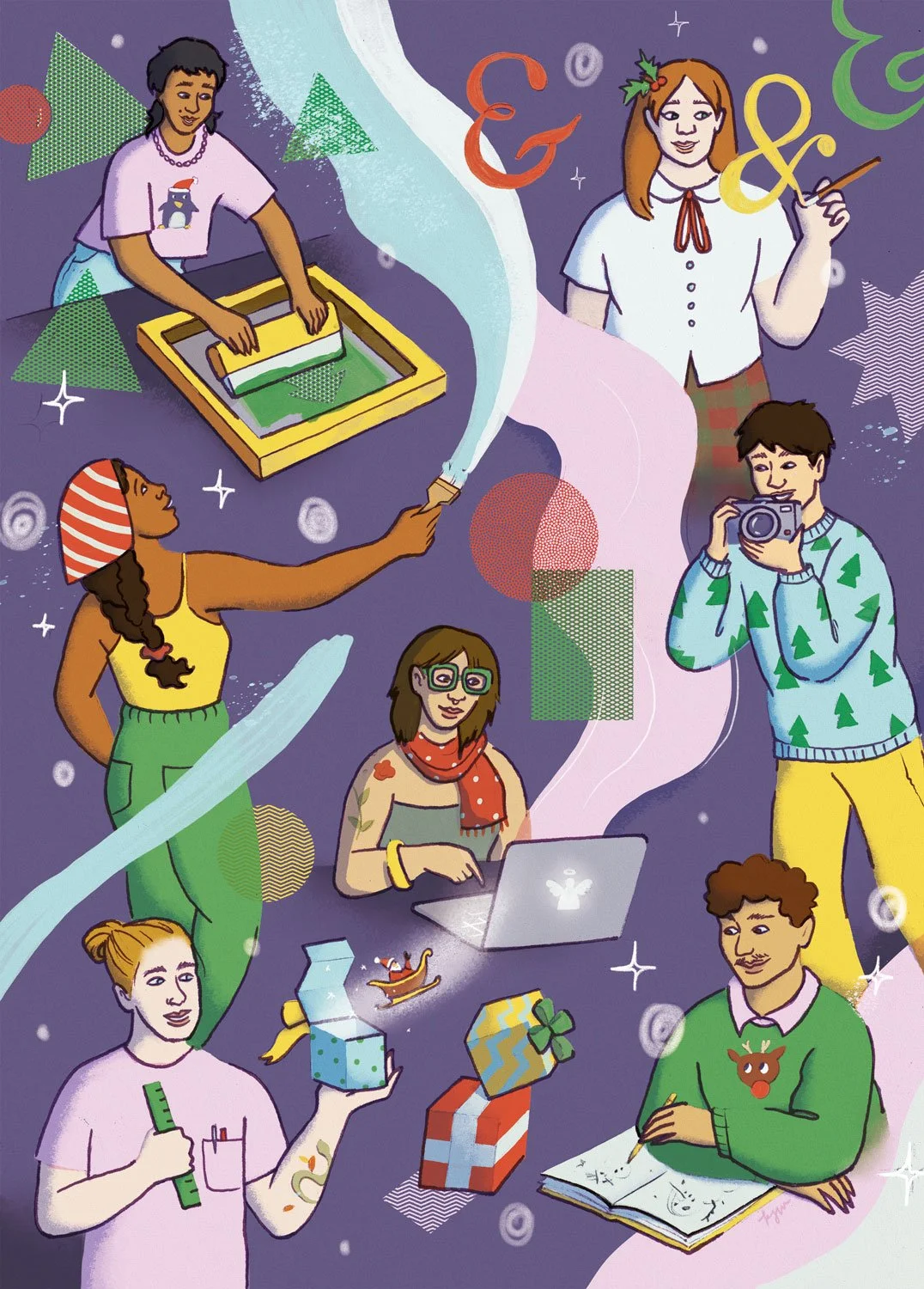
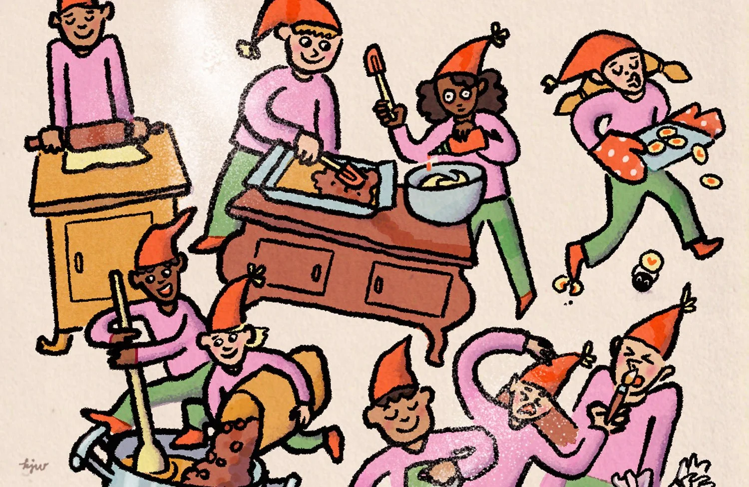
Christmas card illustration for Designforum RLP. 2025 © Kat J. Weiss.


December: My last commission of the year came from Design Forum Rheinland-Pfalz, a organisation acting as an intermediary between designers, companies and politicians. I created a Christmas greeting card depicting artists and designers engaged in the joyful act of creation. I think this was a wonderful way to wrap up the year!


LOWS

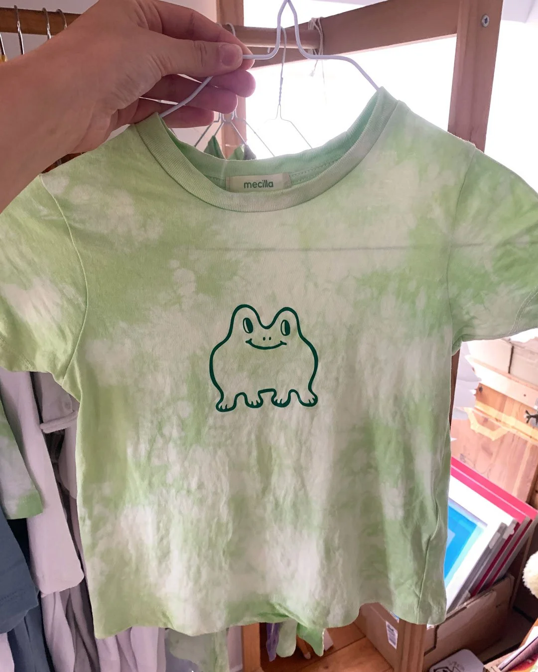
Almost no progress on T-shirts

I’ve been talking for ages about rebooting my t-shirt printing gig, and though I made a bit of progress this year (making screens, dyeing and screen printing t-shirts), I did not get to an actual launch. Hoping for more progress this year…


Didn’t realise a dream project of mine

I’ve always wanted to create a watercolour-based, Seek-And-Find Calendar inspired by the Moselle region in Germany, where I live. I haven’t found the time yet, due — and thanks — to all the other projects I got to work on!


HONOROABLE MENTIONS

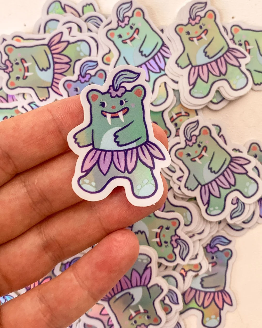
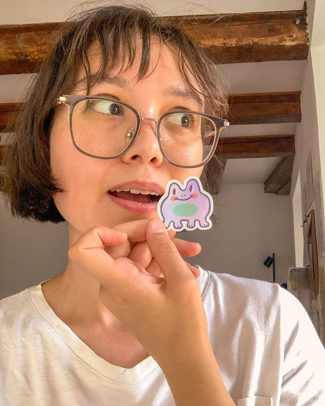
Stickers

Beginning of summer: I made some fun little stickers.


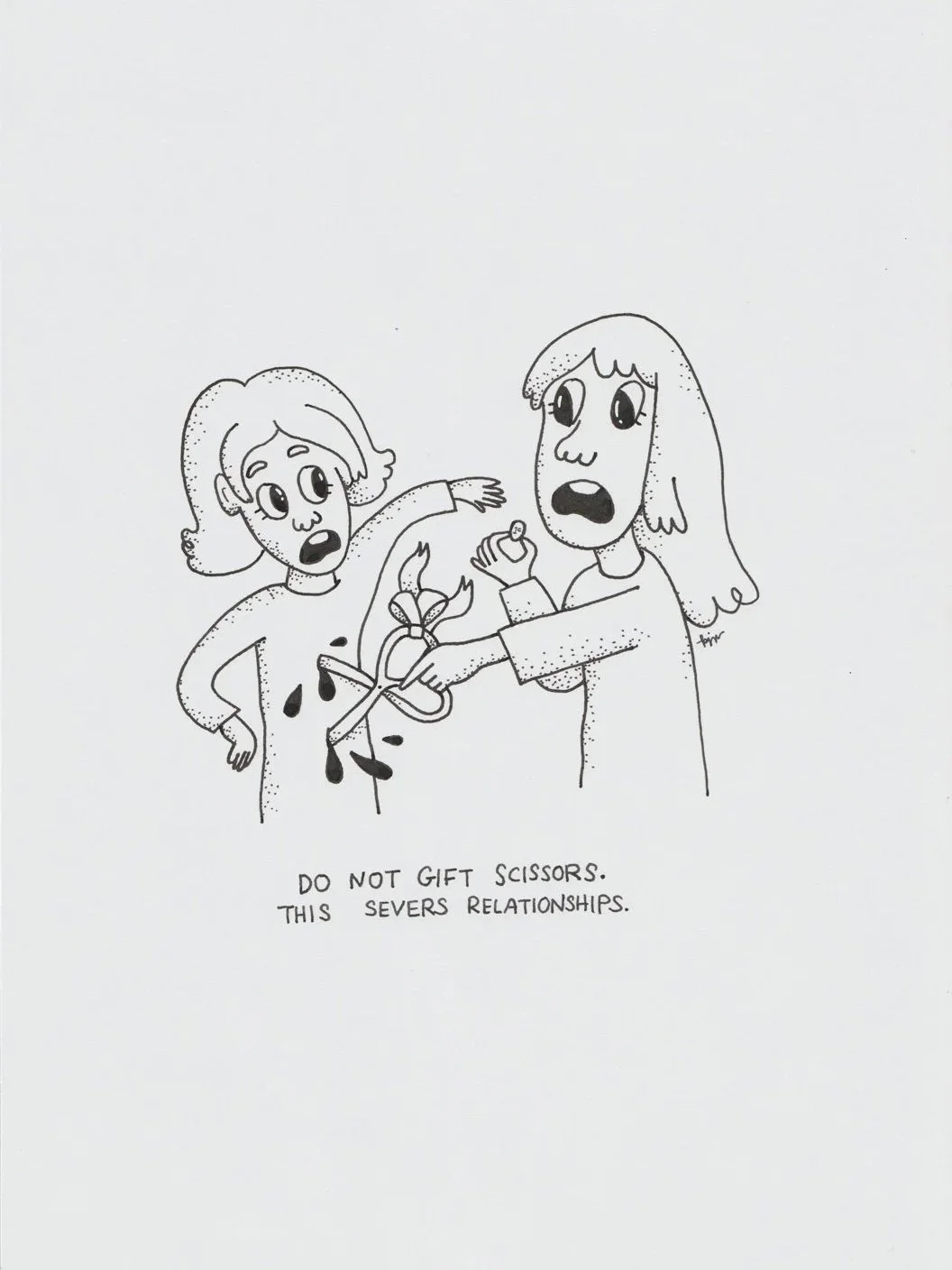
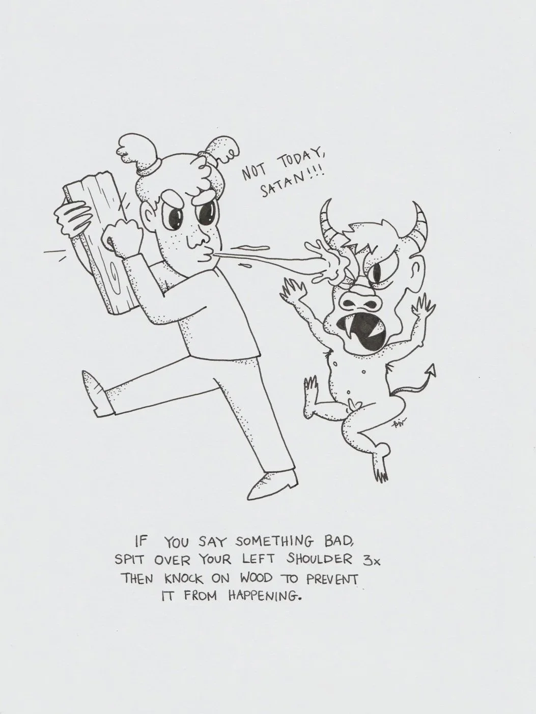
Illustrating Superstitions from around the World

Superstitions. 2025 © Kat J. Weiss.


At the beginning of December, I once again joined my art collective PULPXIX for another group exhibition, titled “Useful Things”. After a phone call with my mother, I was inspired to illustrate the many ominous, often humorous superstitions that exist around the world. For example, how in Chinese culture it’s considered bad luck to gift scissors or clocks.


Christmas Gift: Couple’s portrait

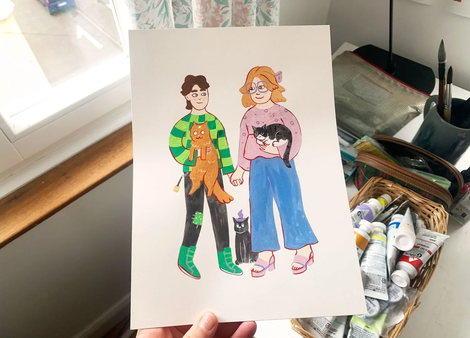
For Christmas: I created this cute gouache portrait for my friend and her girlfriend <3

Big Illustration projects I'm leaving 2024 with; New Illustration projects I'm starting in 2025

Going out in 2024


Honey label for a private client with a small bee-keeping business

Illustration ©️ Kat J. Weiss / Jar mockup by Pixpine

Book cover and print for my fellow artist friend’s photo book Transatlantic — special edition

Illustration ©️ Kat J. Weiss

An installation with an anti-war message. I wasn’t all too happy with my output, but we can only learn by trial and error — making art within the context of my art community, PULPXIX is exactly the room to do that. At the end of the day, I can only hope that my message comes across: we mustn’t accept as a normality, the plight and suffering of children in the world’s horrific wars. 

Photo of my installation ©️ Sebastian Schubmehl, graphic designer

In case you’re feeling charitable, here’s an organisation that I think is doing terrific work in this field:


What's in store for 2025


T-SHIRTS RELOADED...! 

What I had in mind. Illustration ©️ Kat J. Weiss / T-shirt mockup by Mockups-design.com

After a long hiatus in the t-shirt biz, I would like to start something this January!

My lovely friends have been encouraging me to turn my recent doodles in t-shirts. It’s always surprising when something like that happens; that’s how the last t-shirts got started, too. Perhaps there is something about the honesty in expression that people like about doodles?


“Food Fantasy” continued

“Gelato”, Illustration ©️ Kat J. Weiss

I would like to continue my series of placing people and food in surreal contexts, exploring the communal significance of certain cultural foods. For instance, dim sum in Hong Kong or the doner kebab in Germany are foods that bring people across the board to identify with each other. And I think that’s beautiful?

Only problem is, I am a vegetarian (often incorporating veganism into my daily life) and I don’t feel comfortable depicting meat — which a lot of cultural foods still include. Hmm. So the idea might be just to focus on classic vegetarian dishes from different cultures, which I hope won’t be too niche to be relatable.

Illustration Pricing FAQ

The price of an illustration depends on a few factors:

  • Exclusivity – exclusive or non-exclusive rights

  • The number of print or digital media applications, e.g. one or more print media, online, social media, television, etc.

  • The scope of use – how many editions of the illustration will be published, and/or how large is the target audience

  • Duration of use – single use to 1 year, 3 years, 10 years, unlimited

  • Geography of use – how many countries, regions (e.g. DACH region), continents will the illustration appear in, should it be international?

  • Size of artwork

  • Level of detail – background or no background, how many people should be in the illustration, what subject matter should be included, full colour, black & white or only linework

Based on these factors, I can quote your project accordingly.

Sample Prices

Based on “Honorarwerk Illustration“ (2019), an overview of industry-standard prices across all illustration markets in Germany. It was published by Illustratoren Organisation, a German illustration workers’ union.

  • Editorial illustration for magazine or newspaper, print, single page, non-exclusive rights, DACH-region, single use to 1 year – €550

  • School book illustration, print, DACH-region, exclusive rights, single edition, simple motif in colour – €80

  • Children’s or young adult book cover illustration, print, DACH-region, exclusive rights, simple or moderately complex style – €750

  • Poster or flyer (advertising), 1 print medium + online publication, non-exclusive rights, simple style with limited colour, limited editions, single use to 1 year, Germany – €500

🌼 Finding illustration jobs & opportunities on my own after being dropped by my agency

2024 so far: giving a talk about illustration as a career at a university, poster for a children’s theatre production of The Odyssey, and my second mural in Hong Kong :)
Read More

My Illustration Agency Dumped me 🤷🏻‍♀️

Though it stung my ego, it did not come as a surprise, as they have not been able to find me any assignments in these last two years. They rightfully pointed out that, since the creative industry has been very tough in recent times, and they have been unsuccessful in marketing my particular style, they no longer see the sense in continuing our working relationship.

Read More