“Intermediate level” – just because I won’t be explaining the basics, plus I’m assuming you are putting your line work and colour on at least two separate layers, and I mainly want to focus on the animation aspect.
Wooo ok this is gonna be a doozy. If you want the shorter version, feel free to head over to the redacted Reel version on my Instagram.
This is the first time animating beyond simply Lasso-tool-ing and pivoting a limb in a drawing, or making colours fade in/out. There was a lot of back and forth, making it hard to trace my steps, but I’ll try my best to give you as streamlined a version of the process as possible. I’m also going to focus my explanation mainly on one illustration, Mobilwende, but I will also sprinkle in some insights from the others I did (a total of three animated illustrations).
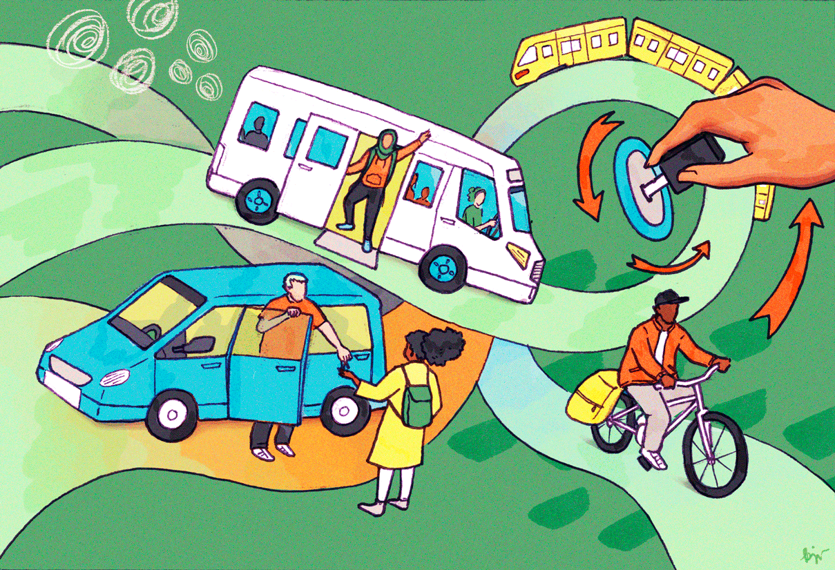
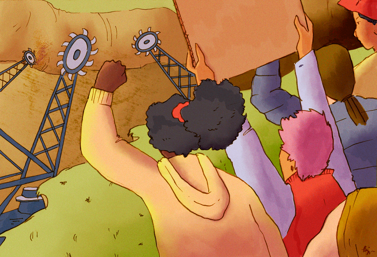
Mobilwende, June 2023
For background on the illustration, Mobilwende, but feel free to skip: Germany is a very car-focused society, and in light of the climate crisis, there are many discussions on how we will transition to a more “mobility-friendly” future, meaning more accessible public transportation, as well as shared modes of transport, like car-sharing. This is my interpretation of what this transition entails, “mobil” meaning “mobile”, and “Wende” meaning “turn.”
1 / Right after drawing and selecting my thumbnail, I decided on where I wanted to add movement in the image. In this case, I decided on the bike, the hand turning the key, the arm of the passenger in the bus, and the person taking the key in the bottom left.

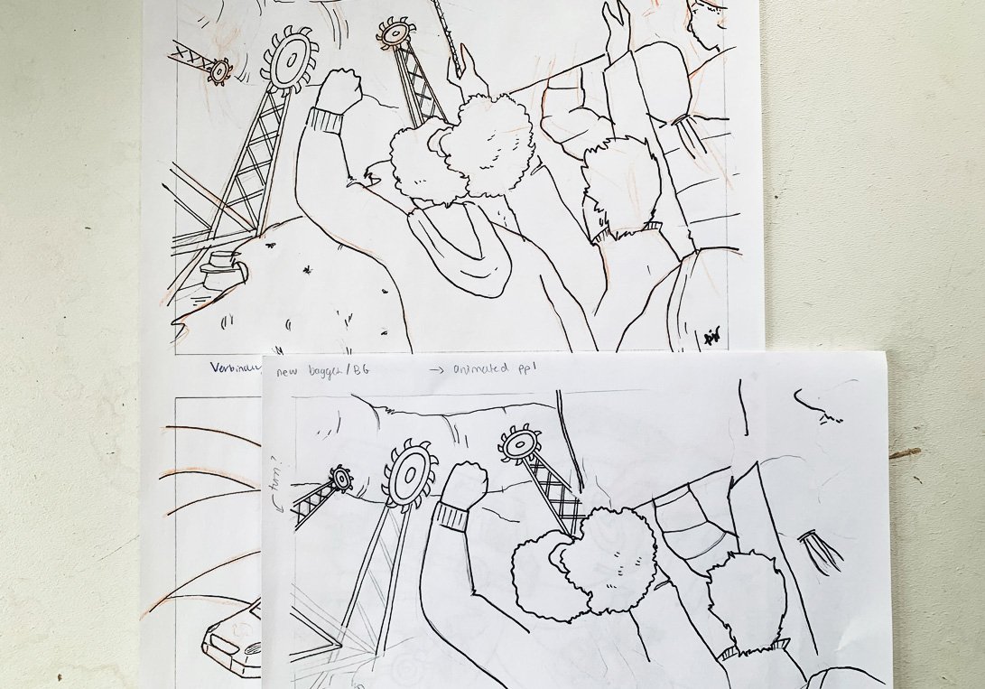
Thumbnail sketch
A note on the conceptual change from thumbnail to drawing, but feel free the skip: Representation of minorities is an important part of my art, because I don’t think we need to be replicating the exclusions in society in our work. So, in the thumbnail you can see that I had a wheelchair user entering the back of the bus on a ramp (or whatever you would call that), because I think truly accessible public transportation needs to be accessible to people with disabilities. Upon further introspection, however, the idea of a future where people are forced to enter the back of the bus, just because they belong to a certain demographic is simply… dehumanising. Once I realised that though, it seemed too difficult to incorporate obvious representations of people with disabilities in the illustration. Or, there might have been a solution, but I wanted to get on with the image, to be honest, and not spend any more time on this specific issue. And I am truly sorry for that. In this case, no apparent representation won over disrespectful representation. But I assure you that representation still very much matters to me, and I will continue to try to do better, to be more inclusive, and if I can’t pull out all the stops in one image (unlikely), the spirit of inclusion will definitely be present in my body of work as a whole.

The final sketch
2 / I then created the final drawing, by blowing up the thumbnail sketch to the correct size in Photoshop, printing that out, and tracing over it on a light table. I love my light table!
3 / Now, for the animated elements; each (hand, bike, legs, arms) was traced over separately on a smaller piece of cut-out paper, adjusted to create the next frame of movement. I felt like a proper Disney animator! Well, probably far from it.

For the bike, I looked at a few reference images but mostly just used my imagination to the create the illusion of a moving wheel and peddling legs. I don’t think everything has to be 100% accurate, just believable, and I actually think these stylistic distortions have a charm to them. I think I actually used two separate pieces of paper for this: for the wheels and the legs.
For the hand: used reference images (my own hand)
For everything else: this would come down the the Lasso tool later on.

Reference used for the animation: my hand.
In retrospect, I wonder if I should have just traced the whole drawing so as to have all animated elements on one sheet of paper… I was afraid that would create too many squiggly lines, but maybe squiggly lines are cool?
Base drawing and animated elements for my other piece, Lützi
To create the wind-blown hair in the Lützi piece, this was simply a matter of changing the direction of the hair lol. I probably could have created something more complex by using reference images, but I’m OK with the level of detail I added here.
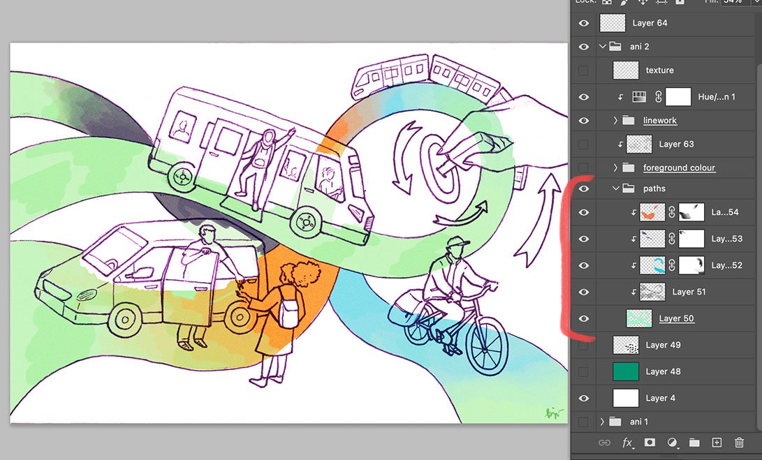
4 / After scanning in my images at 600dpi, isolating the line work and doing a bit of clean up*, I placed the animated elements on top on separate layers, and adjusted their size and position. For the waving arm (bus passenger) and car key lady, I simply duplicated the base layer and rotated the limbs to their correct positions. I then hid all of the animated elements to focus on rendering the base layer.

The animated elements (wheels and bicycles) are added on top on separate layers. We will deal with clean up later in the process.
* for anything that will end up NOT Moving, it’s important to edit/touch up/clean up straight away. It all gets a little tricky otherwise.
5 / Proceeded to add colour and added my usual textures.
I used to use this marker brush (see below) from Kyle T. Webster’s – now Adobe’s – brush set, but I feel like this wastes a lot of time, so nowadays I just use a normal, run-of-the-mill round brush to frame all the sections and fill them in using Actions.
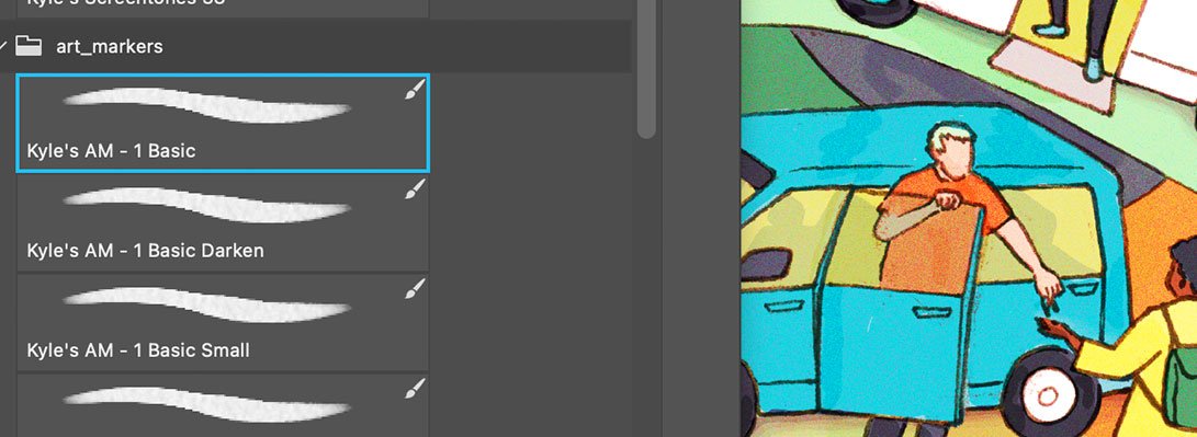
Kyle T. Webster / Adobe Art Markers brushes.
Finishing touches: to nevertheless add a marker texture, I added a Clipping Mask layer to the colour layer group, set the Blend mode to Color Burn, put the opacity to 50% (or lower), and used the marker brush I talked about earlier, at 30-50% opacity, in black.

Clipping Masks are my friend.
6 / Now for creating the second frame: I grouped all the layers together, duplicated the group, then added the animated layers (hand, wheels, legs, arms) back on top of the line work layer in the second group. If you have any textures and adjustment layers on top of everything – we’ll worry about those later.


Everything from the original layer that is still visible in Layer Group 2 (and is not a static part of the animation) needs to be erased. Broken lines can be reconnected. Note the position of the animated elements on top of the original line work layer (which has been lowered in opacity just for presentation’s sake, in reality it was fully opaque). Also, I just realised that I animated the arrows as well but forgot to mention that. Please forgive me lol
It looks a little messy at first, but basically what you do now is erase the original position of the things that move (hand, bicycle, legs, arms), and if there are breaks in the lines you just draw them back on top. I like using this Doozy Inker, it’s likeness to ink is… on point.

This is my favourite brush for filling in/reconnecting lines that were originally hand-drawn, in ink.
The same is done for the colour layers; just adjust, erase, and fill in spaces that need it. Admittedly it gets kind of confusing here, so you may have to turn off all the layers (assuming you place your colours on separate layers, like I do) and then just go through each layer one by one and tweak, or consider flattening multiple layers together to simplify the process.
Did I mention that Clipping Masks are my friend?
To create the moving gradient in the pathways, this was all a matter of first creating the bigger/longer gradient for the second frame (Layer Group 2), then shortening/moving the gradient with a Layer Mask in the first frame (Layer Group 1). Separate colour layers are helpful here, but I bet you already knew that ;)
You can keep switching off Layer Group 1 / Layer Group 2 to see what the final GIF/animation will look like. If it looks seamless, then you are almost there; first, let’s get back to the textures/adjustment layers we set aside earlier. You need to duplicate these, then drag them on top of Layer Group 1, so essentially each Group has their own set of textures/adjustments.

You need to merge texture and adjustments with the layer groups twice… and separately.
If all is good to go, Save, and then Save a copy of that document (I usually add “GIF” or “animation” to the name). Continue working on this new file.
In this copy, you’ll flatten the layer groups, each with their own adjustment/texture layers, so you essentially just have two layers, one for each frame.

Each flattened layer is a frame of your animation.
7 / Creating the GIF using Timeline:

Timeline tab
Go to Window > Timeline. Click “Create Frame Animation” in the middle of the Timeline tab group, delete the frames that are auto-generated in the timeline, make sure all of your Layers/frames are on visible and in the correct order in the Layers tab, then go to the hamburger/three line menu in the top right of the Timeline tab and select “Make Frames from Layers.”
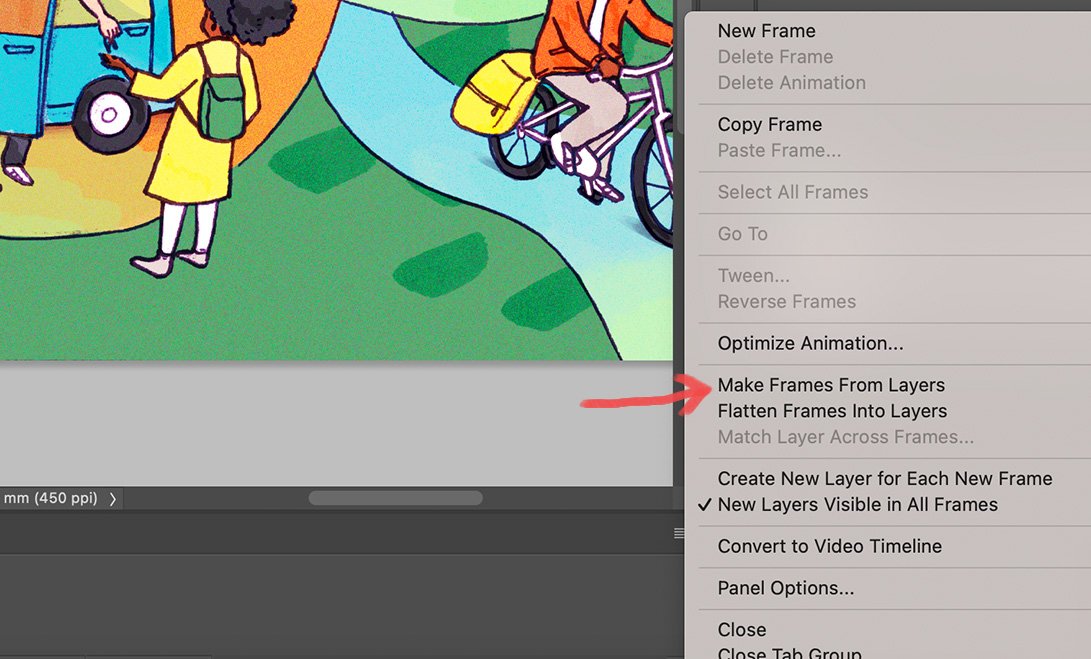
Make Frames From Layers, from the “hamburger menu”
Now you can set the animation duration from the bottom left drop-down menu (Forever, 3 times, once, etc). Select all the frames in the timeline, then go onto the drop down menu on one of the frames to set the frame duration. You can select one of the presets or insert your own (normally I do like 0.3 - 0.4 seconds per frame). You can also make one frame longer than the other.

Setting the Loop duration

Setting frame Duration/Delay
There’s probably much to explore here but I like to keep things simple for now.
8 / Exporting to GIF:
On Mac, click Shift+ Option + Command + S. This will open the Save For Web menu.

Save For Web menu
Make sure to select “GIF” from the 4-up tab, and optimise the Dither, Color, Color Reduction Method, Size, etc. (for a more thorough explanation on this please head here). These will effect the size of your file, and if you’re going to upload it to web then you may want to try to get it as low as possible without compromising the image; According to GIPHY the max size of a GIF is 100MB, though they recommend 8MB or less. Then save!
One final note / On learning, failing, and learning…
Translate – this is the piece I ended up feeling the most unsure about. It’s quite a detailed piece and I don’t think it needs to be animated, besides that, I don’t know if I have the skills (yet) to include movement in an already busy piece. Conclusion: it’s OK to just have “still” images sometimes.
As for the Lützi piece, I feel like some areas feel awkwardly static while the rest of the image moves (at least to my eye); basically, it feels a little disjointed. Conclusion: It might be worth redrawing the entire second frame, which would create squiggly lines, therefore making the moving parts feel more like part of the illustration (rather than isolated).