All my current projects + Why I’m taking a relaxed approach to my work!

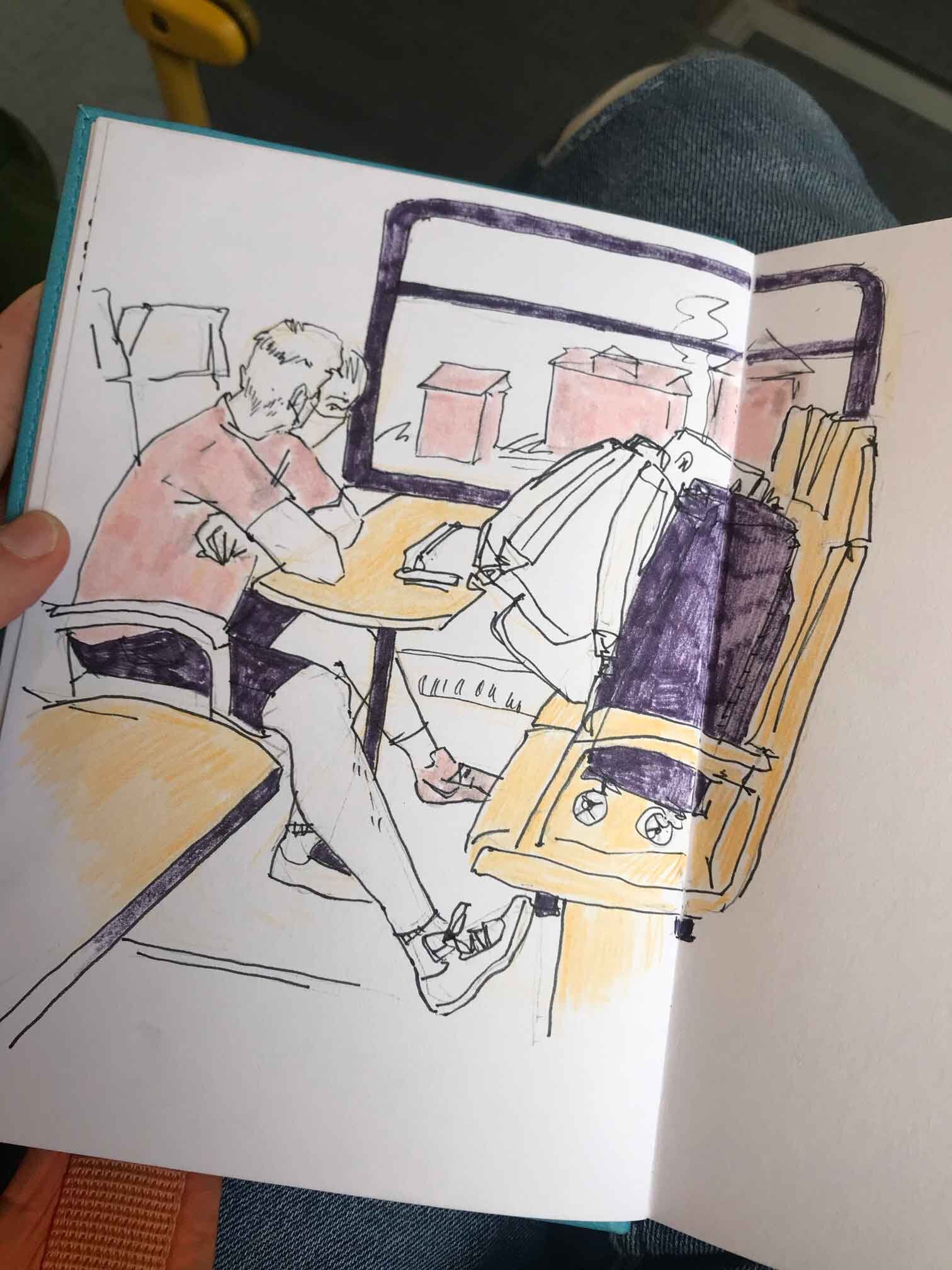
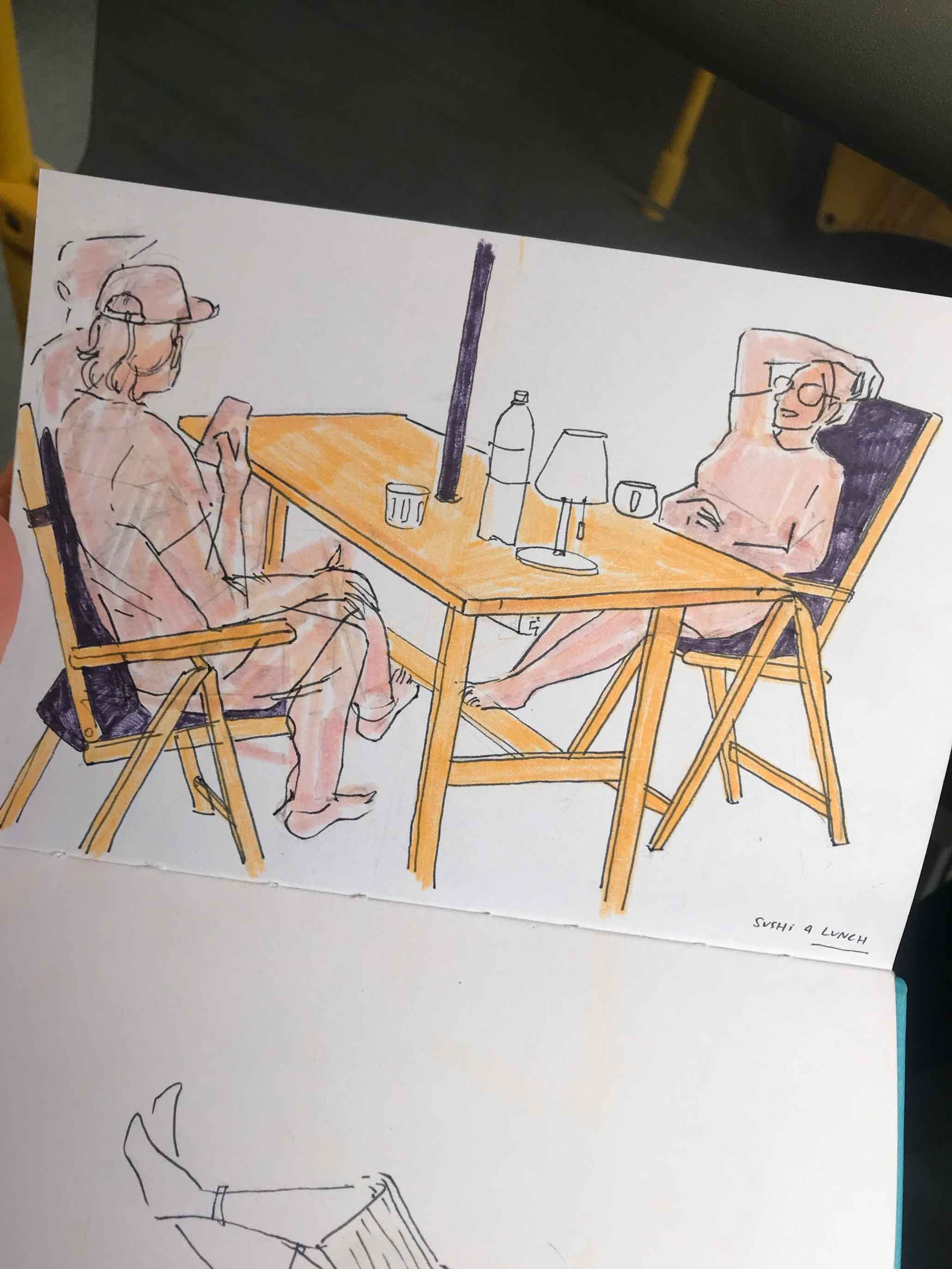
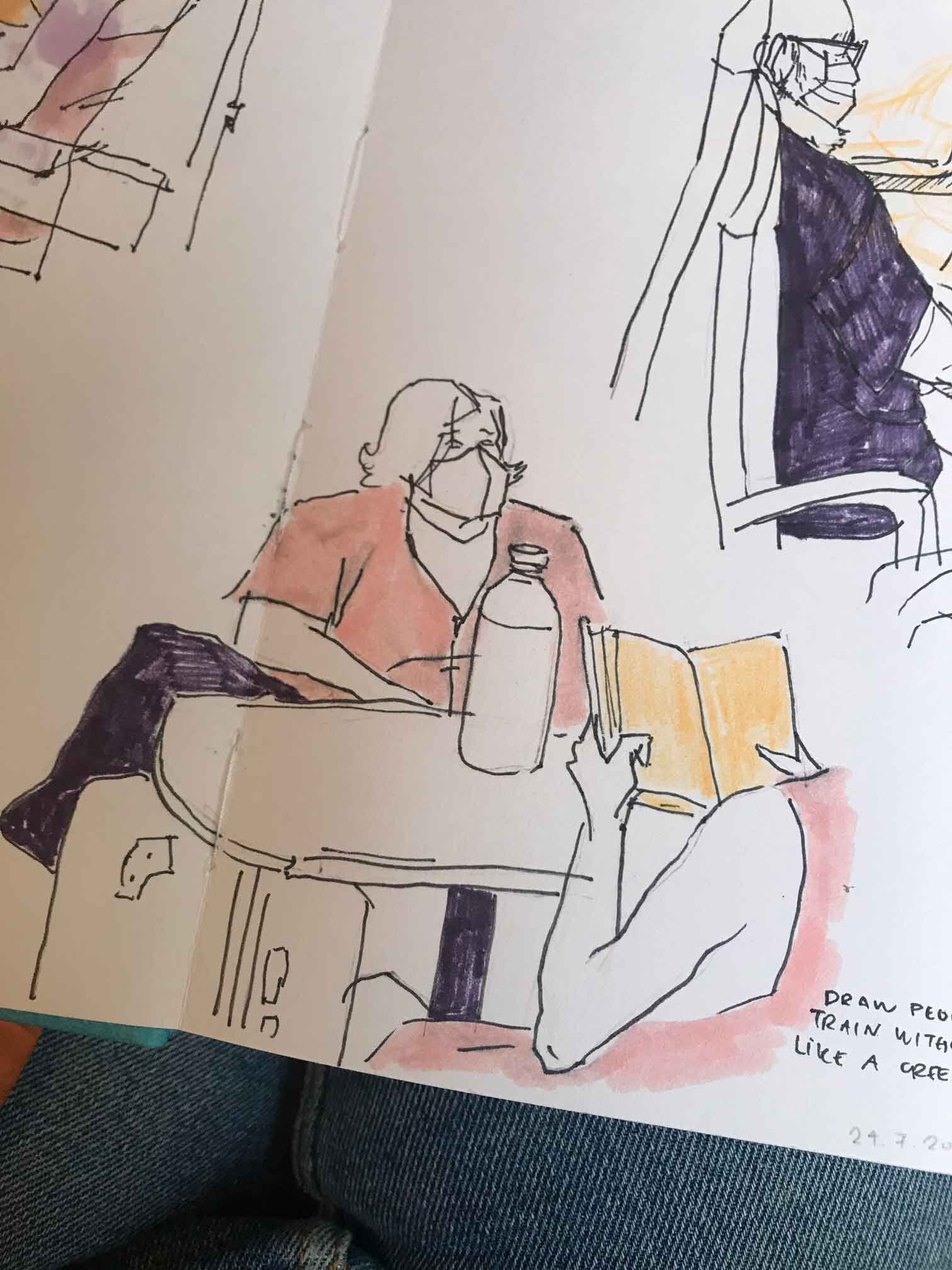
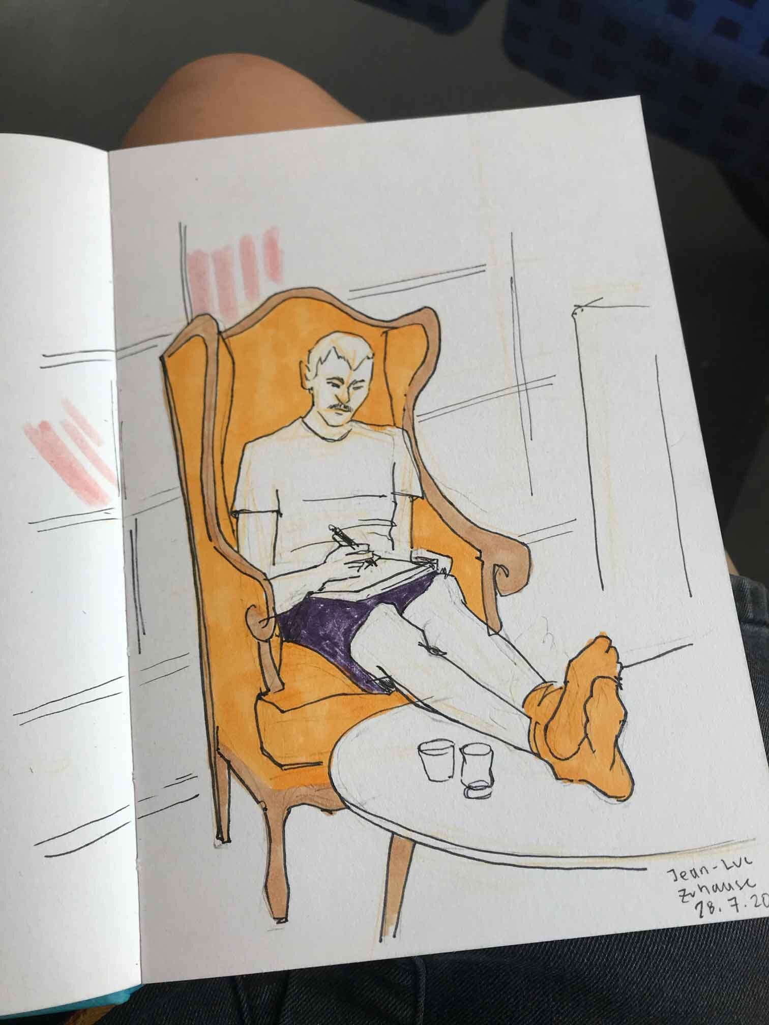
I’ve recently felt inspired to do more sketching. To capture the energy around me, and to keep drawing, even if it turns out bad. I haven’t felt that way in a long time. Perhaps it’s a summer thing. Overall, I’m prioritising mood over quality, though it’s also nice if the sketch turns out good at the end. 

I’m also working on this piece that I’m just calling “hot pot” for now. I have a thumbnail composition already, and my plan of attack is to do studies of the individual aspects of the image before hashing out the final layout. Oh, and I’m experimenting with dip pens + water colour, and I really like it so far! My favourite part is that you can draw kind of crappy and this medium will make it look intentional lol. 

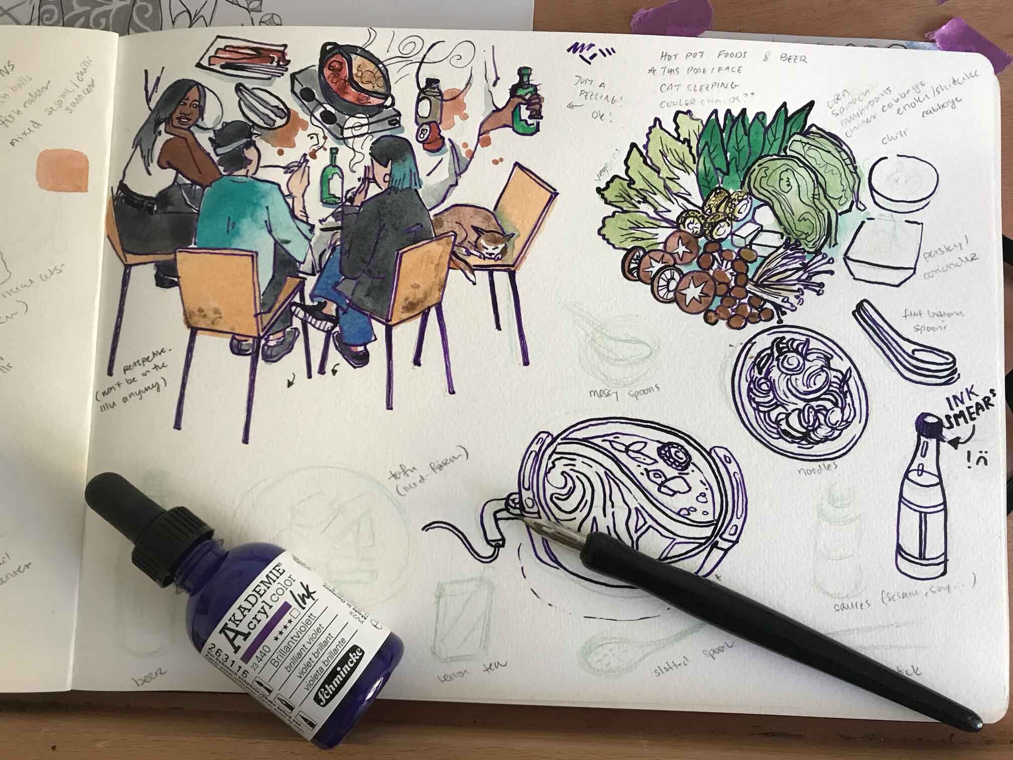
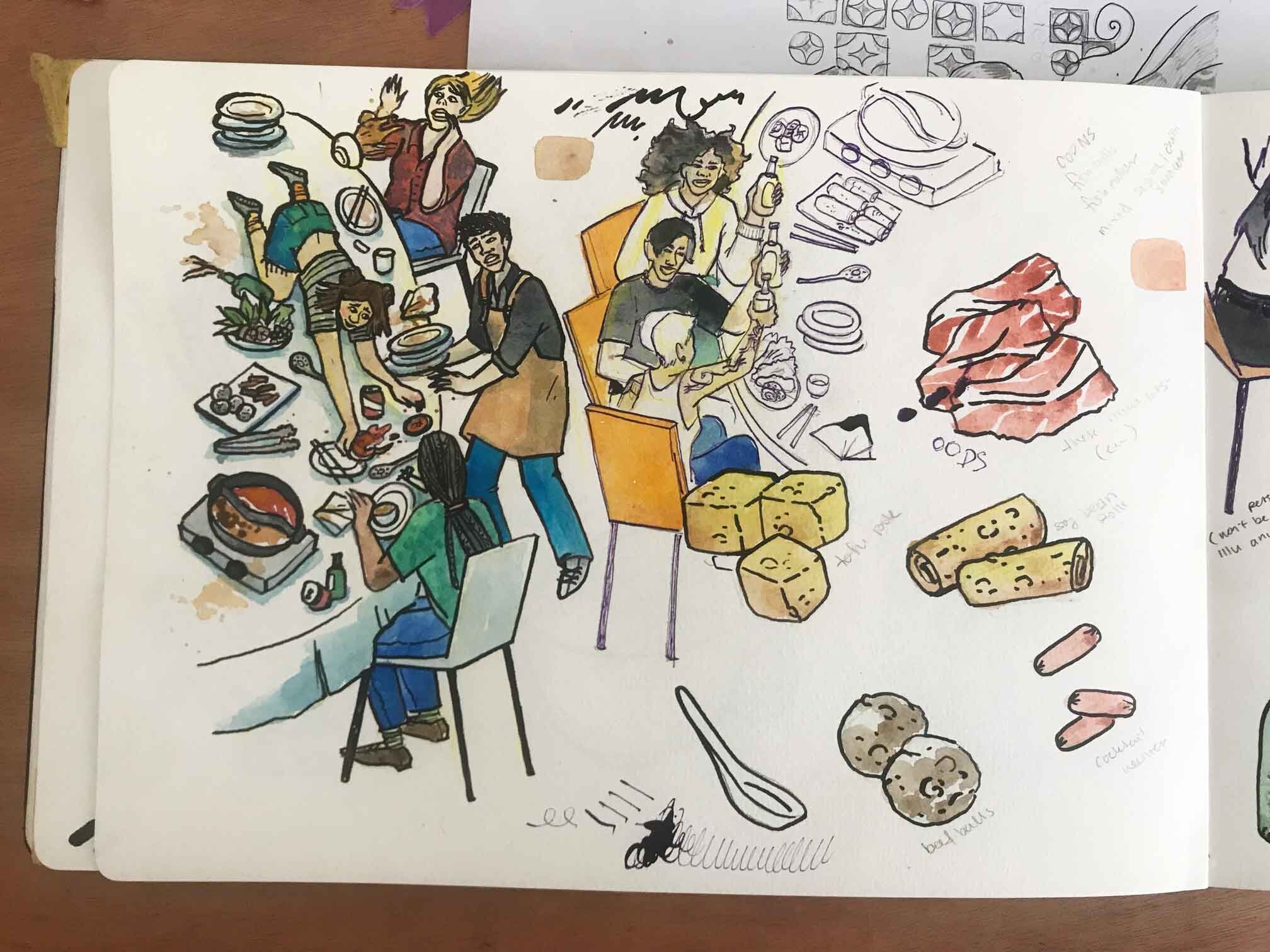
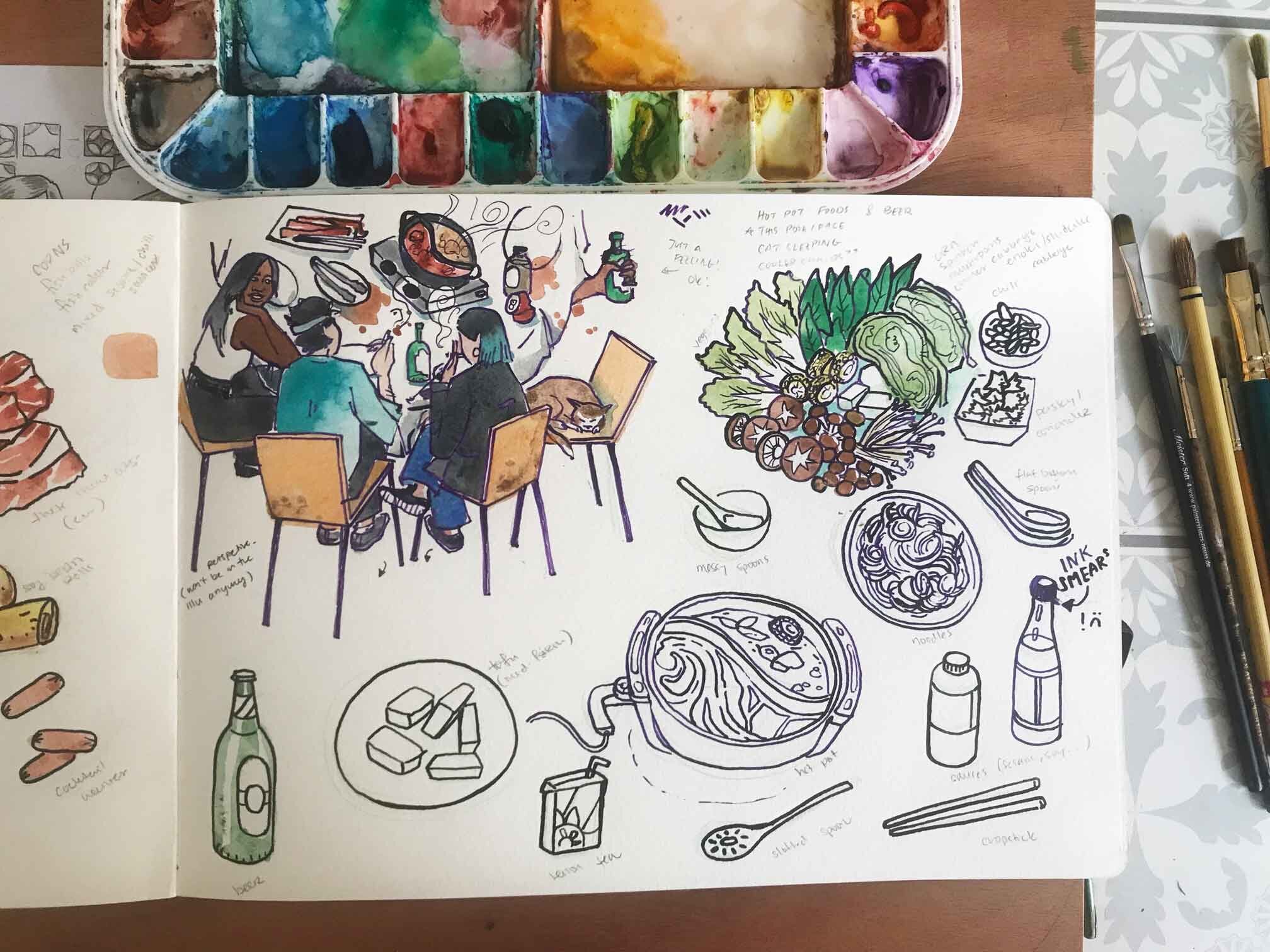
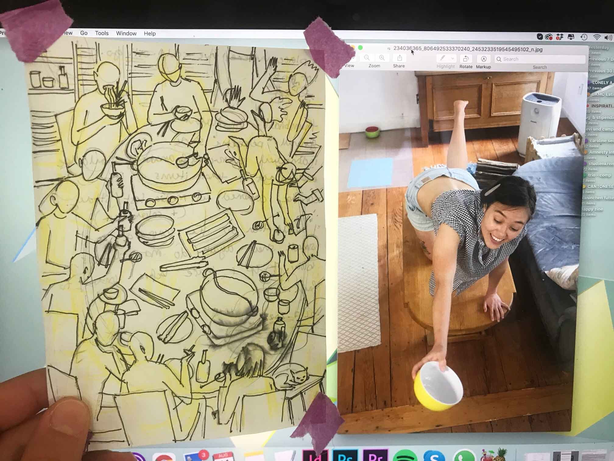
In general I’m going for a more relaxed, imaginative and playful approach with this piece. I don’t want to always have to rely on reference images, and to check if every single detail is correct (my normal mode). It’s just so exhausting and really takes out all the fun. It’s hard to work alone because all I hear in my mind are those critical, perfectionist thoughts. I realised that I am a lot more easy going when I have someone to talk to while working. Just like in my personal life, I wish that in my working life, I had more of a balance between working alone and working with people around me. 

In the mean time, my  strategy is to be mindful – to notice when I have those extremely self critical thoughts, and then to let them go. It also helps to have relaxing music while working, here’s my drawing playlist in case you’re curious!

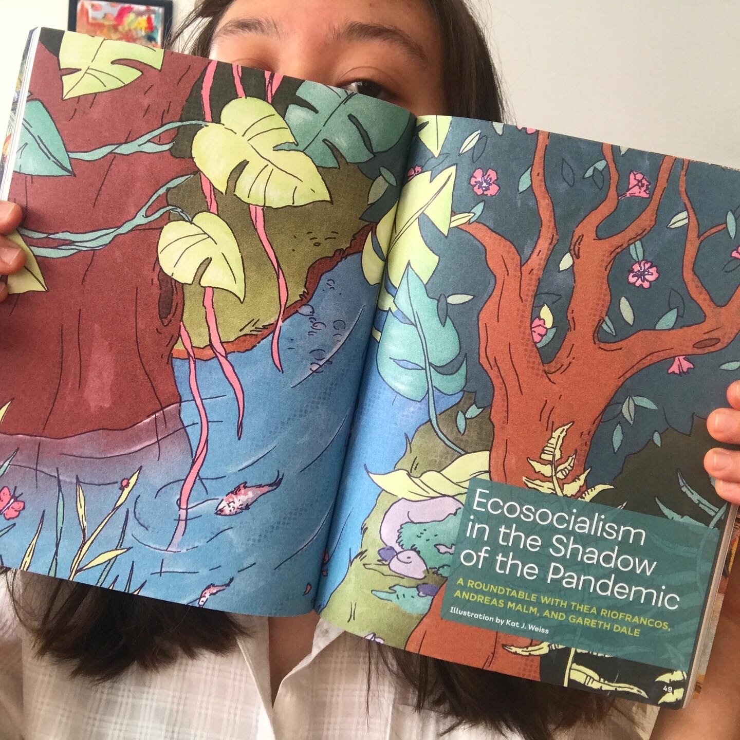
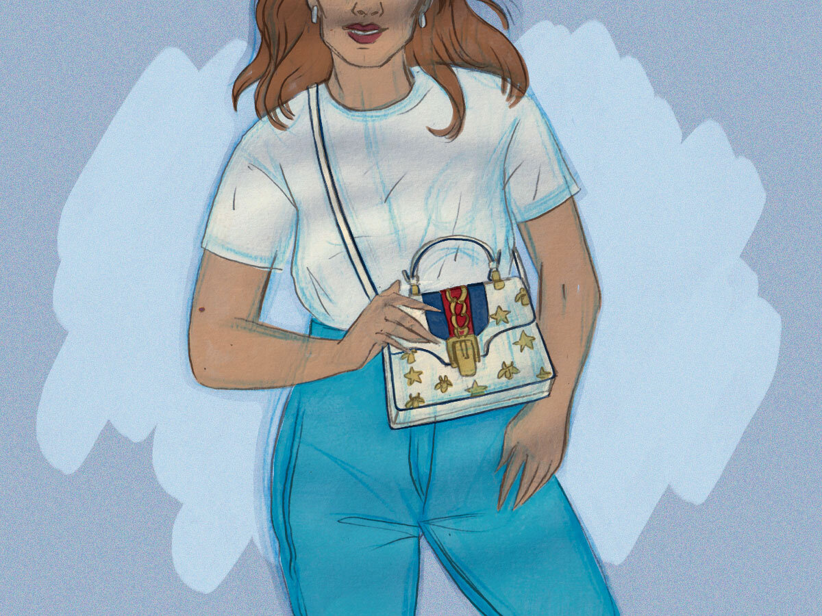
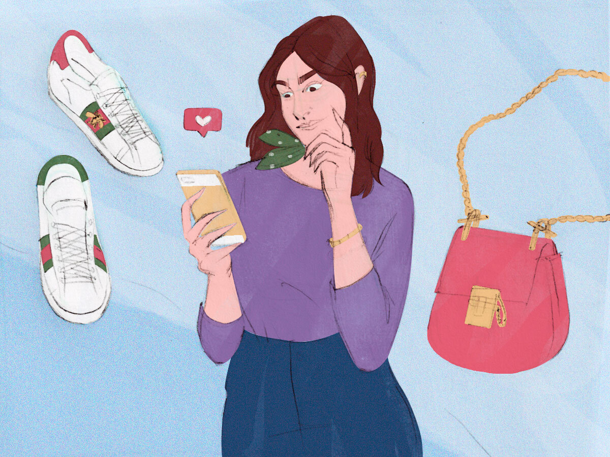
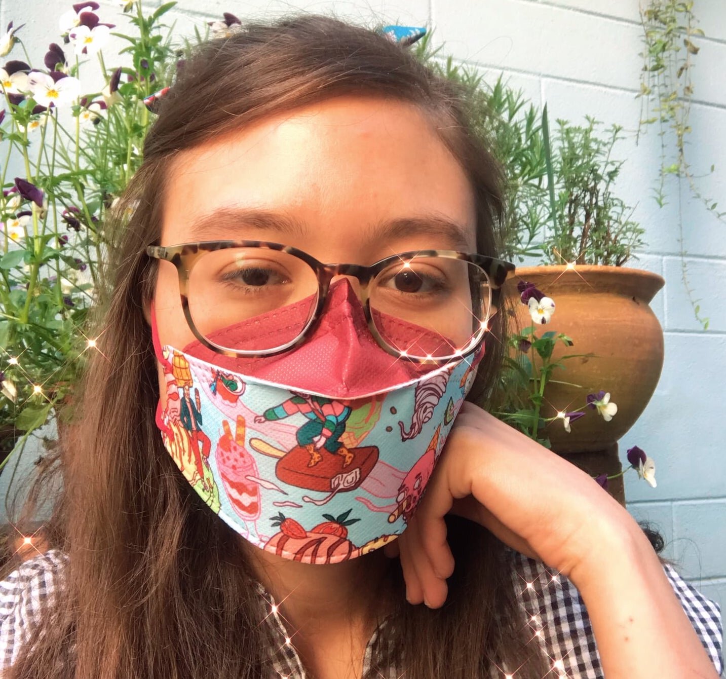
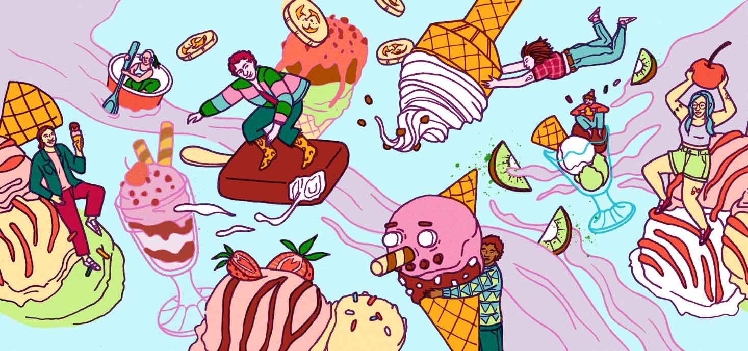
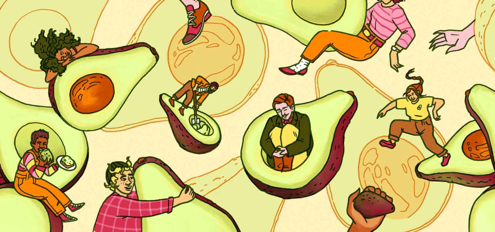
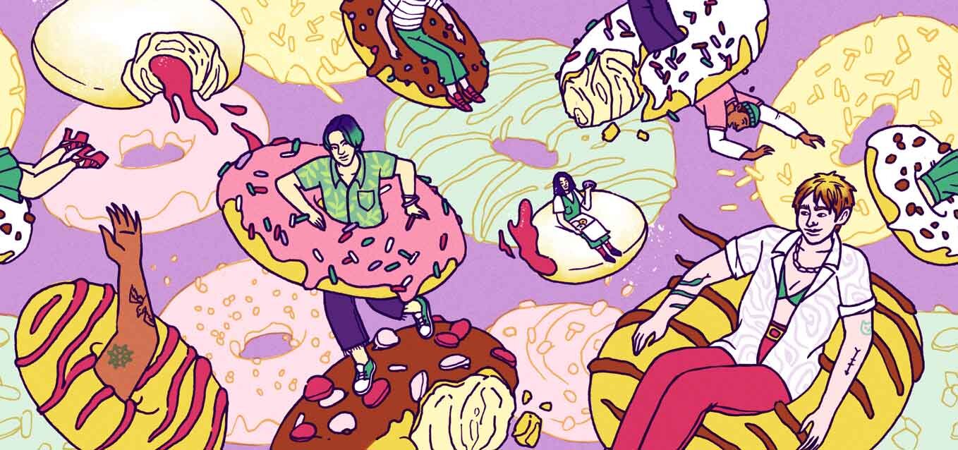
BTW, you’ve seen this already, but here’s the printed version of the feature illustration I did for Spectre Journal Issue 3! AD: Gabe Berlin, he was awesome to work with!

Finally, I signed a contract for another project with the Ban Ki-moon Centre in Austria. Here was the first project, in case you missed it. I’ll be starting next month, so I’ll keep you updated!

Finally finished this piece + does “correct perspective” make good art?

FKA the piece I never thought I’d finish because I didn’t like it, but – I recently got round to it because my agency was asking for “space themed” illustrations, so that gave me a lil kick in the butt. Sometimes in life you just gotta finish things you don’t enjoy. I look at it now and think “ok, this and this part* could’ve been better, but people seem to like it anyway and at least I finished it!” Yeah that’s all. 

Space Café, July 2021

Space Café, July 2021

* If you’re curious about what in particular I’m not happy with in this piece it’s: a) the skater’s right arm b) the seated woman in the front/right – her right arm, too c) then in general the sense of depth in this environment, I’m not sure if I nailed it; perspective is not one of my strongest suit but I’m trying to improve it.

On the other hand, I can also make peace with the fact that, in general, a more symbolic perspective is more important to me than realistic perspective, ie it’s more important to me to sacrifice correct perspective in order to show certain details. I feel like if I were to show everything in 100% correct perspective, certain aspects, like a person’s outfit, or the contents of a table, might get lost. I hope that makes sense?!

If we look traditional Thai (temple) mural paintings for instance, a lot of it is completely flat! It’s definitely not true to life, but there’s a charm to this kind of representation, because it tells a story. It literally gives us a full(er) picture of the environment and what is happening in it.

I’m definitely not knocking people trying to master 3-point perspective, OK. I just think there are different ways to art good, and that’s all. 

A new style / skill: Vector Illustrations

I’ve recently been working on a new series of vector illustrations for Craftview, a company which puts softwares for woodworkers, landscapers, construction workers, etc, all in one place.

015-kat-weiss-carolineseidler-com-craftview1.jpg

Anyway, I never thought that I could do corporate-type vector illustrations or include that “style” into my portfolio somehow, but this project gave me the push to try. And, save for the line work that is normally evident in my work, I think it kinda fits with the rest of what I do? I mean, it’s people-focused and the characters look approximately the same, shape-wise. Let’s see what my agency (and the world) thinks. I hope this can open some new doors! 

BTW, in order to keep the style somewhat in line with my other work, I did my thumbnail sketches the way I normally would, but then simply did a shape-based execution in illustrator (using mainly the pencil tool, not the pen tool, as this works with the organic shapes in my work).

ueber-uns.jpg
019-kat-weiss-carolineseidler-com-craftview5.jpg

What I appreciated / found interesting about this process: I felt like I was building dolls, but in 2D, and there were many instances where I could simply copy and paste existing shapes (heads, arms, legs…) to build new ones. Working with vector also means you can have the final output be virtually any size, but… that’s a given.